
Church Bulletin Board Layout: Get the Printable Zoning Map
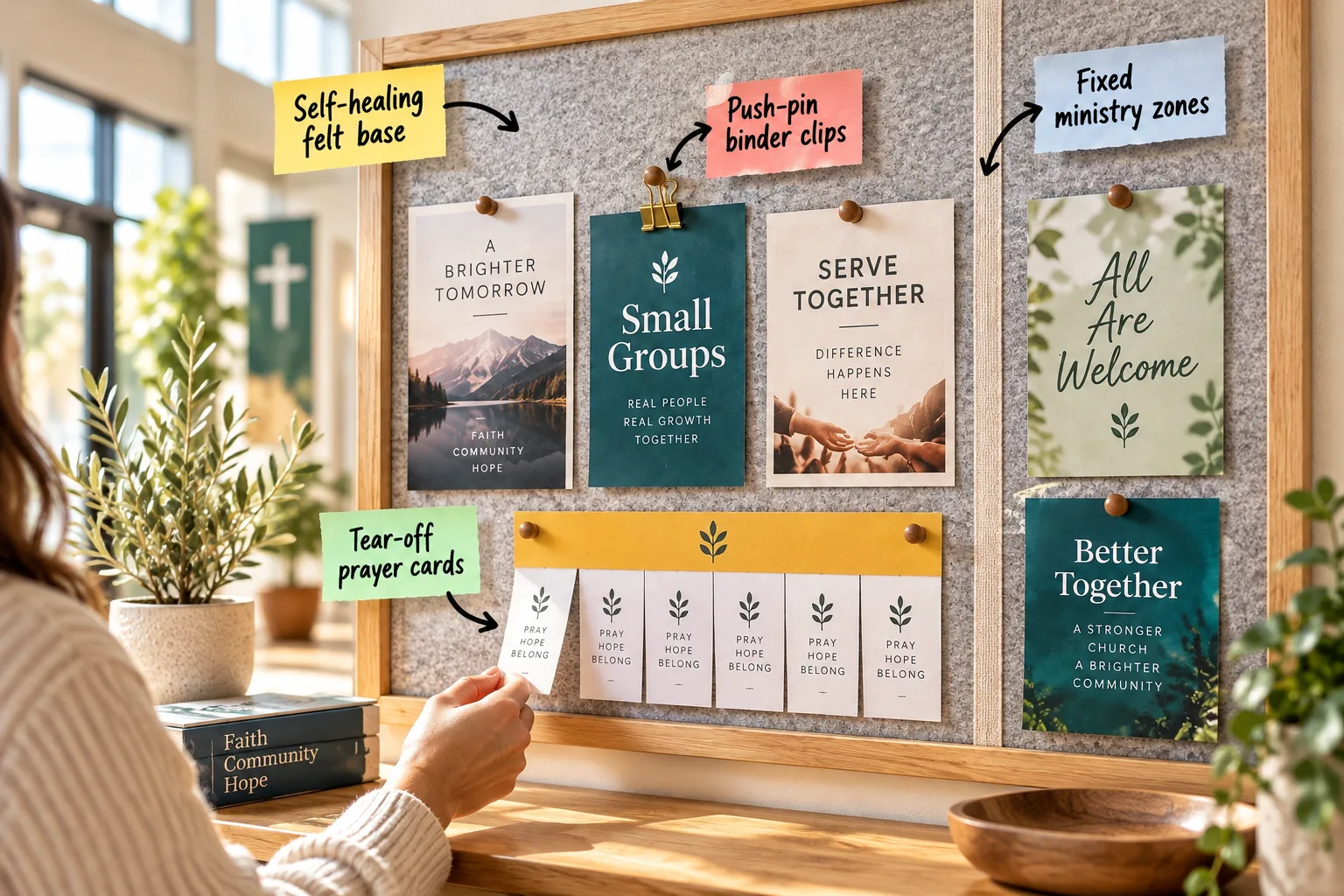
Transform your cluttered foyer into a structured hub of connection by downloading our printable board zoning map and following this step-by-step layout guide. You will learn exactly how to divide your space into permanent ministry zones so every visitor instantly finds the information they need.
The Foundation: Upgrading to a Self-Healing Felt Base
Start by replacing crumbling cork with a self-healing felt base to completely hide old pinholes. A standard 1/2-inch thick acoustic felt panel grips pins tightly, maintaining a clean backdrop even after years of weekly flyer rotations.
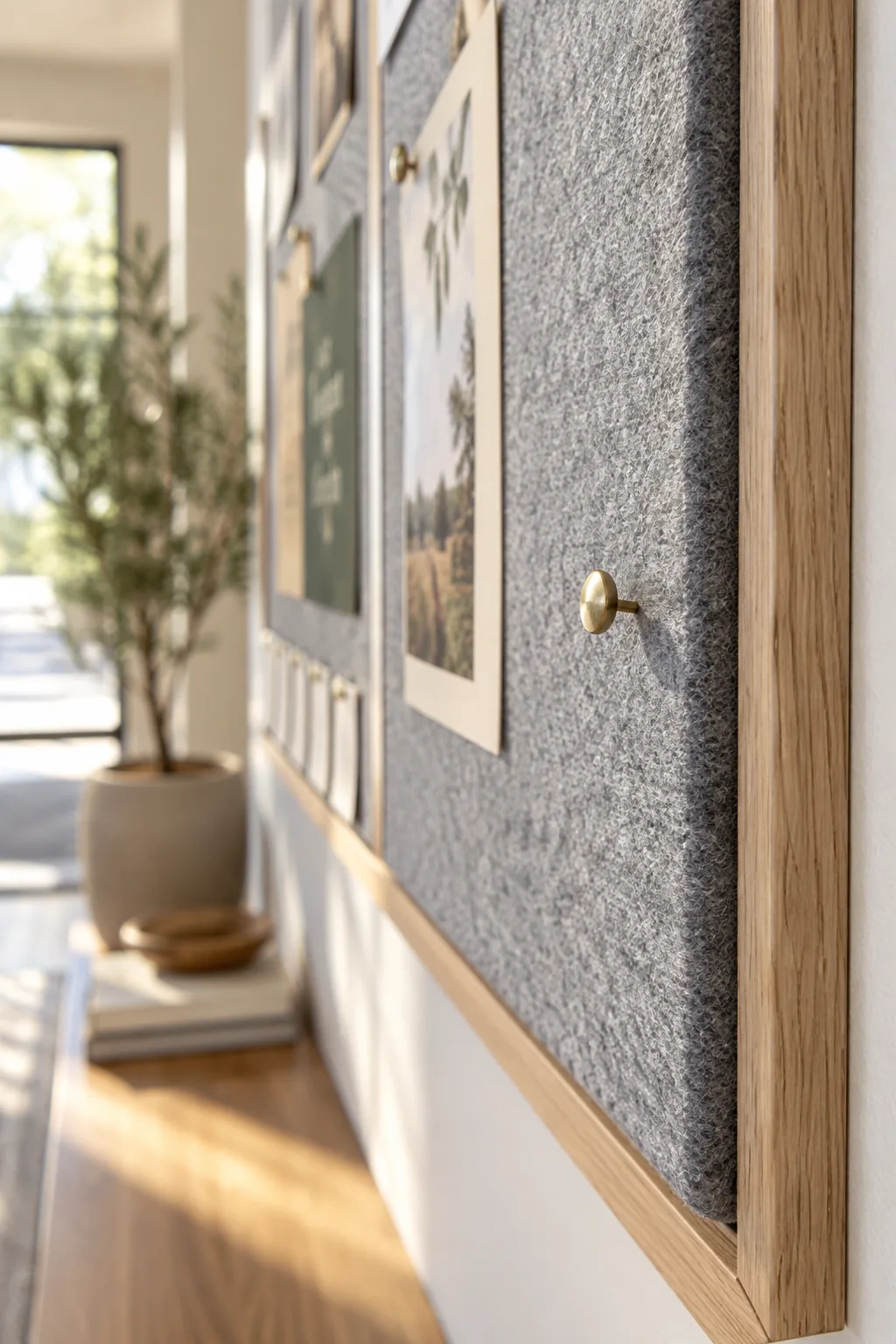
Before mapping out your new layout, make sure you aren’t undermining your efforts with a failing foundation.
Choosing the Right Board Frame for High-Traffic Foyers
A beautiful felt backing needs a sturdy frame to withstand constant interaction in a busy church foyer. Selecting the right frame material ensures your display remains structurally sound while complementing your interior architecture.
| Frame Material | Durability | Visual Style |
|---|---|---|
| Solid Oak | Very High | Traditional, warm |
| Matte Aluminum | High | Modern, minimalist |
| Painted Pine | Moderate | Cottage, transitional |
I always recommend avoiding thin plastic frames, as they warp quickly under the tension of stretched felt and tight ribbon dividers.
Planning Your Layout: The Printable Board Zoning Map
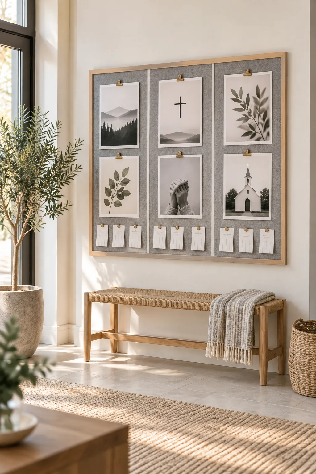
Download our printable board zoning map to establish a permanent, scannable structure for your foyer. This guide divides a standard 48×36-inch board into three distinct vertical columns—Connect, Serve, and Grow—ensuring visitors intuitively know where to look.
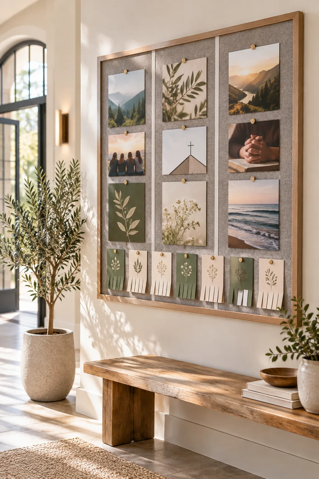
Sticking to this proven three-column layout prevents the chaotic overlapping that usually plagues community announcement boards.
Color-Coding Your Ministry Categories
Assigning a distinct background color to each ministry zone helps visitors process information at a glance. When a guest approaches the board, they should immediately recognize that blue flyers belong to community groups while green indicates service opportunities.
Creating Fixed Ministry Zones with Ribbon Dividers
Translate your map to the physical board using 1/4-inch grosgrain ribbon to create fixed ministry zones. I use this exact ribbon trick in my Denver studio to separate fabric swatches, pulling it taut and securing it behind the frame for permanent visual boundaries.
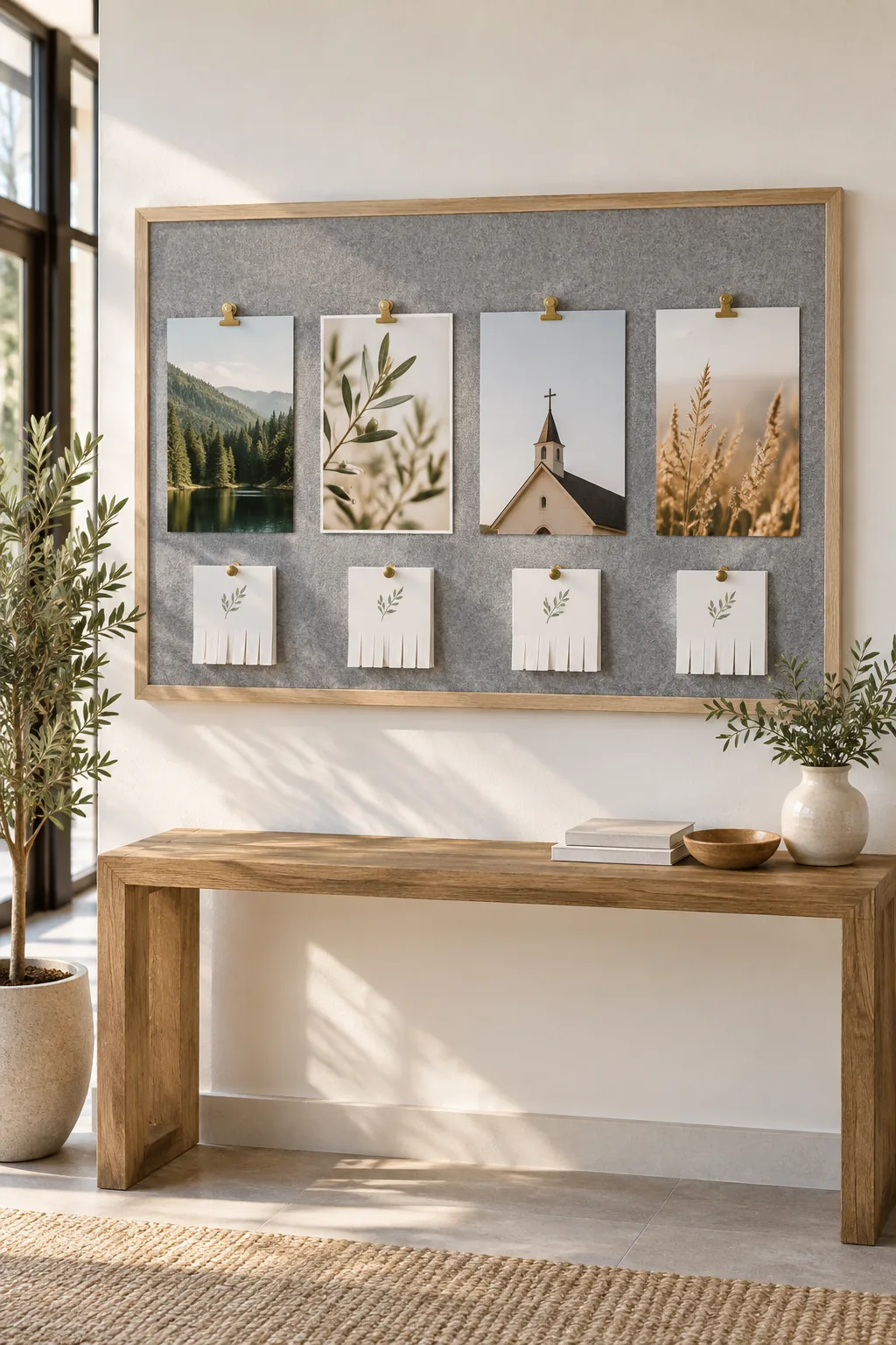
Pulling the ribbon tight establishes subtle but firm borders that prevent announcements from bleeding together across categories.
Sizing and Spacing Your Core Announcements
Enforce a strict sizing hierarchy to keep the board visually calm and deeply scannable. Limit standard flyers to 5×7 inches to maximize your available display area without overwhelming the viewer.

Maintain at least 2 inches of negative space between every printed piece to give the information plenty of room to breathe.
Creating Standardized Flyer Templates
Providing your ministry leaders with pre-designed templates eliminates visual clutter and ensures important details are never forgotten. A standardized layout forces clarity, requiring a bold headline, concise description, and a single obvious call to action.
- Place the primary event title in a bold, easily readable sans-serif font.
- Include the exact date, time, and location in a dedicated sidebar.
- Add a QR code in the bottom right corner for immediate digital registration.
Protecting Flyers with Push-Pin Binder Clips
Preserve high-quality printed materials by hanging them with push-pin binder clips rather than piercing the paper directly. A standard 0.6-inch mini brass clip grips thick cardstock securely while looking polished and intentional.
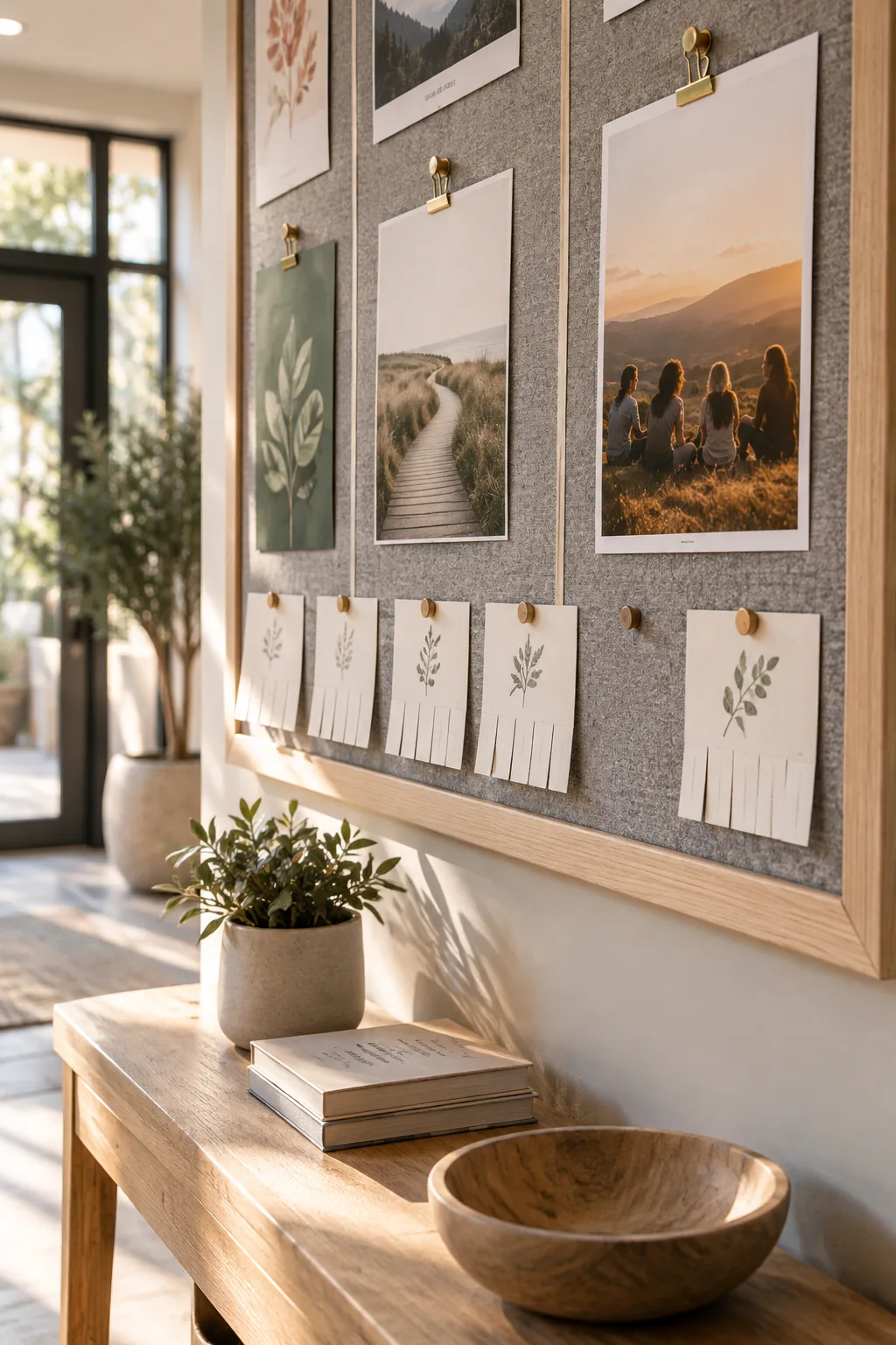
I recently switched to these clips for my client presentation boards, allowing me to reuse expensive seasonal graphics year after year without showing damaging pinholes.
Designing for Interaction: Tear-Off Prayer Cards
Turn passive reading into active engagement by installing tear-off prayer cards along the bottom edge. Position these interactive elements roughly 48 inches from the floor to meet ADA reach guidelines, a measurement I always verify when designing public commercial spaces.
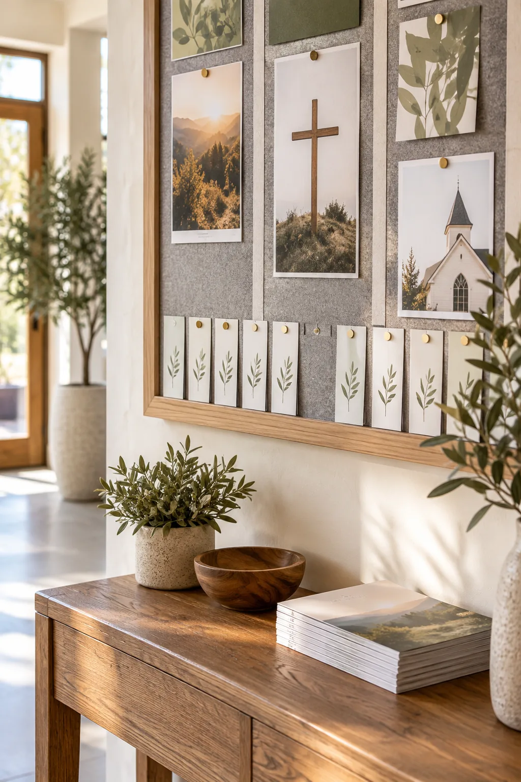
Interactive elements only work if they function smoothly; jagged, torn paper discourages people from participating.
Managing Clutter: The Two-Week Expiration Rule
Implement a strict two-week expiration rule for all date-specific events to prevent visual chaos. Assign one volunteer to clear outdated materials every Monday morning, ensuring the board always reflects current opportunities rather than past history.
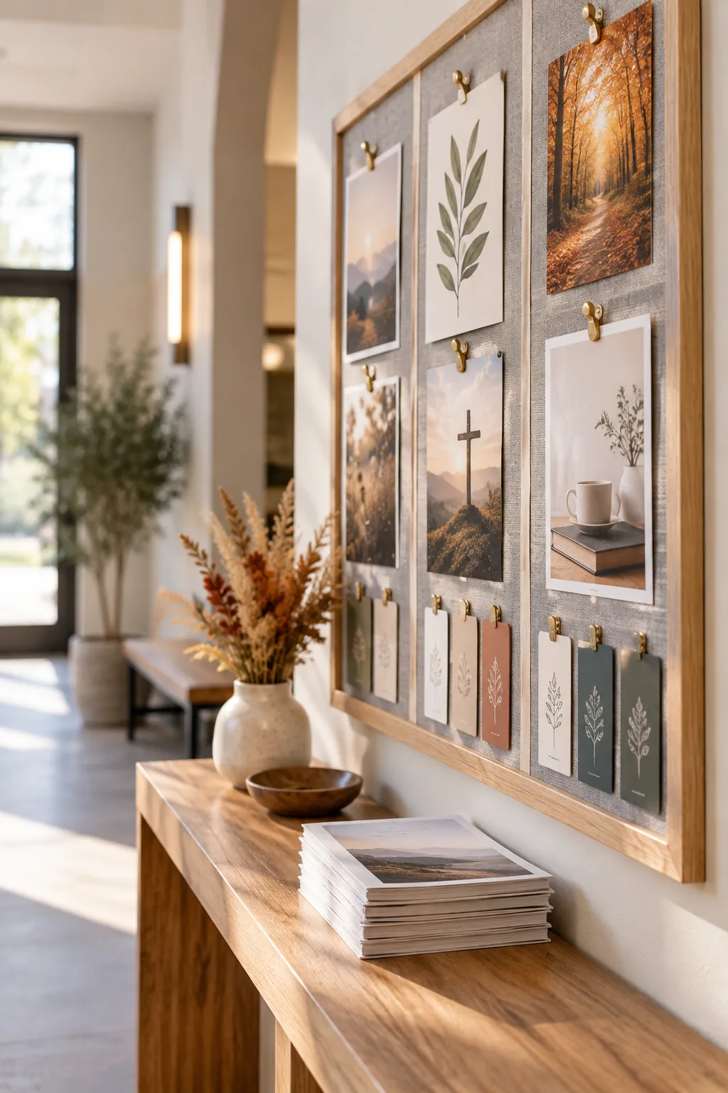
To keep this maintenance quick and systematic, follow a simple three-step clearing process each week.
- Remove any event flyer that has already occurred over the weekend.
- Take down undated general announcements that have been pinned for over a month.
- Re-center the remaining current flyers within their designated ministry zones.
Positioning Welcome Materials Below the Board
Maximize the utility of your announcement space by placing a slim console table directly beneath the bulletin board. This provides a natural landing zone for deeper informational pieces like welcome booklets and small group directories that are too heavy to pin.
5 Bulletin Board Styles for Any Church Space
Find the perfect aesthetic to match your congregation's unique atmosphere.
Minimalist Scandi: Embrace clean lines with a light ash wood frame and soft grey felt, using strict monochrome typography for a distraction-free reading experience.
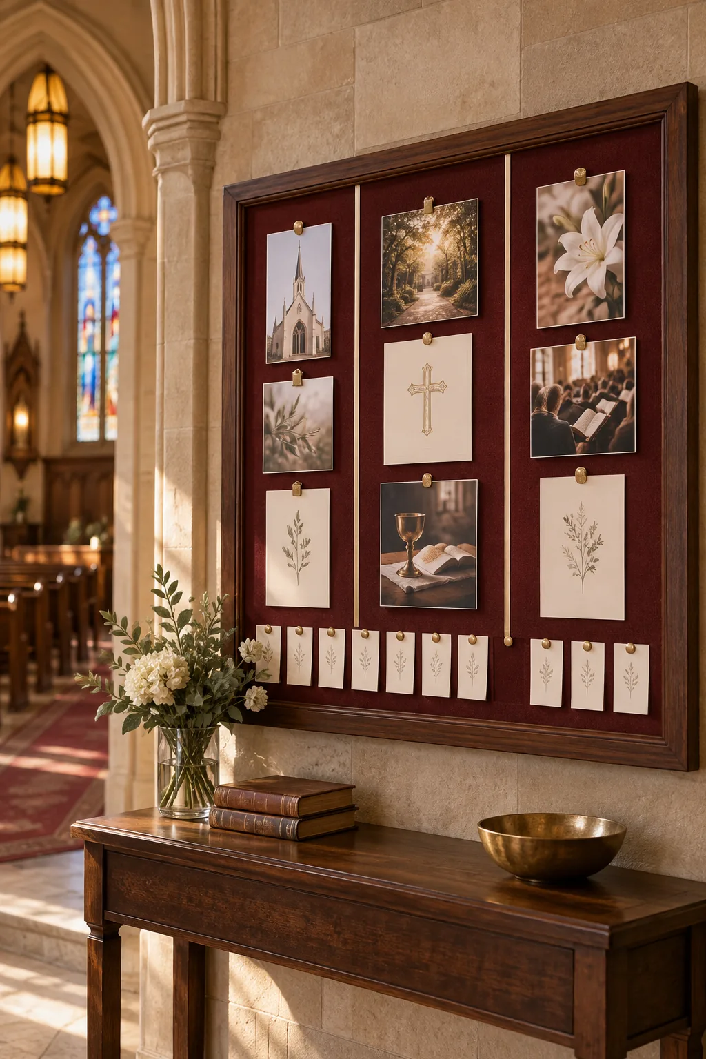
Traditional Sanctuary: Honor historic architecture using a dark oak frame with rich burgundy fabric backing, securing elegant announcements with polished brass hardware.
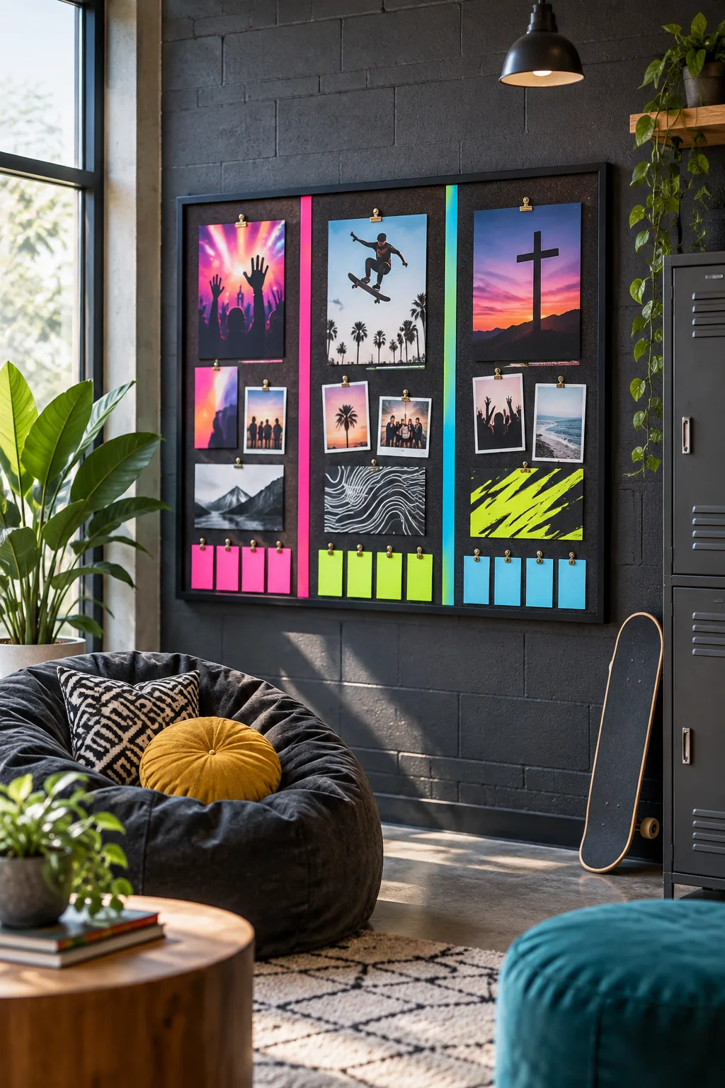
Modern Youth Room: Energize the youth space with a matte black frame and vibrant color-blocked zones, making event flyers pop against a high-contrast background.
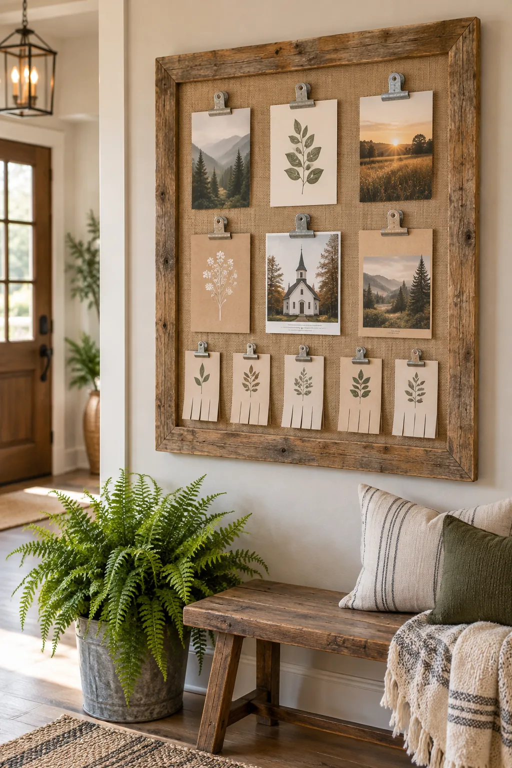
Rustic Farmhouse: Bring warmth to the foyer with a reclaimed wood border and textured burlap backing, hanging rustic galvanized clips for a welcoming touch.
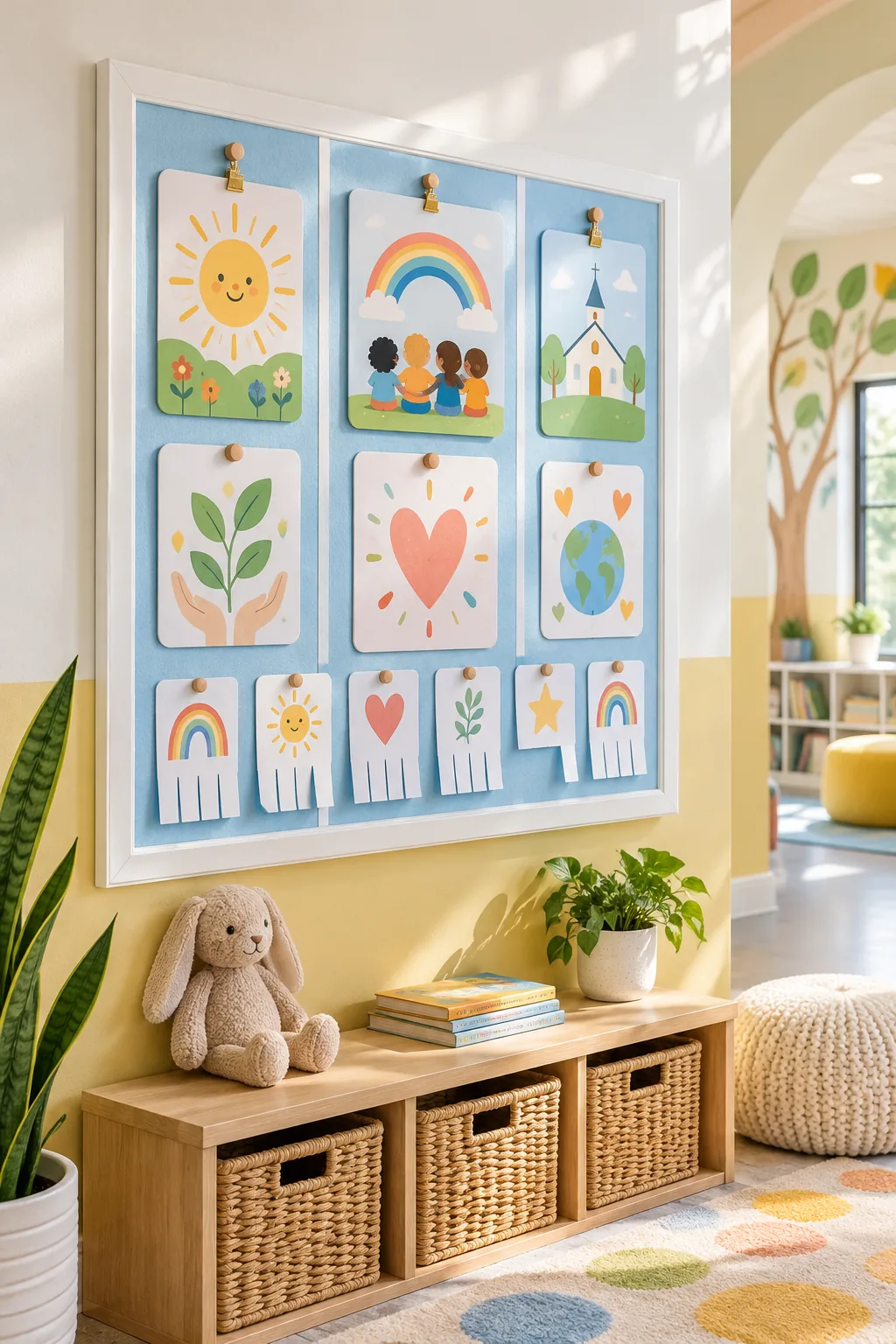
Bright Kids Ministry: Create an approachable children's ministry board featuring a crisp white painted frame, pastel felt backing, and playful rounded corners on all printed materials.
Refreshing the Board for Seasonal Ministry Shifts
Keep the underlying zones intact while swapping out the top category headers quarterly to signal a new season. I love changing the primary color palette of these headers to reflect the time of year, instantly drawing fresh attention to the board without requiring a total redesign.
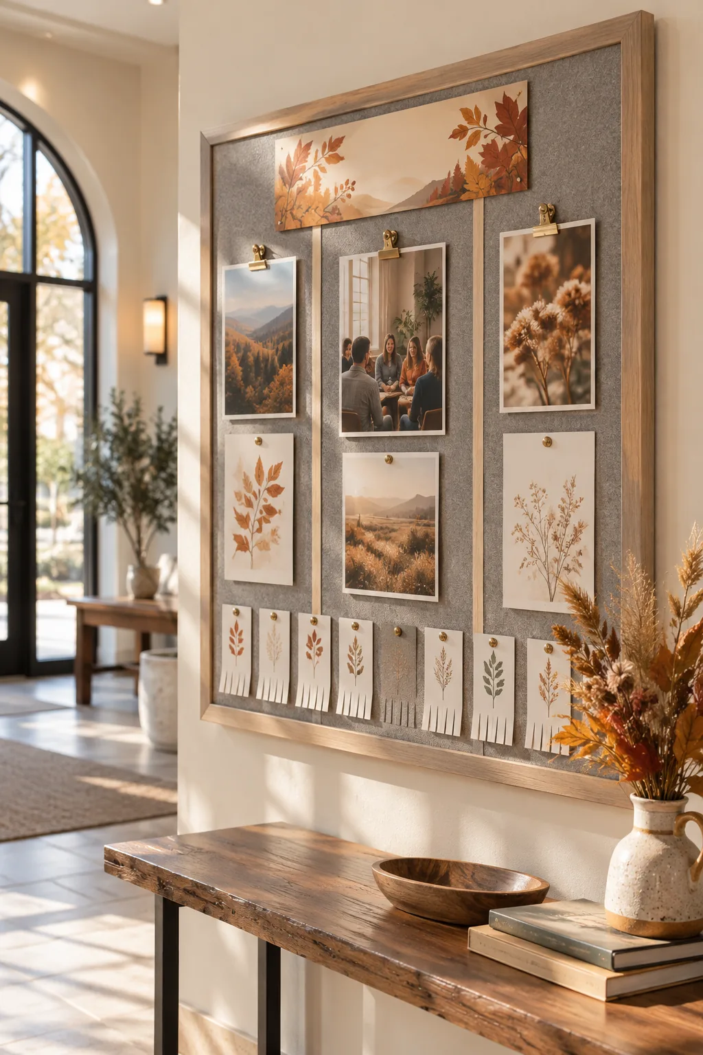
Updating these simple headers ensures your foyer always feels active, relevant, and thoughtfully curated.