
The Bedroom Paint Color Cheat Sheet: Mastering the LRV Trick
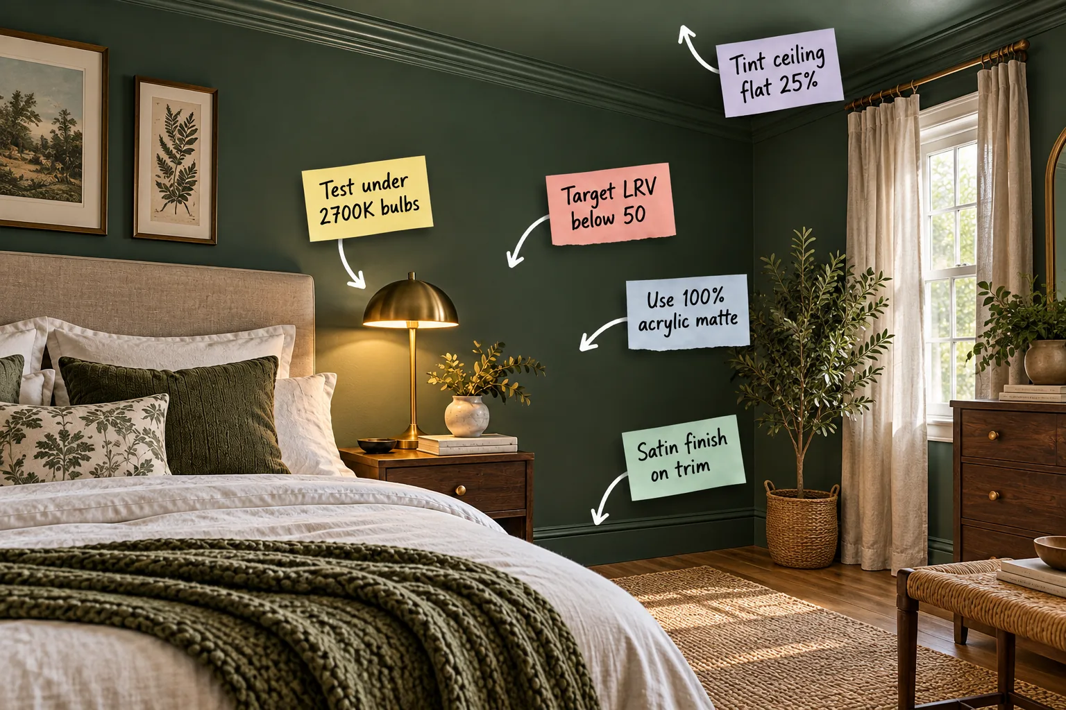
Achieving a perfectly moody and restful bedroom requires more than just picking a dark swatch from a fan deck, which is why I created this comprehensive Bedroom Paint Color Cheat Sheet. By following these specific rules, you will be able to select the exact paint finishes, light bulbs, and LRV range needed for a serene, designer-quality space.
Understanding the LRV Trick
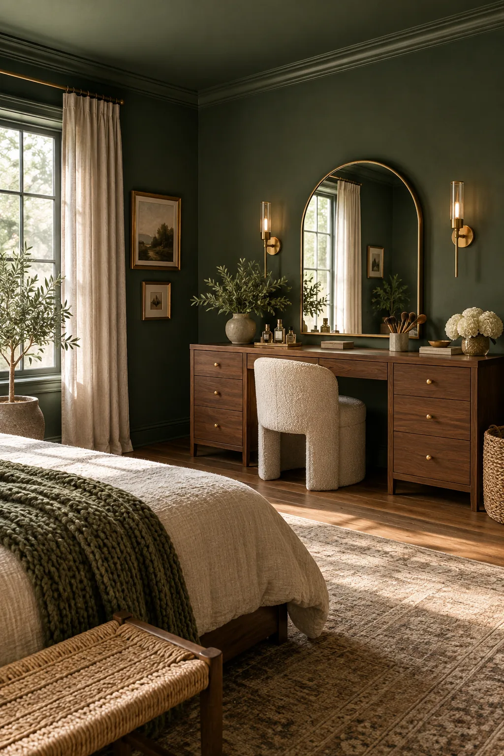
Light Reflectance Value dictates room mood, and a bedroom requires an LRV below 50 to absorb excess light and create a truly enveloping atmosphere rather than a bright, active one. In my own Denver home, switching our primary bedroom from a stark white to a deep green with an LRV of 14 completely cured my husband’s restless sleeping habits.
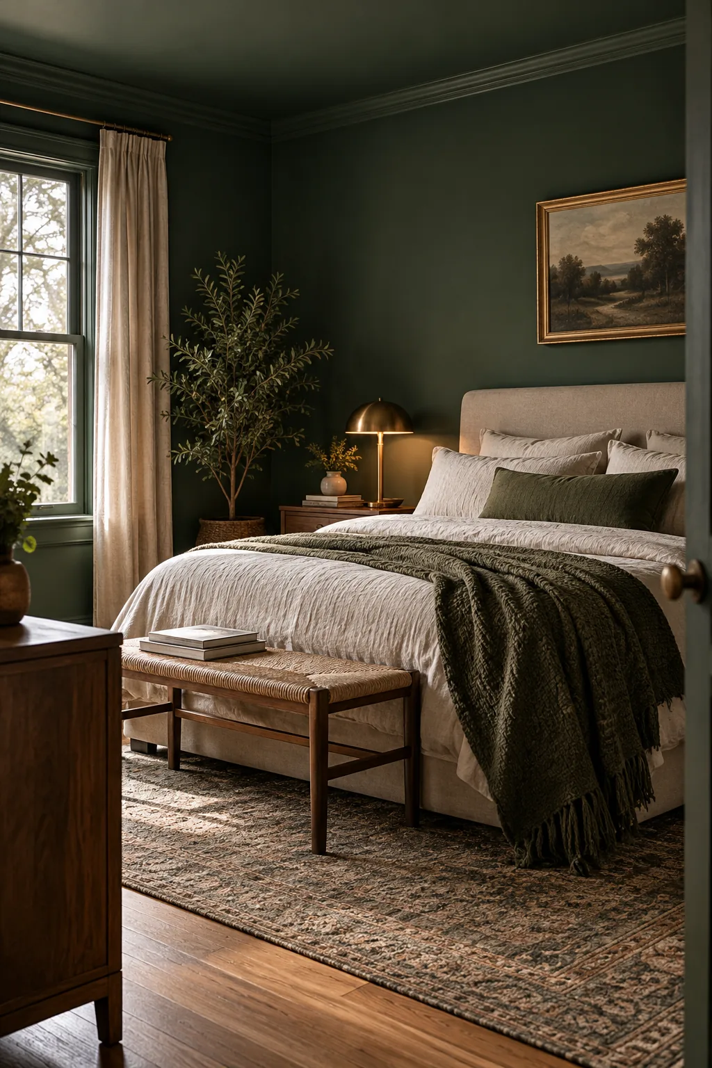
Before committing to a dark color, make sure you aren’t letting your current bright walls deceive your eyes during the crucial sampling process.
Evaluating Natural Light Exposures
Rooms with north-facing windows receive cooler, indirect sunlight that naturally darkens paint, meaning you might need an LRV closer to 45 rather than 30 to maintain visual balance. Conversely, bright south-facing rooms can easily handle an LRV as low as 10 without feeling like a cave.
Testing Under 2700K Bulbs
Paint colors shift dramatically depending on the specific light source in the room, so you must always evaluate your final swatches under the exact artificial lighting conditions you will experience at night.
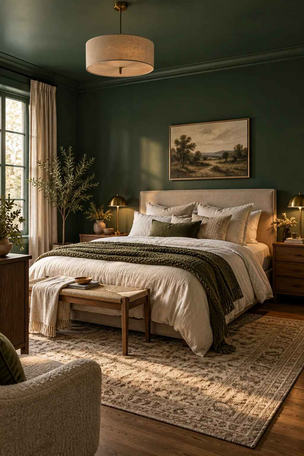
Because bedrooms are primarily evening spaces, I always follow a specific testing sequence to ensure deep greens and blues render beautifully instead of turning stark or muddy.
- Install 2700K LED bulbs in your bedside lamps and overhead fixtures before applying any paint samples to the wall.
- Paint a large, two-foot sample board and prop it directly behind the illuminated lamp to see the direct interaction.
- Observe the color at 8:00 PM to verify the warm undertones remain rich and visually comforting before making your final purchase.
Selecting the Right Primer for Dark Colors
Transitioning to a low-LRV shade requires a gray-tinted primer to reduce the number of expensive topcoats needed for full, opaque coverage. This crucial step prevents the old wall color from bleeding through and subtly altering the undertones of your carefully chosen dark paint.
Choosing a 100% Acrylic Matte Wall Finish
A matte finish absorbs harsh glare and expertly hides minor drywall imperfections, creating a velvety, soft surface that makes dark colors feel incredibly rich, grounding, and expensive.
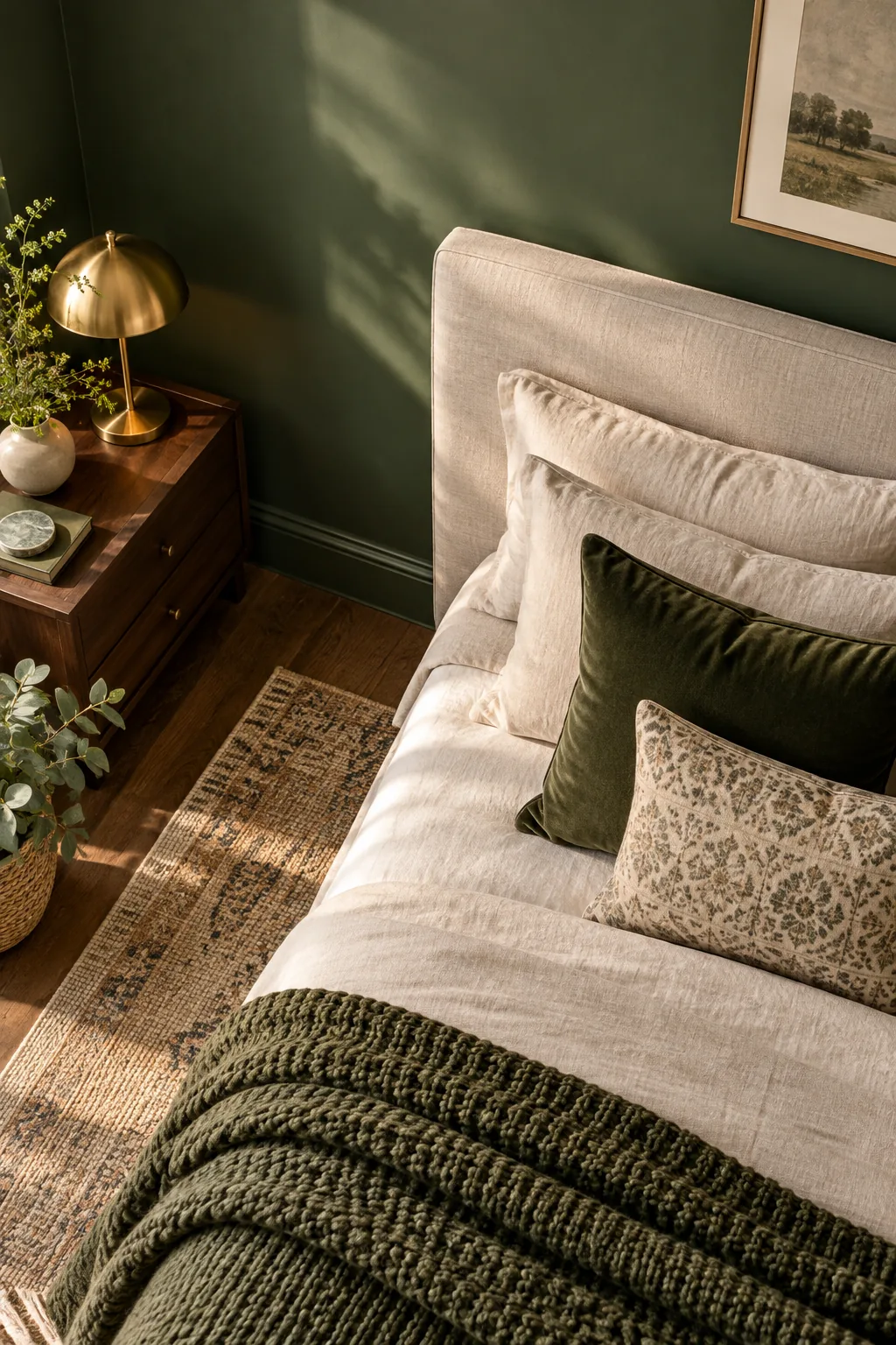
Always explicitly specify a 100% acrylic formulation at the paint counter to guarantee the luxurious, non-reflective look of flat paint while ensuring the walls remain highly durable and fully washable over time.
Accounting for Drywall Imperfections
If your bedroom features older, textured walls, the light-absorbing qualities of a true matte finish will brilliantly disguise those subtle bumps and ridges. Glossier finishes reflect light directly off every single imperfection, drawing unwanted attention to the exact architectural flaws you want to hide.
Using a Satin Finish on Trim
Instead of changing colors for the baseboards and window casings, carry your dark wall hue all the way down to the floor using a satin finish to maintain a cohesive, uninterrupted visual flow.
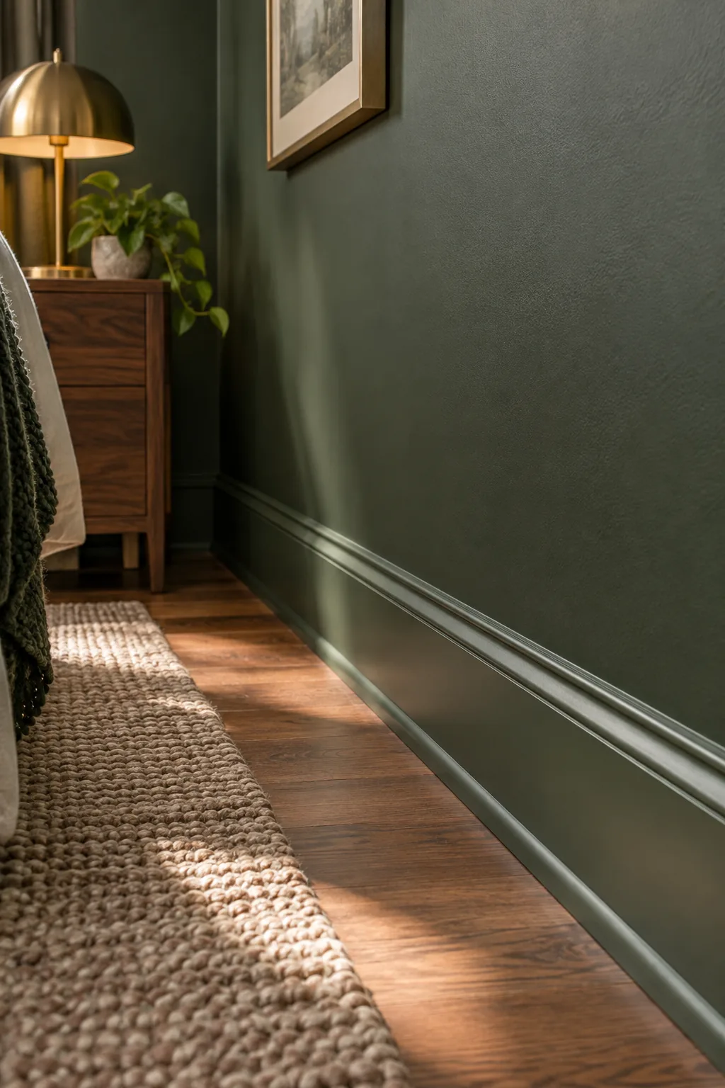
This subtle sheen shift creates an elegant architectural framing effect while providing the necessary scuff resistance and easy cleaning capabilities required for high-traffic zones near the floor.
| Surface | Recommended Sheen | Durability Level |
|---|---|---|
| Primary Walls | 100% Acrylic Matte | Medium-High |
| Ceiling | Standard Flat | Low |
| Crown Molding | Standard Flat | Low |
| Baseboards | Satin | High |
| Window Casings | Satin | High |
| Interior Doors | Satin | High |
Painting the Doors to Match
Extending your satin trim color onto the bedroom doors eliminates jarring white rectangles, allowing the eye to rest and reinforcing the room’s cocoon-like energy. This monochromatic approach modernizes traditional spaces and makes small bedrooms feel significantly larger by blurring the room’s hard boundaries.
The 25% Ceiling Tint Formula
A stark white ceiling instantly ruins the moody effect of dark walls by creating a harsh, high-contrast visual break overhead. When I designed a moody forest-green retreat last year, eliminating the white ceiling was the single decision that made the space feel truly cohesive.
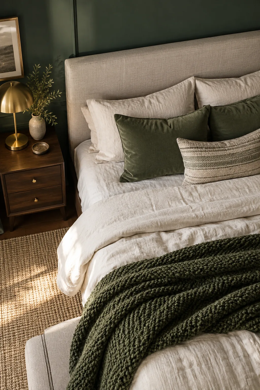
Ask the paint counter to mix a high-quality flat ceiling paint tinted with exactly 25% of your chosen wall color to create a seamless, restful canopy that gently echoes the walls.
Blending the Crown Molding
If your bedroom features crown molding, paint it the exact same color as the ceiling using a flat finish to visually elevate the room’s overall height. This technique prevents the molding from acting like a heavy racing stripe that visually lowers the ceiling line.
Softening the Room with Textiles
Deep, low-LRV walls require significant textural contrast to avoid feeling flat, heavy, or visually overwhelming within the relatively confined footprint of a standard primary bedroom.
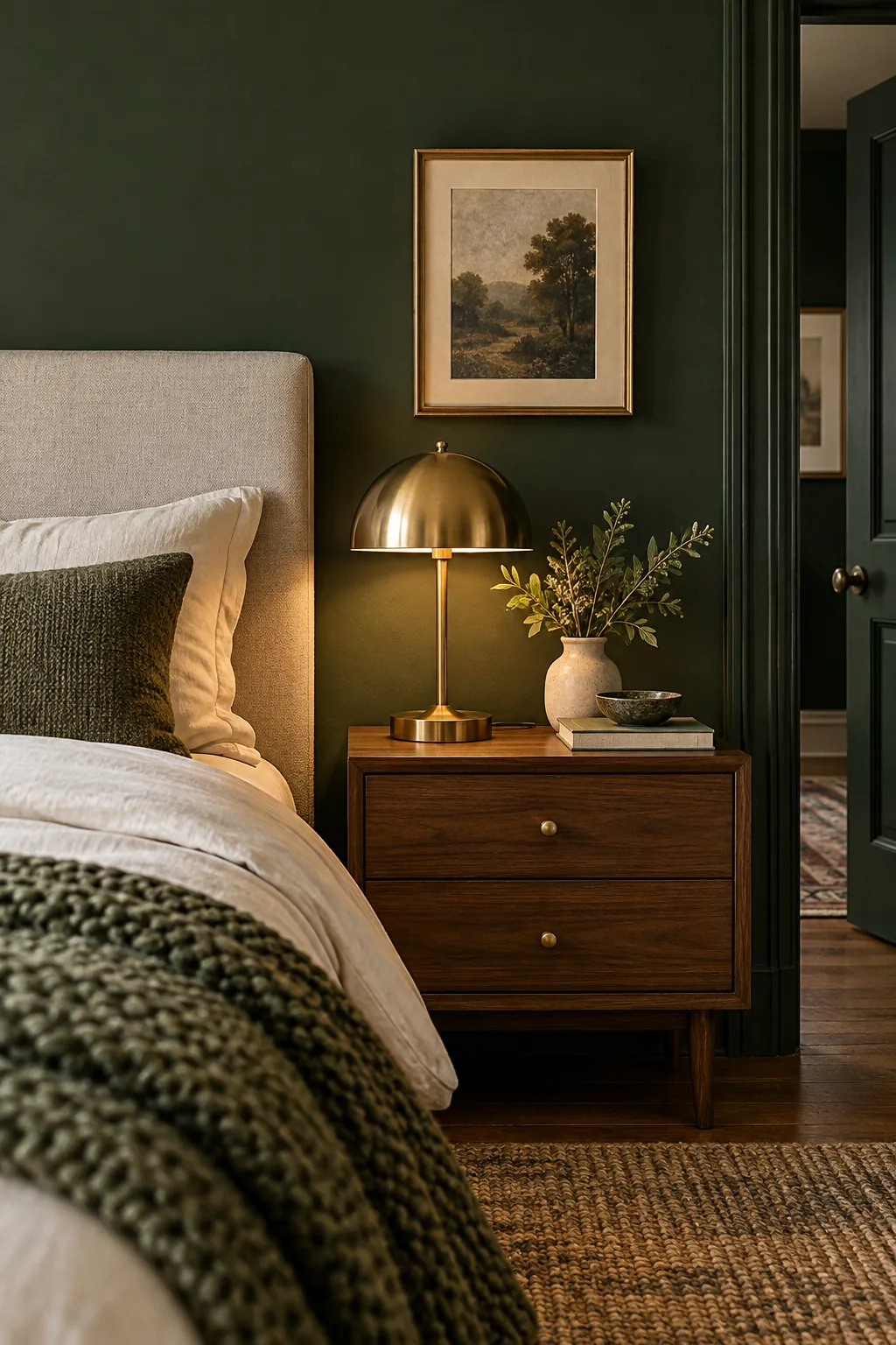
Incorporate high-LRV textiles like cream linen sheets, plush rugs, and chunky knit throws to perfectly balance the room’s visual weight and introduce the necessary softness for a sleeping space.
Layering Ambient Lighting
Dark walls naturally absorb ambient illumination, so you must introduce multiple low-wattage light sources at different heights to prevent the corners from feeling cavernous. A combination of bedside lamps, floor lamps, and picture lights creates a warm, layered glow throughout the entire room.
Adding Warmth with Brass and Wood
Matte, dark paint colors serve as the absolute perfect, high-contrast backdrop for highlighting natural materials, woven elements, and organic textures throughout your carefully curated sleeping space.
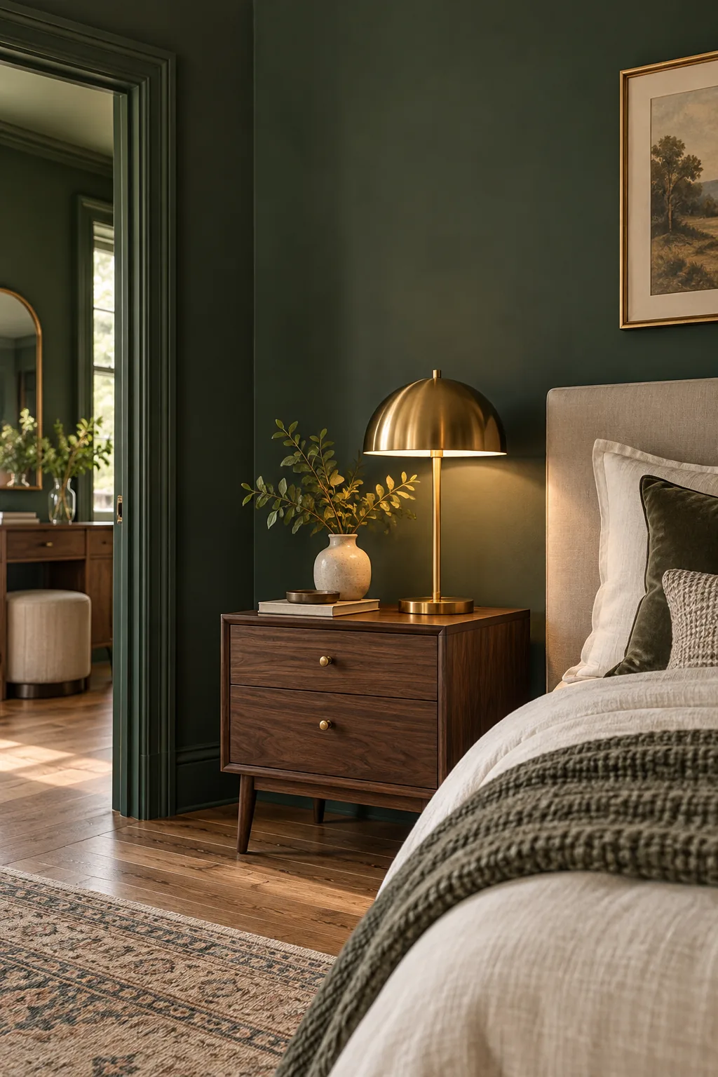
Warm metallics like aged brass fixtures and rich wood tones like solid walnut pop beautifully against a deep green canvas, bringing vital warmth and subtle reflection to the cool shadows.
More Low-LRV Bedroom Looks
See how this exact paint formula translates across different colors and design styles.
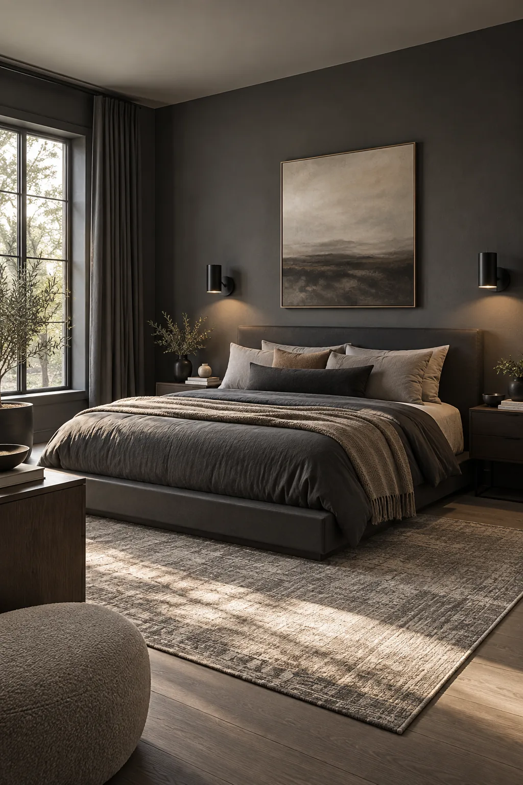
Minimalist Charcoal Gray: Deep gray absorbs light beautifully in minimalist spaces, letting structural furniture take center stage.
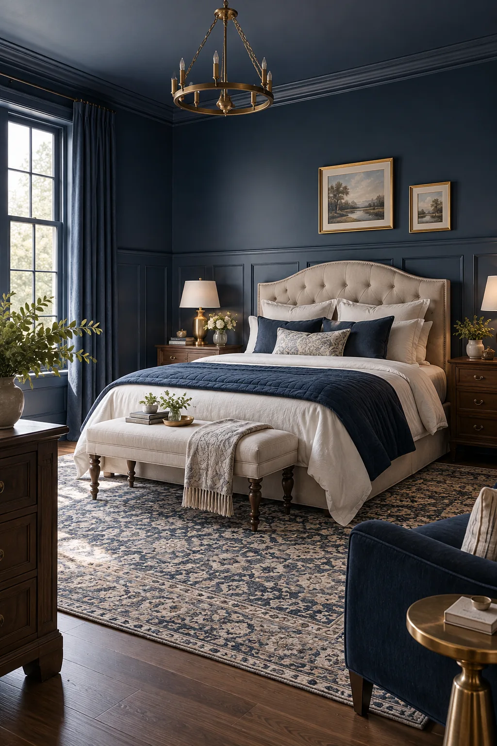
Traditional Navy Blue: Color-drenching traditional wainscoting in navy blue modernizes classic architectural details instantly.
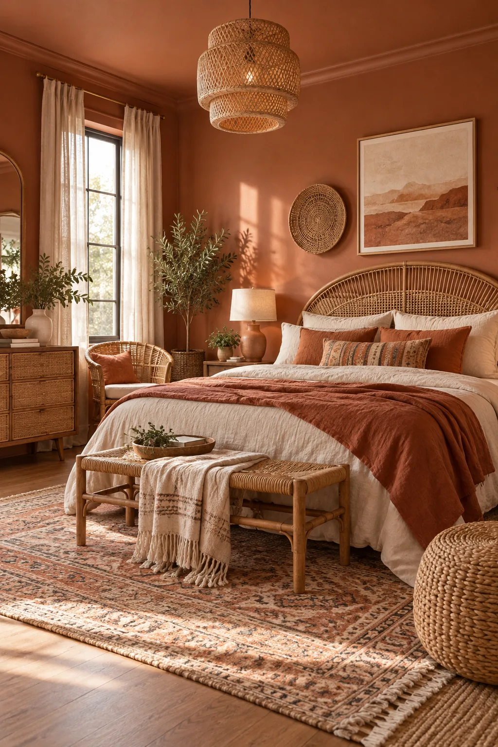
Bohemian Warm Terracotta: A low-LRV terracotta wraps the room in warmth, perfectly complementing natural rattan and woven textures.
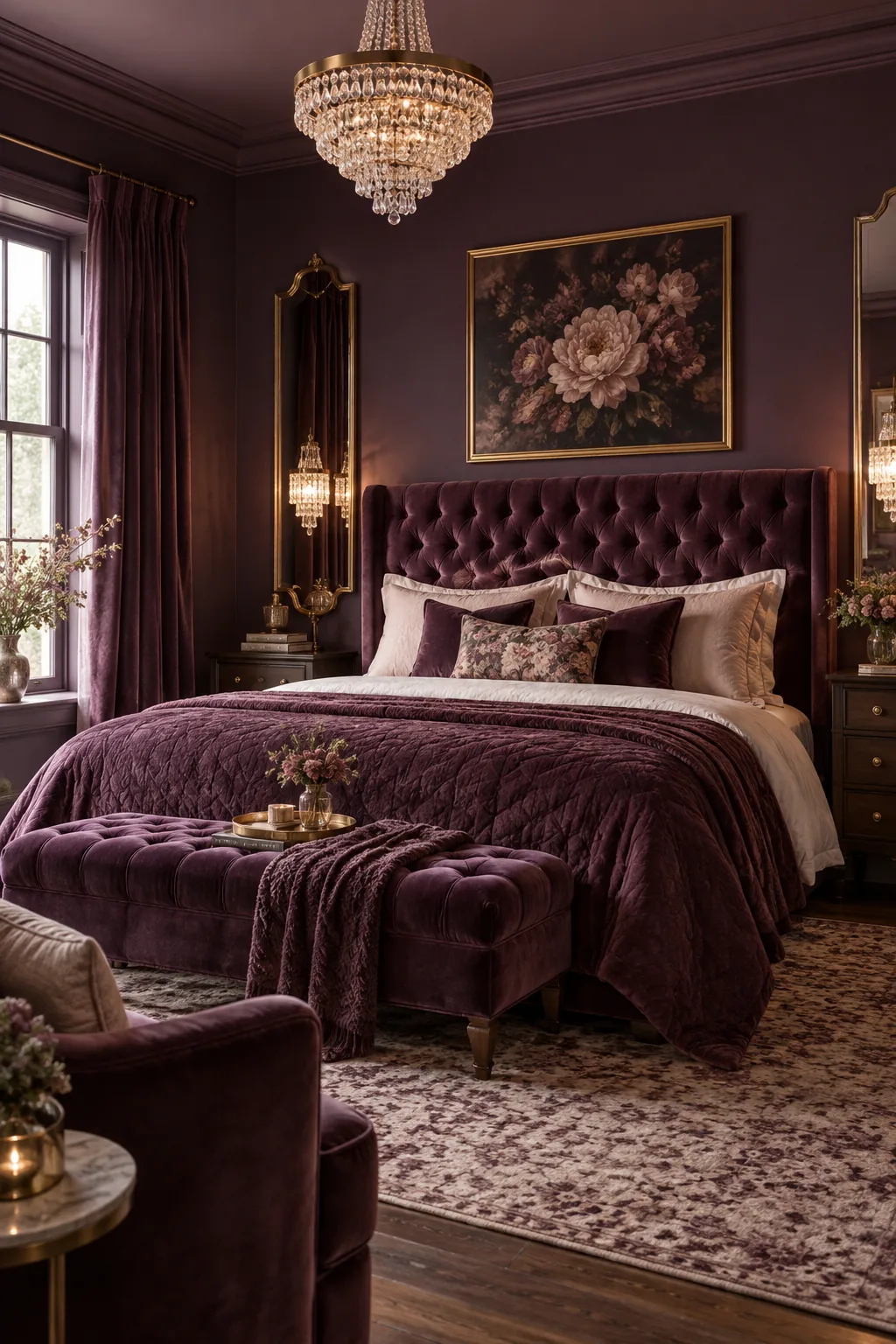
Romantic Rich Plum: Deep plum walls create a jewel-box effect that makes velvet upholstery and crystal lighting glow.
Your Bedroom Paint Color Cheat Sheet
Pulling this all together requires precise communication with your painter to ensure the LRV, lighting, and sheen pairings execute flawlessly. I keep this exact formula saved on my phone for every single bedroom project because it removes all the guesswork from the mixing process.
Save this exact breakdown to ensure you get the perfect finishes mixed at the paint counter, guaranteeing your new bedroom becomes the restful, designer-quality retreat you deserve.