
One Kitchen, 8 Bold Color Looks
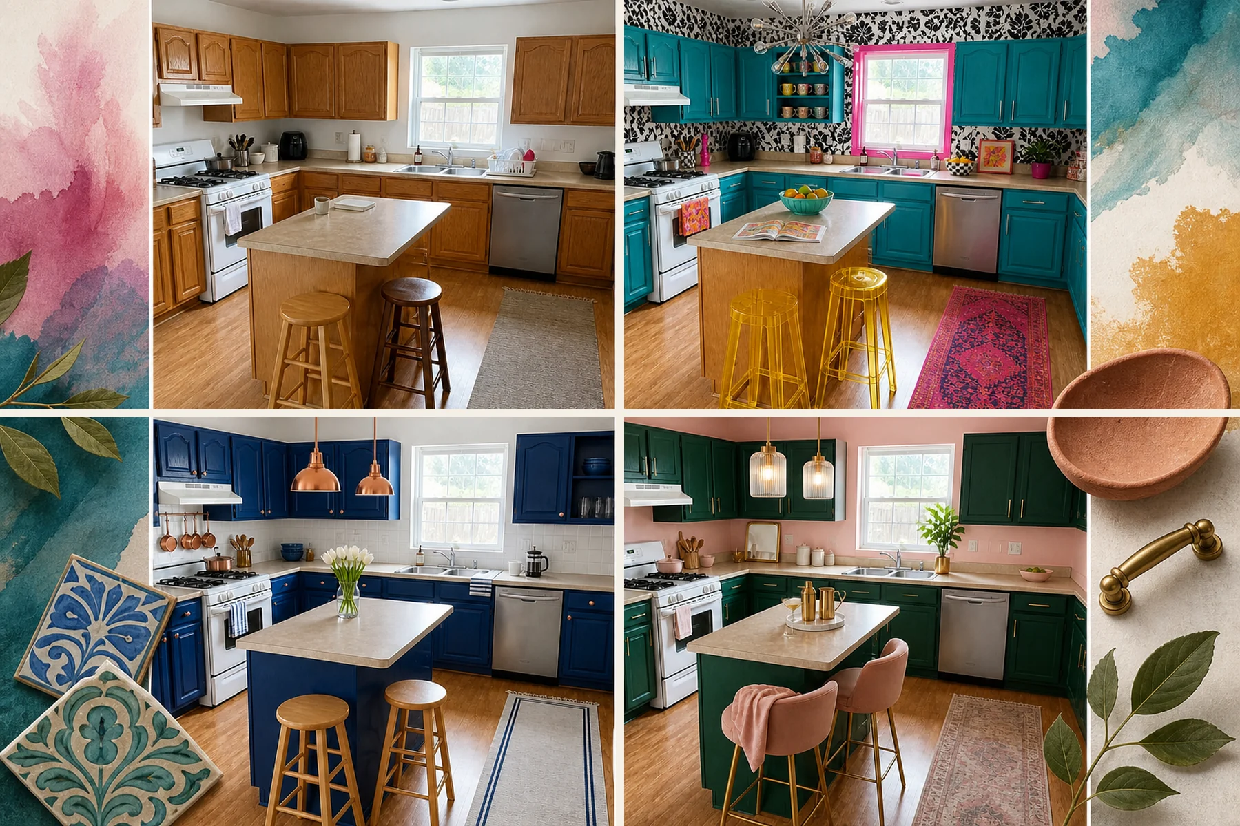
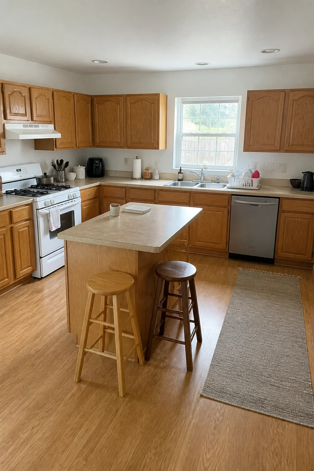
Moving past builder-grade basics doesn’t require full demolition when you wield bold color. We kept this kitchen’s standard layout intact to demonstrate how strategic hues redefine the space, providing a concise key-move comparison guide detailing the exact paint and hardware combinations.
Terracotta & Sage
Embrace a warm, grounded aesthetic by painting the builder-grade oak cabinets a muted sage green. We applied a highly textured terracotta limewash to all visible upper walls to introduce immediate organic character and depth. Swapping the standard hardware for sleek matte black bar pulls instantly modernizes the traditional cabinet doors. We kept the original L-shaped layout, basic laminate counters, and stainless appliances completely fixed to prove the power of paint.
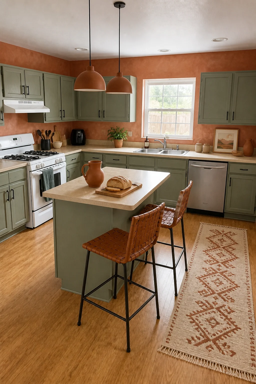
The textured plaster wall treatment absorbs natural light beautifully, preventing the rich terracotta pigment from overwhelming the compact room. Pairing this earthy wall color with matte black hardware grounds the soft sage cabinetry, creating a warm, inviting atmosphere without feeling heavy or dark. Woven leather counter seating adds essential tactile friction against the smooth painted wood, completing the natural material story. You can easily carry this saturated color confidence into your entryway for a cohesive home palette.
Earthy Texture Toolkit
Moody Forest
Create a deeply sophisticated, cozy atmosphere by coating the original oak cabinets in a rich hunter green. We enveloped the upper walls and the ceiling in a matte charcoal paint to intentionally blur the room’s physical boundaries. Installing unlacquered brass cup pulls and a multi-arm brass chandelier adds crucial reflective warmth to the dark space. We left the existing hardwood flooring and basic beige counters entirely untouched during this dramatic update.
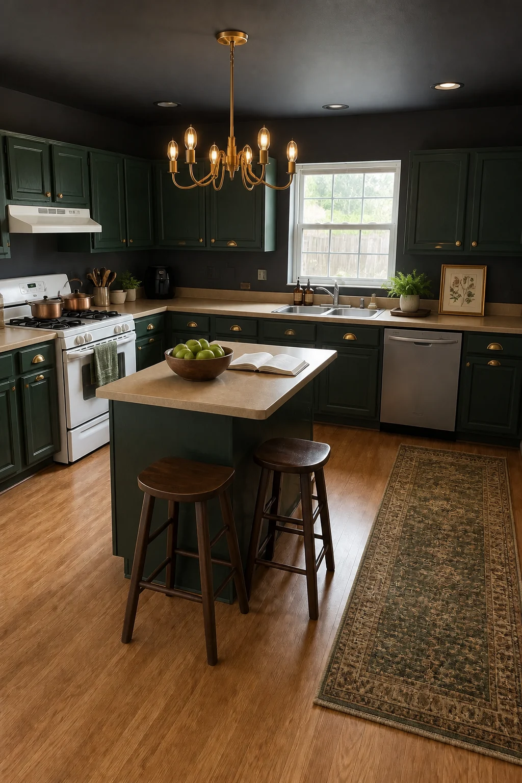
Wrapping the upper architecture in matte charcoal makes the standard ceiling height feel endless while maintaining a wonderfully intimate mood. The unlacquered brass hardware provides necessary glowing highlights that keep the dark green cabinetry from reading flat or heavy. Dark walnut saddle stools seamlessly blend into the surrounding shadows, maximizing the perceived floor space around the small prep island. This tone-on-tone approach delivers a high-end, custom look on a standard budget.
Cobalt & Copper
Deliver a massive punch of energy by introducing vibrant cobalt cabinet paint alongside a glossy white square tile backsplash. We maintained the original window placement and standard drop-in sink, proving that basic fixtures can shine in the right context. Adding polished copper hardware and factory-style pendant lighting introduces brilliant metallic contrast. Light ash wood stools keep the center prep island feeling bright, accessible, and perfectly balanced against the intense blue.
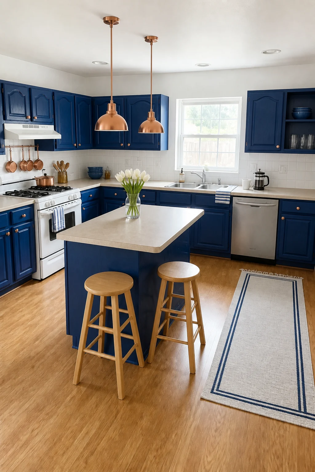
Electric blue demands significant visual breathing room, which the crisp white upper walls and glossy ceramic tiles deliver perfectly. The polished copper accents introduce a high-contrast metallic warmth that cuts beautifully through the cool tones of the cabinetry. This classic jewel-tone approach feels incredibly clean and structured while completely transforming the builder-grade foundation. A simple white cotton runner rug with a blue border stripe reinforces the crisp, tailored aesthetic.
Jewel-Tone Essentials
- Cobalt blue cabinet paint
- Polished copper pendant lights
- Light ash backless stools
- Polished copper cabinet knobs
Mustard & Navy
Embrace a classic color-blocking strategy by painting the lower and upper cabinets a deep navy blue. We covered all exposed upper walls in a saturated mustard yellow flat paint to maximize visual impact and energy. Installing sleek brushed brass hardware and a single white enamel dome pendant anchors the highly contrasting palette. We kept the core L-shaped footprint and center island structure exactly as they were, relying entirely on pigment.
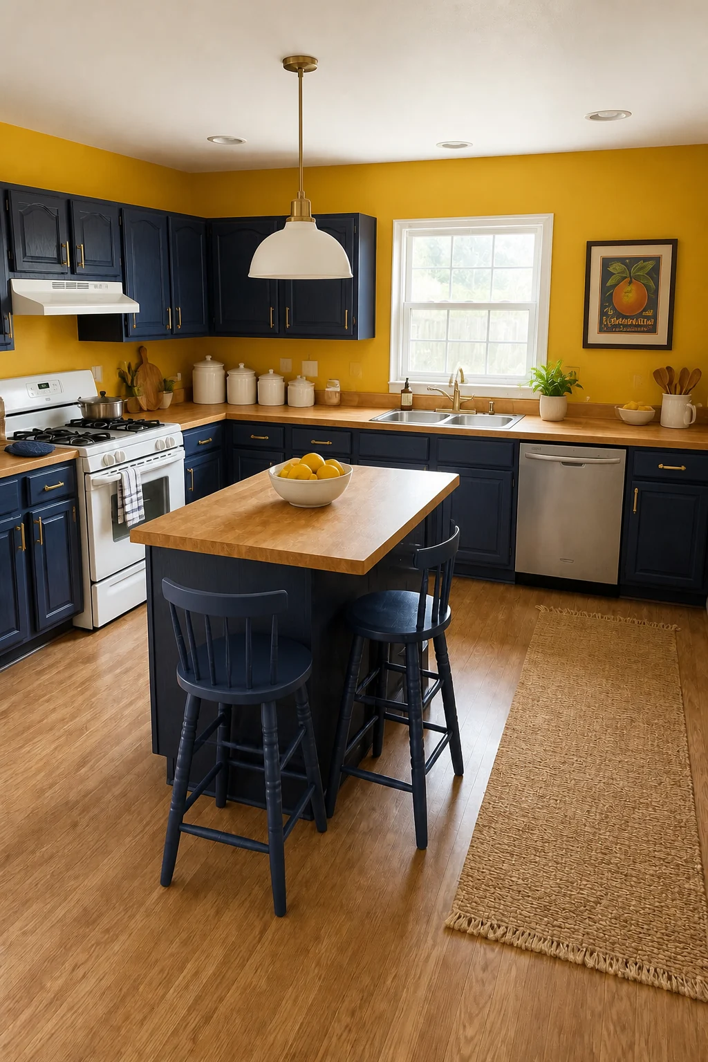
This bold complementary strategy succeeds because the dark navy firmly anchors the lower half of the room, allowing the energetic mustard to shine above. The white enamel pendant and simple brass hardware provide quiet visual resting places between the intense, competing hues. Warm butcher block counters bridge the gap between the dark painted wood and bright walls, adding essential everyday durability. Woven jute rugs introduce necessary organic texture to the floor.
Retro Primary
Channel playful midcentury energy by applying glossy cherry red paint to the standard cabinet doors. We painted the walls a pale aqua blue to provide a soft, unifying backdrop for the intensely vibrant primary colors. Bringing in a bold black-and-white checkerboard runner rug and bright yellow diner-style stools completes the nostalgic transformation. This design proves that a fixed builder-grade layout can easily handle high-energy, rule-breaking retro hues.
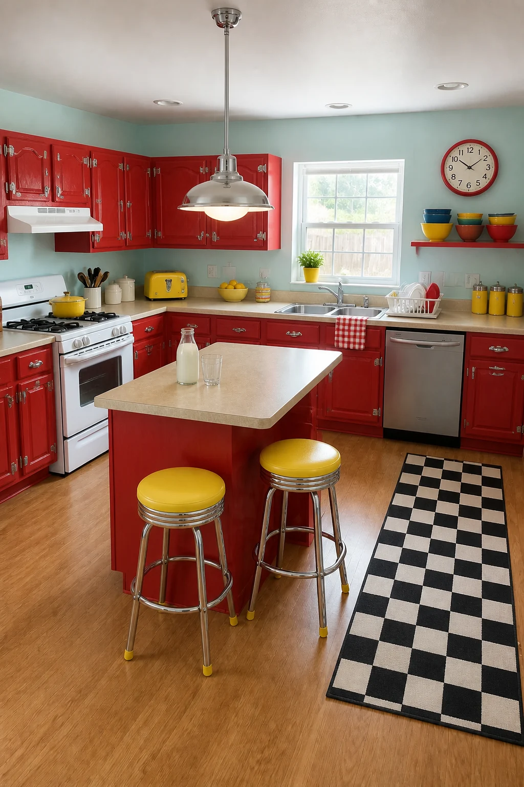
Nostalgic primary colors can easily feel chaotic, but the soft aqua walls temper the aggression of the red cabinets perfectly. The graphic checkerboard rug introduces necessary geometric structure to ground the highly energetic, playful palette. Chrome retro latch hardware adds period-appropriate shine that distracts entirely from the basic cabinet profiles. Keeping the counters and appliances neutral allows these cheerful, saturated accents to take center stage without overwhelming the eye.
Emerald & Blush
Elevate the kitchen into a glamorous, Art Deco-leaning space with rich emerald green cabinetry. We wrapped the walls and ceiling in a soft blush pink paint to create a luxurious, highly curated visual tension. Adding brushed gold T-bar pulls and fluted glass pendants brings immediate high-end sophistication to the basic room. We elevated the fixed baseline architecture without moving a single wall, plumbing line, or major appliance.
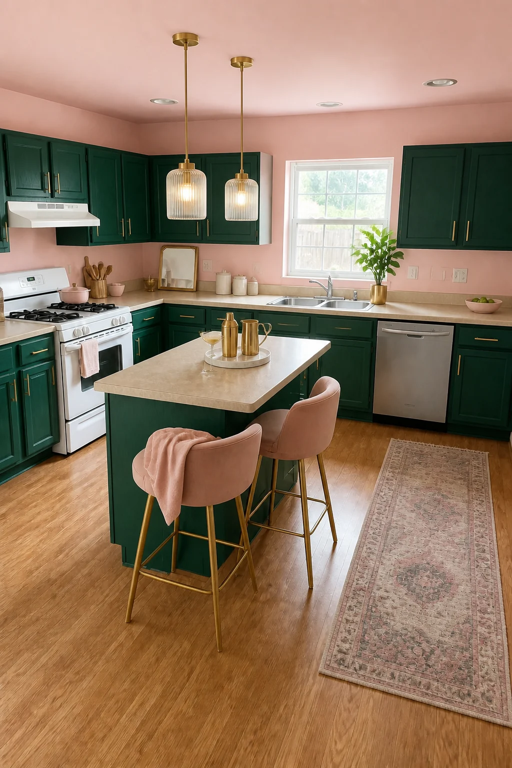
The unexpected pairing of masculine emerald and feminine blush feels incredibly chic, intentional, and perfectly balanced. Brushed gold hardware and plush pink velvet upholstery shift the focus entirely away from the basic cabinet profiles to the luxurious new finishes. Fluted glass lighting bounces soft reflections around the matte painted surfaces, keeping the room glowing and bright. A faded gray Persian-style runner rug adds subtle historic character to the modern glam palette.
Balancing Glamour
Pair heavily saturated jewel tones with soft, dusty pastels to prevent the room from feeling overly dark. Introduce reflective surfaces like fluted glass and brushed gold to bounce light around the matte painted finishes.
Aubergine & Greige
Establish a deeply mature, elegant mood by painting the cabinets a rich plum aubergine. We swapped the plain white walls for a mottled greige Roman clay plaster to introduce subtle, sophisticated texture and warmth. Dark bronze edge pulls, charcoal wood stools, and smoked glass pendants maintain the understated, moody atmosphere. We anchored the unchanged hardwood floors and standard stainless appliances with a deeply sophisticated, wine-toned color palette.
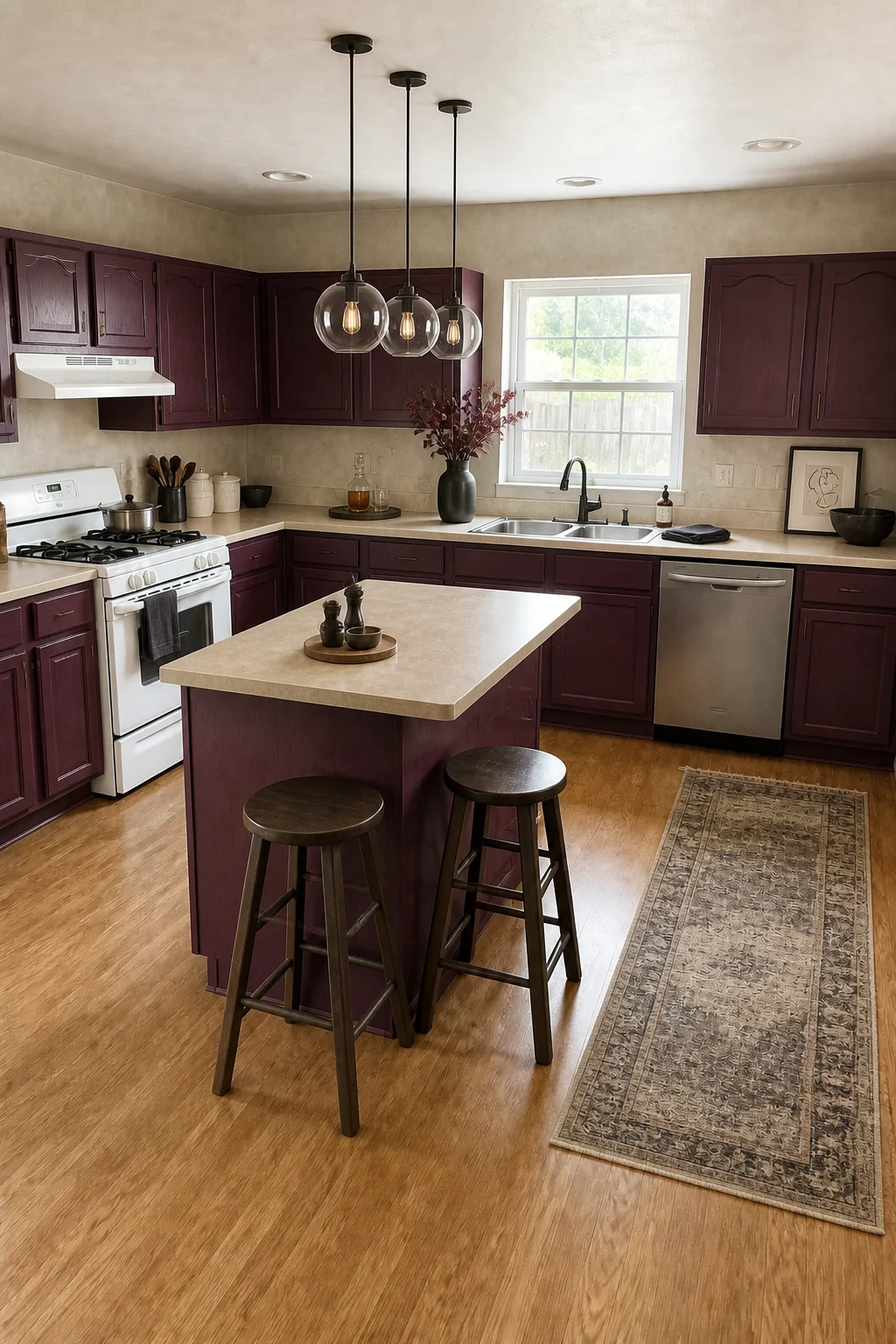
Aubergine offers a uniquely elegant alternative to standard blues or greens, acting almost as a neutral against the textured greige plaster. The dark bronze edge pulls keep the hardware profile intentionally minimal, allowing the rich wine tones to dominate the visual field. Charcoal stained wood stools anchor the prep island, tying the dark palette together seamlessly. Dried burgundy smoke bush branches in a dark ceramic vase complete the moody, textured styling.
Neon Maximalist
Break all the conventional rules with an electric maximalist approach featuring vibrant teal cabinetry. We applied a bold black-and-white botanical wallpaper to all upper walls and framed the back window in hot pink trim. Transparent yellow acrylic stools add another layer of fearless color without adding visual bulk to the small island. This scroll-stopping design completely distracts from the fixed beige laminate counters and basic stainless sink.
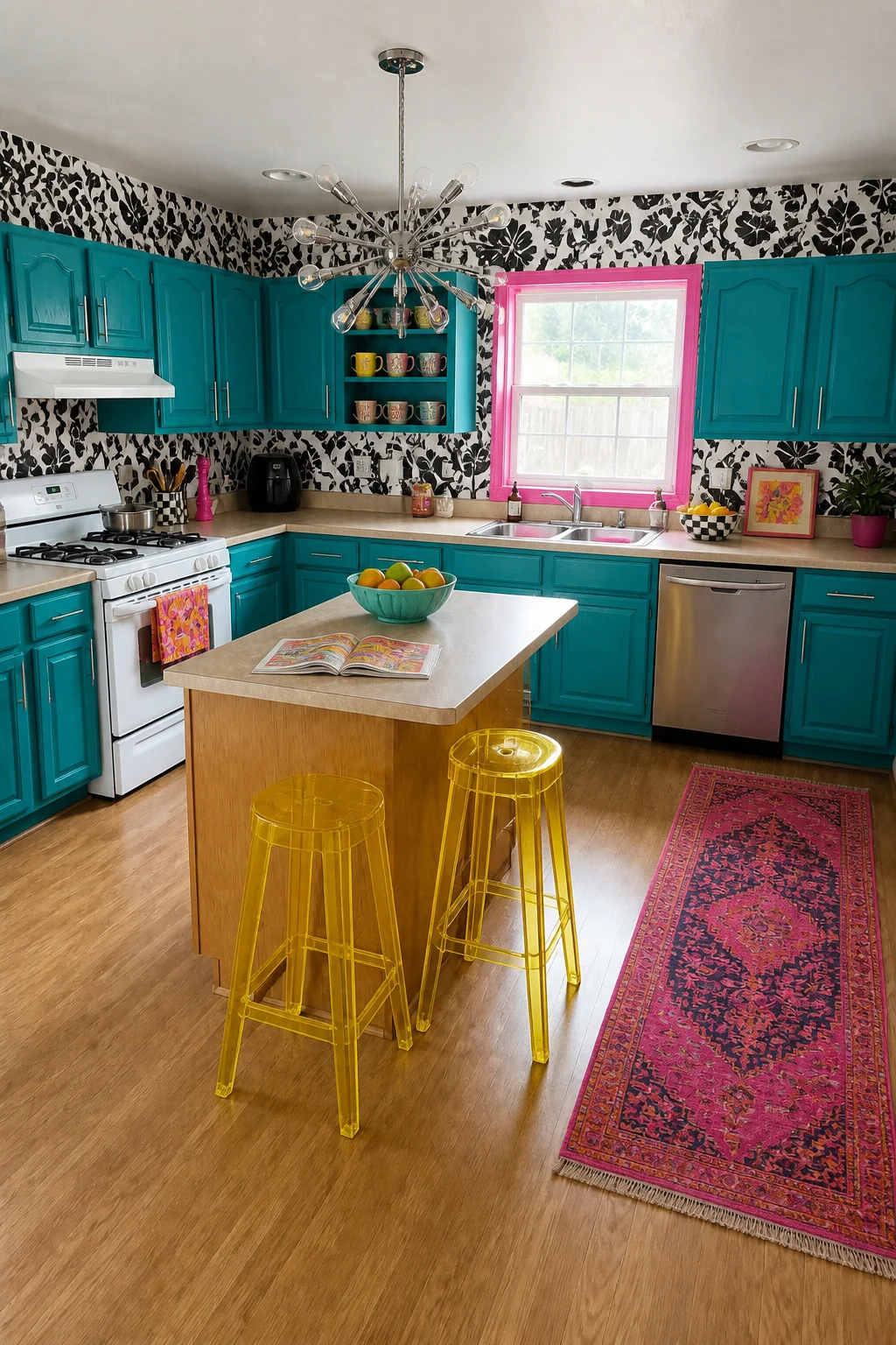
This high-voltage strategy relies on the stark graphic wallpaper to separate the electric teal and hot pink, preventing the intense colors from clashing directly. The transparent acrylic seating introduces vibrant energy while keeping the center island feeling open and unobstructed. Oversized polished nickel hardware adds a final punch of modern shine to the brightly painted doors. A hot pink overdyed vintage rug ties the wild, energetic palette together perfectly.
Find Your Perfect Palette
For a Cozy, Intimate Atmosphere
If you want a highly sophisticated, cozy environment but worry about the room feeling too small, the Moody Forest approach is your ideal match. Tone-on-tone darks intentionally blur the room’s physical edges, making standard ceilings feel significantly higher while creating an enveloping warmth. Unlacquered brass accents provide the necessary reflective highlights to keep the space glowing.
For a Clean, Classic Aesthetic
If you love vibrant color but prefer a structured, traditional aesthetic, the Cobalt & Copper style is the perfect compromise. The crisp white upper walls and glossy tile provide a classic, breathable backdrop that lets the electric blue shine without overwhelming the space. Polished copper hardware adds a timeless metallic warmth that elevates the entire room.
For a Grounded, Natural Feel
If you want to introduce bold hues while maintaining a calm, organic vibe, choose the Terracotta & Sage palette. Muted earth tones and highly textured limewash create a tactile, soothing environment that feels incredibly welcoming. The matte black hardware and woven leather accents ensure the colorful space remains grounded, earthy, and perfectly balanced for everyday living.