
12+ Inspiring Mood Board Examples for Your Home
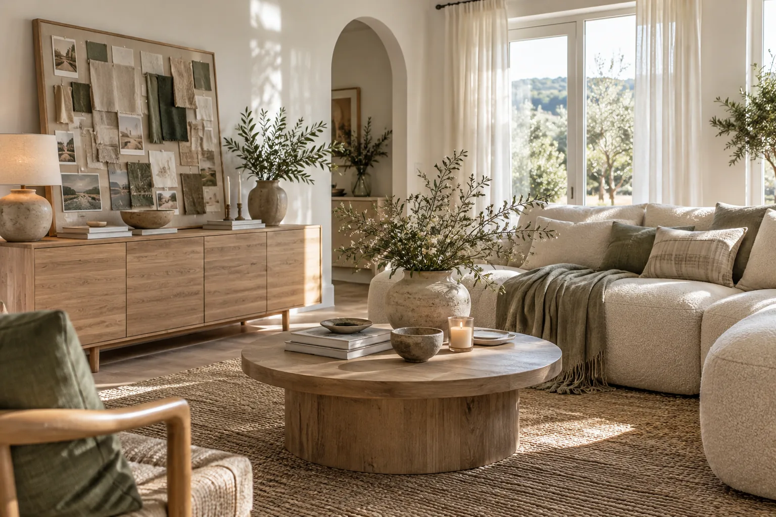
Every great room makeover starts with a solid plan to keep your vision on track. I use these layout tricks all the time to mix fabrics, paint chips, and inspiration photos before buying a single piece of furniture.
1. The Classic Corkboard Grounding
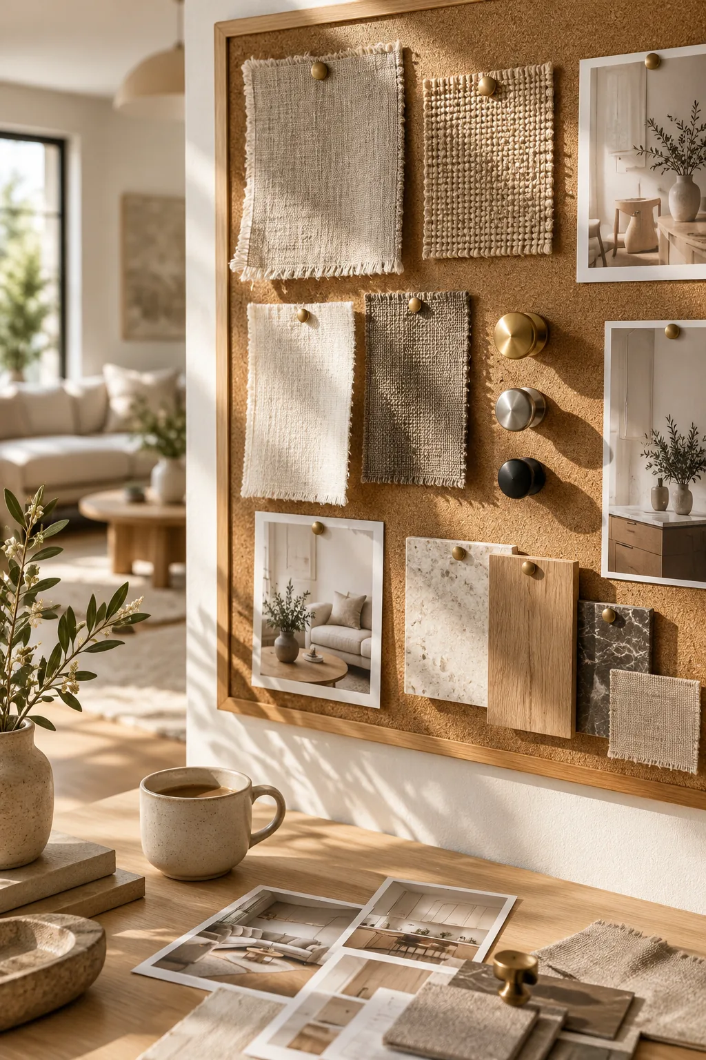
A corkboard covered in linen swatches and hardware samples instantly grounds a neutral living room design. Pinning everything physically lets you see how natural light hits the metal finishes throughout the day.
2. The Clean Digital Grid
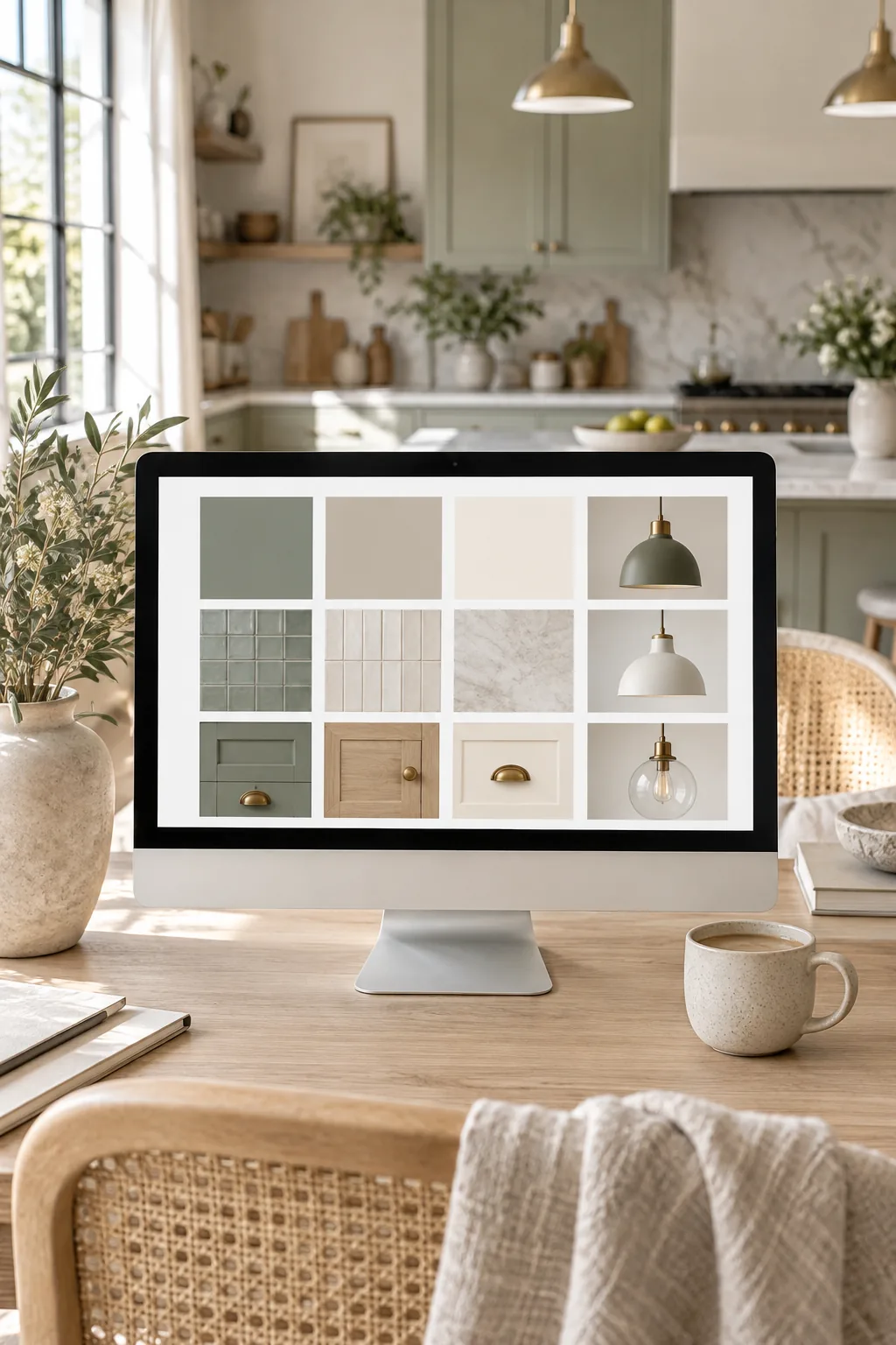
I always start my kitchen projects with a digital grid layout. Placing cabinet colors right next to backsplash tiles on a clean white background makes it obvious if the undertones clash. It keeps the whole design process incredibly focused.
Plus, you can easily swap out the pendant lights with just a click.
3. The Overlapped Texture Stack
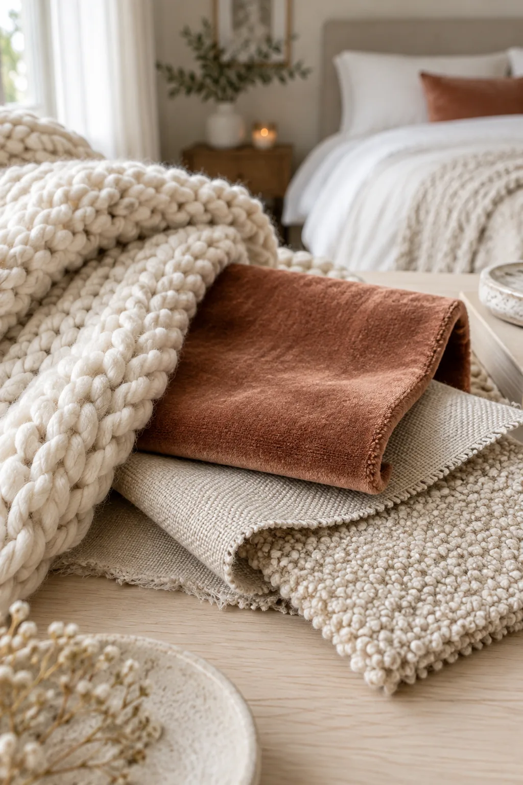
Overlapping your fabric textures creates a realistic sense of depth that flat images just cannot provide. Layering a chunky knit over a velvet sofa sample shows exactly how the cozy elements will interact in your bedroom.
4. The Dark Canvas Contrast
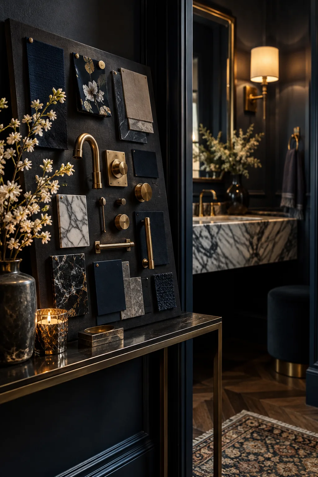
A moody, dramatic vibe comes together perfectly on a dark background canvas.
Pinning brass hardware against charcoal and navy paint chips makes the metals pop. You instantly see the rich contrast.
It is the best way to plan a powder room with serious impact.
5. The Oversized Foam Scale
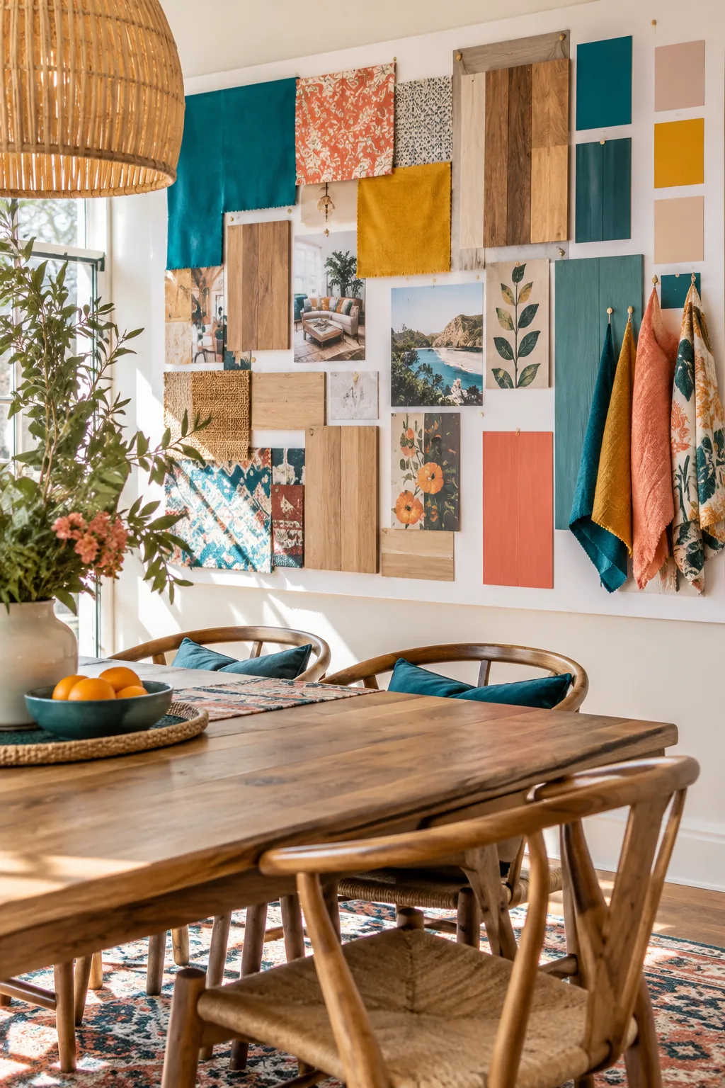
Using a massive foam board lets you tape up actual floor planks alongside your fabric cuts. The sheer size of this physical board gives you a true sense of scale for your dining room. You can step back across the room to see how the wood tones blend from a distance. It completely changes how you view the materials.
6. The Soft Circular Flow
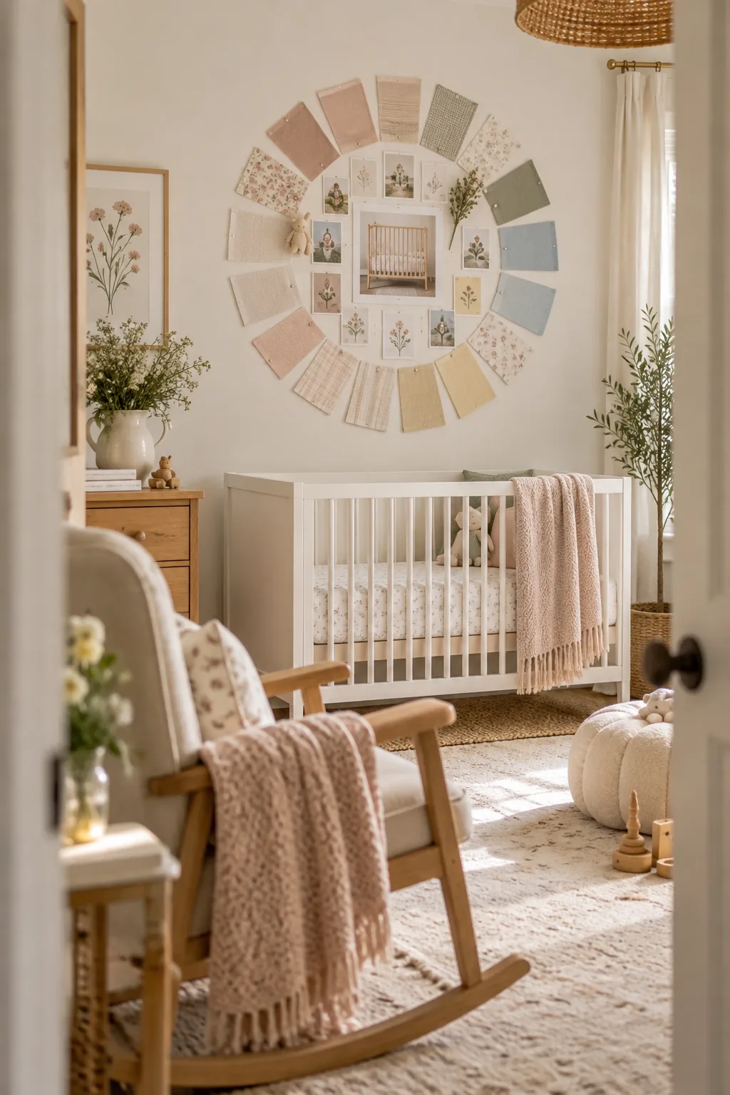
My favorite trick for a nursery is building a circular mood board layout. Placing the crib design in the center and radiating the pastel swatches outward feels incredibly soft and organic. It breaks away from rigid grids to give you a much softer visual flow. You end up with a board that feels as calming as the room itself.
7. The 80/20 Material Balance
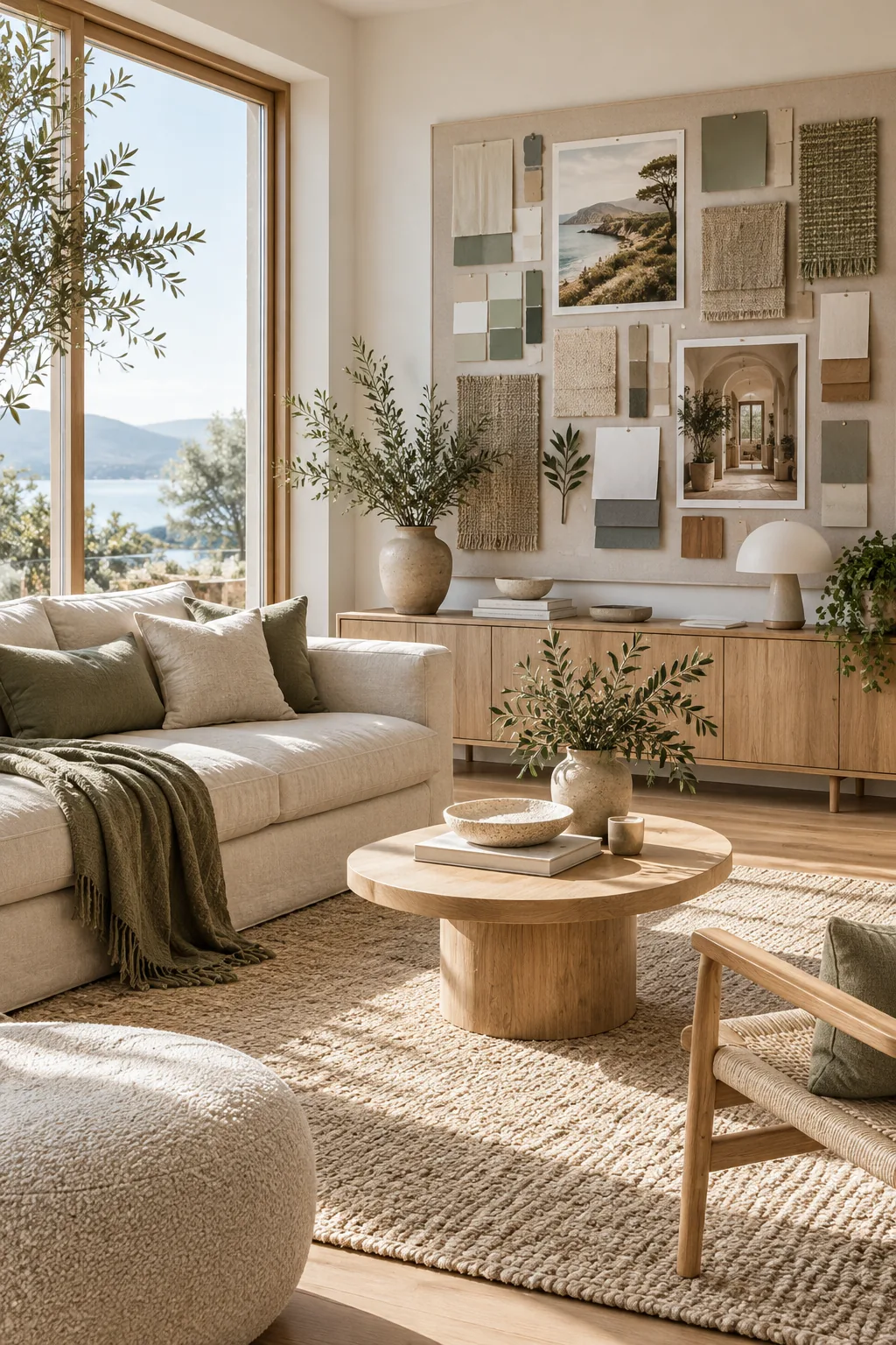
Exactly 80 percent of your board should focus on your core materials, leaving the rest for pure inspiration photos. Balancing paint chips and rug samples with a few lifestyle images keeps the design grounded but aspirational. I love adding a photo of a cool boutique hotel or a stunning landscape to set the overall mood. This ratio prevents the board from looking like a messy collage of random furniture. It keeps your living room design totally focused on the actual feeling you want to achieve.
8. The Minimalist Negative Space
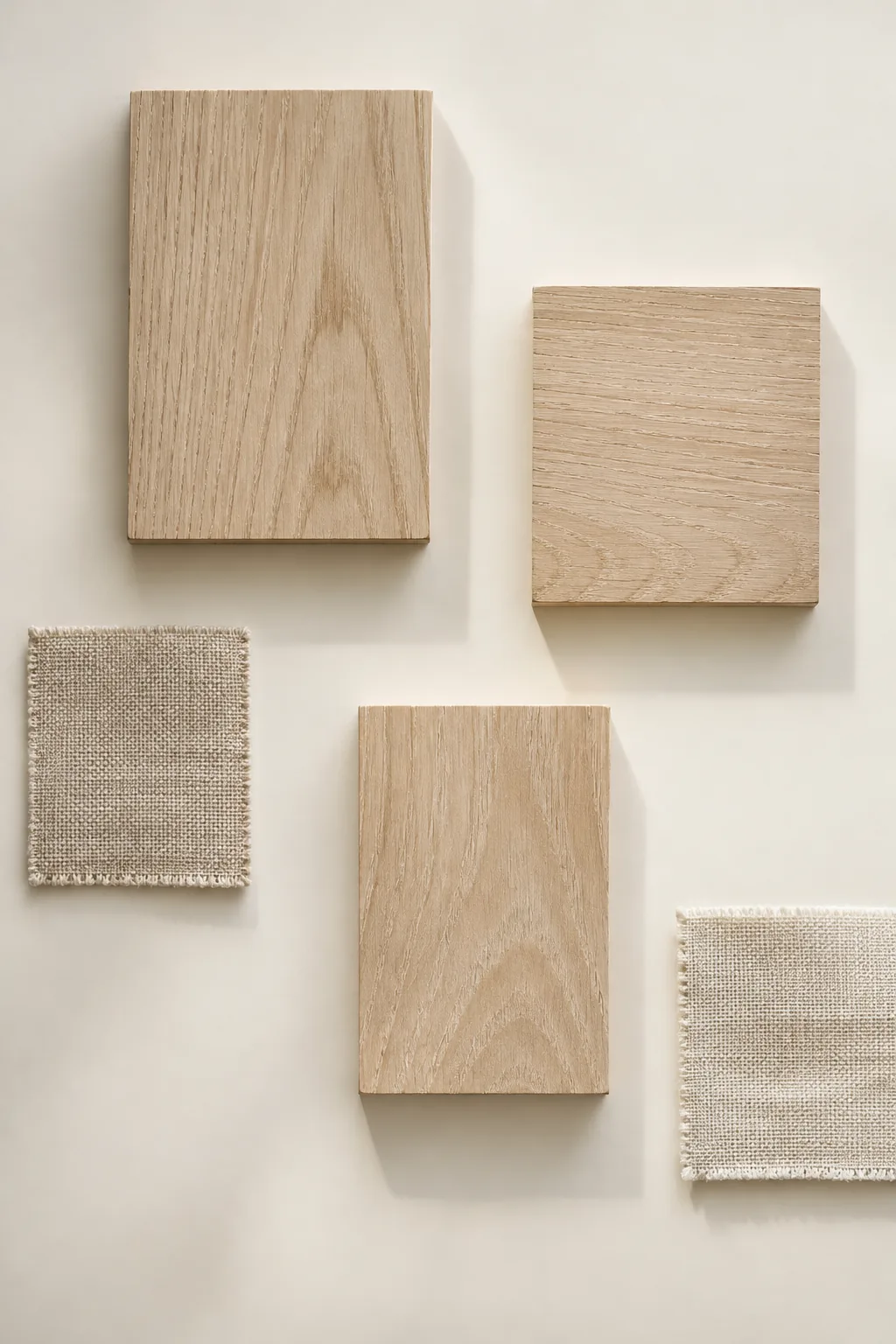
A minimalist, airy aesthetic relies heavily on lots of negative space between your pinned items. Grouping just a few white oak samples and linen fabrics with wide gaps makes the whole board feel incredibly serene. It forces you to edit out anything that is not absolutely essential to the room.
This layout naturally stops you from over-decorating before you even start.
9. The Tactile 3D Tray
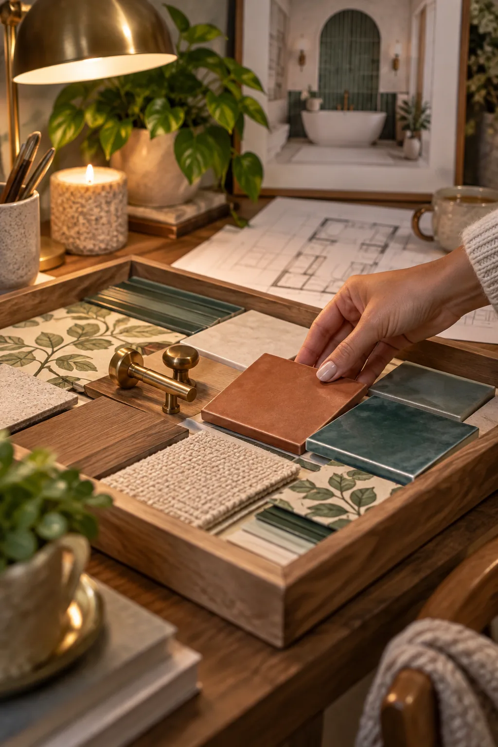
I always keep a dedicated tray on my desk to act as a 3D mood board for ongoing projects. Tossing ceramic tile samples, cabinet knobs, and wallpaper scraps into a shallow wooden dish lets me play with combinations daily. Shuffling the pieces around with my hands sparks new ideas much faster than staring at a screen. It is a highly tactile way to finalize a bathroom remodel.
10. The Multi-Zone House Plan
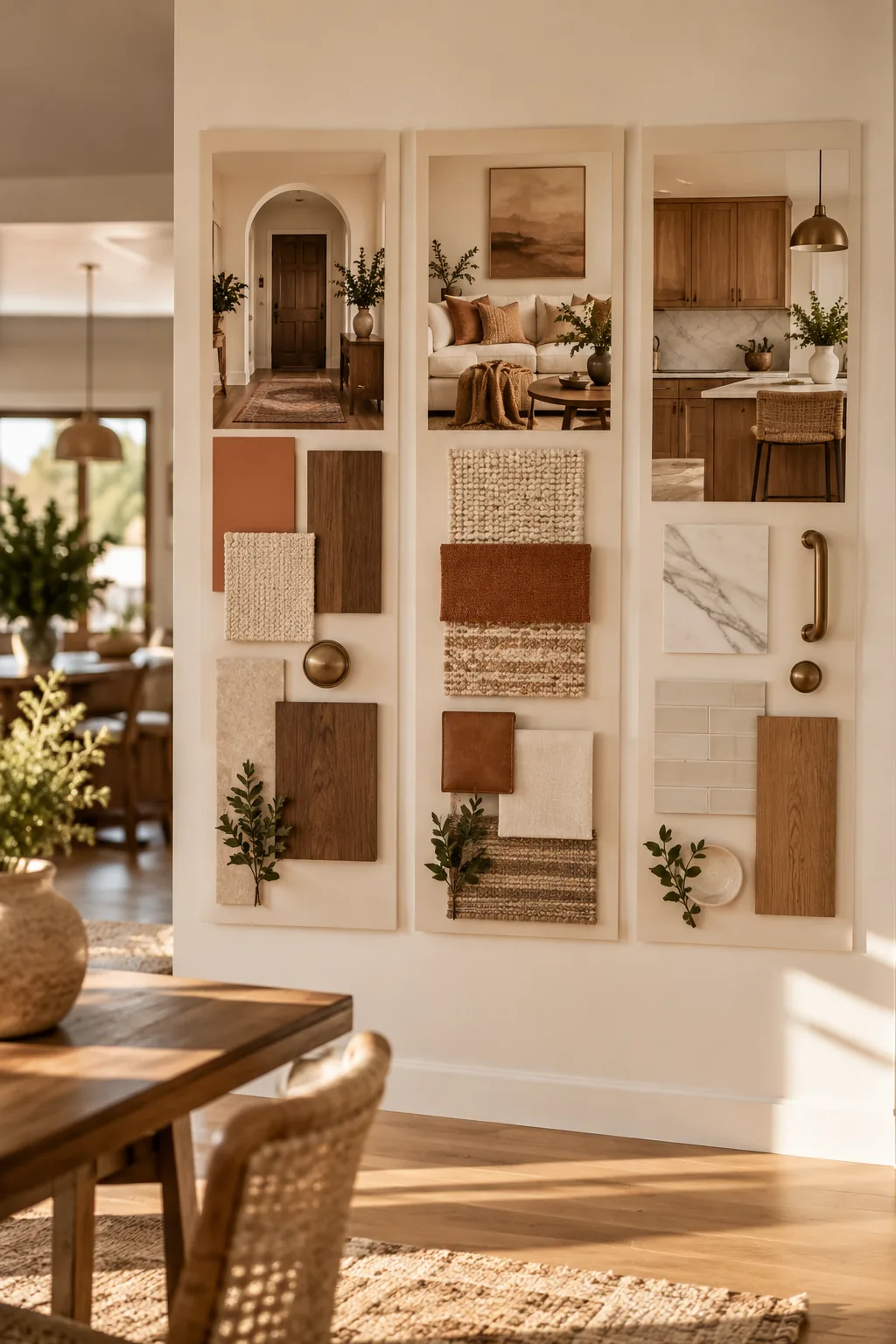
Three distinct color zones make a whole-house mood board incredibly easy to read. Grouping the entryway tones, living area textures, and kitchen finishes into separate columns ensures the transition between spaces makes sense. You can instantly spot if the hardwood flooring clashes with the tile in the next room over. It is the smartest way to guarantee a cohesive flow across an open floor plan.
Why it works: Visually separating the rooms while keeping them on one board highlights any jarring color jumps.
11. The Sketch and Swatch Combo
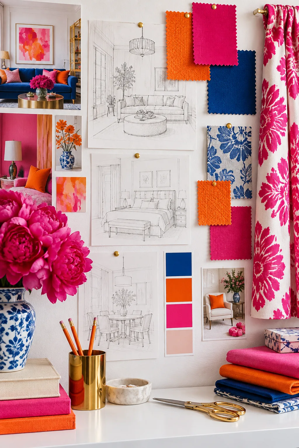
I recently started adding hand-drawn sketches right next to my fabric swatches for a more custom feel. Seeing a rough layout of the room alongside the actual window treatments bridges the gap between idea and reality. It helps clients visualize exactly where each texture is going to live in the space.
- Floor plan sketches
- Elevation drawings of built-ins
- Quick furniture doodles
12. The Magnetic Whiteboard Flip
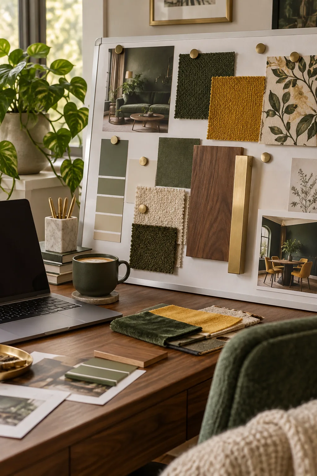
A massive magnetic whiteboard works wonders for organizing a messy home office redesign. Slapping magnetic clips onto upholstery samples and paint cards lets you rearrange the entire room concept in seconds. You do not have to deal with messy glue or pushpins ruining your expensive material cuts. It is incredibly satisfying to slide a piece of brass trim across the board to see how it looks next to a new desk finish. This setup makes the whole design process feel incredibly dynamic and fluid.
13. The Perfect 9×9 Square
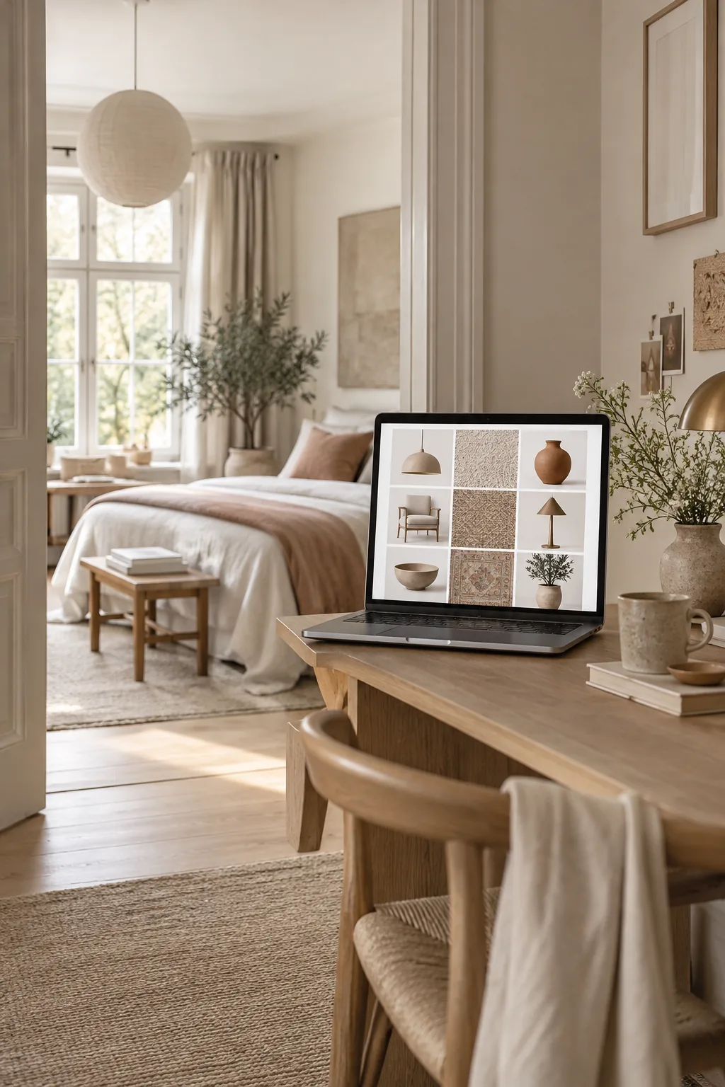
Using a 9×9 grid layout on your screen mimics a classic photo gallery for easy viewing.
Dropping lighting fixtures and rug patterns into uniform squares keeps everything perfectly organized. You never have to worry about messy overlaps or weird scaling issues.
It is the fastest way to pull together a cohesive bedroom design on your lunch break.
Why it works: The rigid grid structure forces you to give equal visual weight to every single element.