
Designing a Perfect Blue Kitchen: The Materials Cheat Sheet
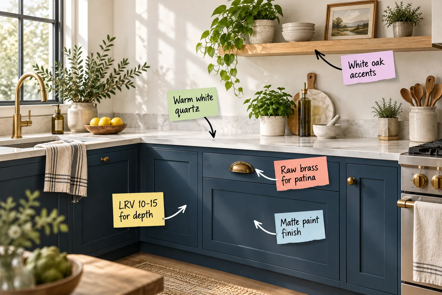
Planning a navy makeover requires balancing cool architectural tones with warm organic textures for a truly harmonious space. You will be able to confidently select the right paints, hardware finishes, and complementary materials using our comprehensive Blue Paint & Materials Cheat Sheet.
Finding the Perfect Blue Depth
To ensure your base cabinets anchor the room without turning into a flat black void in low light, selecting a color with an LRV 10-15 for depth is absolutely essential for maintaining that rich, dusty navy character throughout the day.
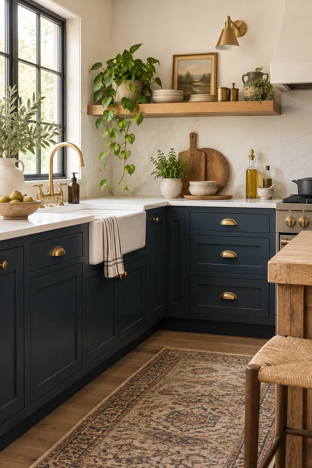
Before committing to a dark cabinet color, watch out for these common sampling errors that can easily ruin the final effect, skewing the undertones and leaving your newly painted kitchen feeling unexpectedly gloomy.
Evaluating Paint Undertones
Beyond the basic reflectance value, identifying the subtle undertones in your chosen navy dictates exactly how the color interacts with your surrounding materials, reflecting natural light differently as the sun moves across your home throughout the changing day.
| Undertone | Visual Effect | Best For |
|---|---|---|
| Green | Warms the room | North-facing light |
| Purple | Adds formal drama | Bright, sunny spaces |
| Gray | Stays neutral | Highlighting brass accents |
Opting for a heavily grayed-out navy ensures the cabinets act as a neutral foundation, allowing your metallic hardware and wood elements to take center stage without competing for visual dominance.
Prepping Cabinets for Dark Colors
Achieving a flawless, opaque finish requires meticulous surface preparation, starting with a thorough deglossing phase and a high-quality bonding primer to ensure the new dark pigments adhere securely to the existing cabinet faces without future peeling.
Why Matte Paint Elevates the Look
In my own Denver kitchen, choosing a matte paint finish hid everyday fingerprints beautifully, creating the perfect soft, glare-free backdrop for unlacquered cup pulls to slowly develop their unique historic warmth over years of daily use.
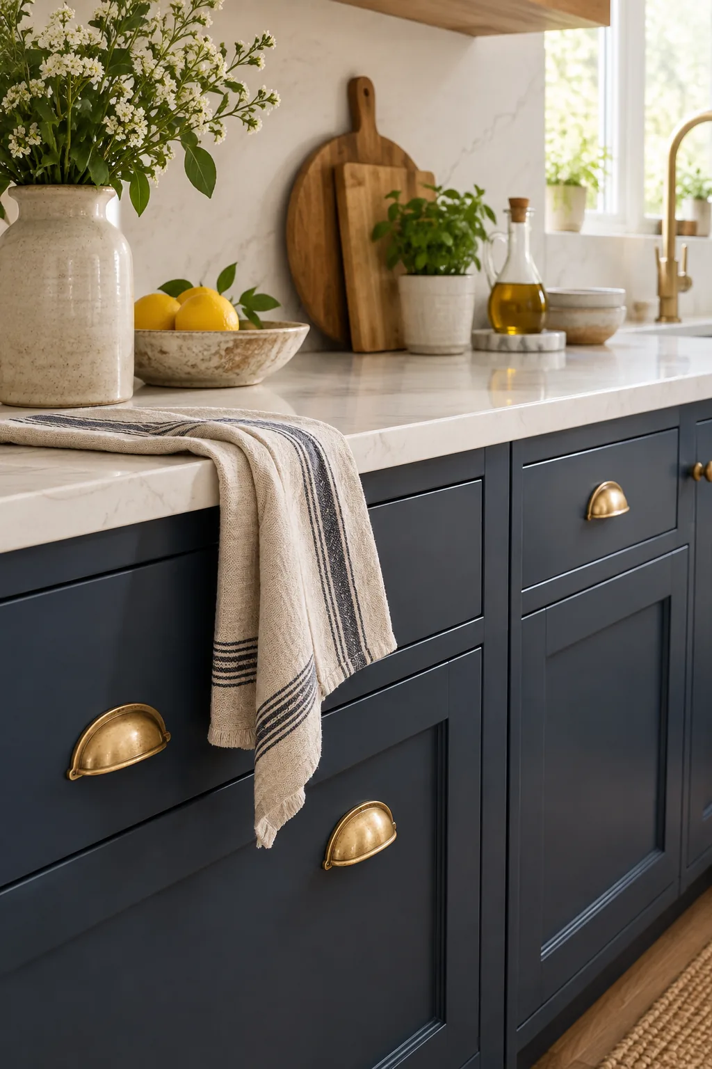
Because lower sheen levels absorb rather than reflect ambient light, this painting technique entirely eliminates the harsh, distracting glare that often plagues high-gloss cabinetry when installed in bright, sunlit cooking spaces.
Protecting the Matte Surface
While flat finishes offer incredible visual depth, applying a specialized clear matte polyurethane topcoat provides a crucial, invisible layer of durability against the inevitable acidic spills and shoe scuffs common in high-traffic family cooking zones.
Selecting Hardware That Ages Gracefully
Introducing raw brass for patina on your drawer fronts establishes a living finish that intentionally oxidizes over time, adding a necessary layer of organic, historic warmth that beautifully contrasts with the crisp, cool blue doors.
Placement Rules for Cup Pulls
Centering your heavy brass cup pulls precisely on the top third of the drawer face ensures comfortable ergonomic access while maintaining a visually grounded, traditional proportion across the entire horizontal run of your lower cabinetry.
Mixing Metals with Raw Brass
To prevent the kitchen from feeling overly matched, rigid, or catalog-bought, deliberately introduce a secondary metal finish like polished nickel on your plumbing fixtures to add a crisp, reflective counterpoint to the aging brass hardware.
The Countertop Contrast
Balancing heavy, dark base cabinets requires a bright, expansive horizontal surface, and installing warm white quartz achieves this necessary contrast without ever introducing the sterile, clinical feel associated with pure stark white countertop materials.
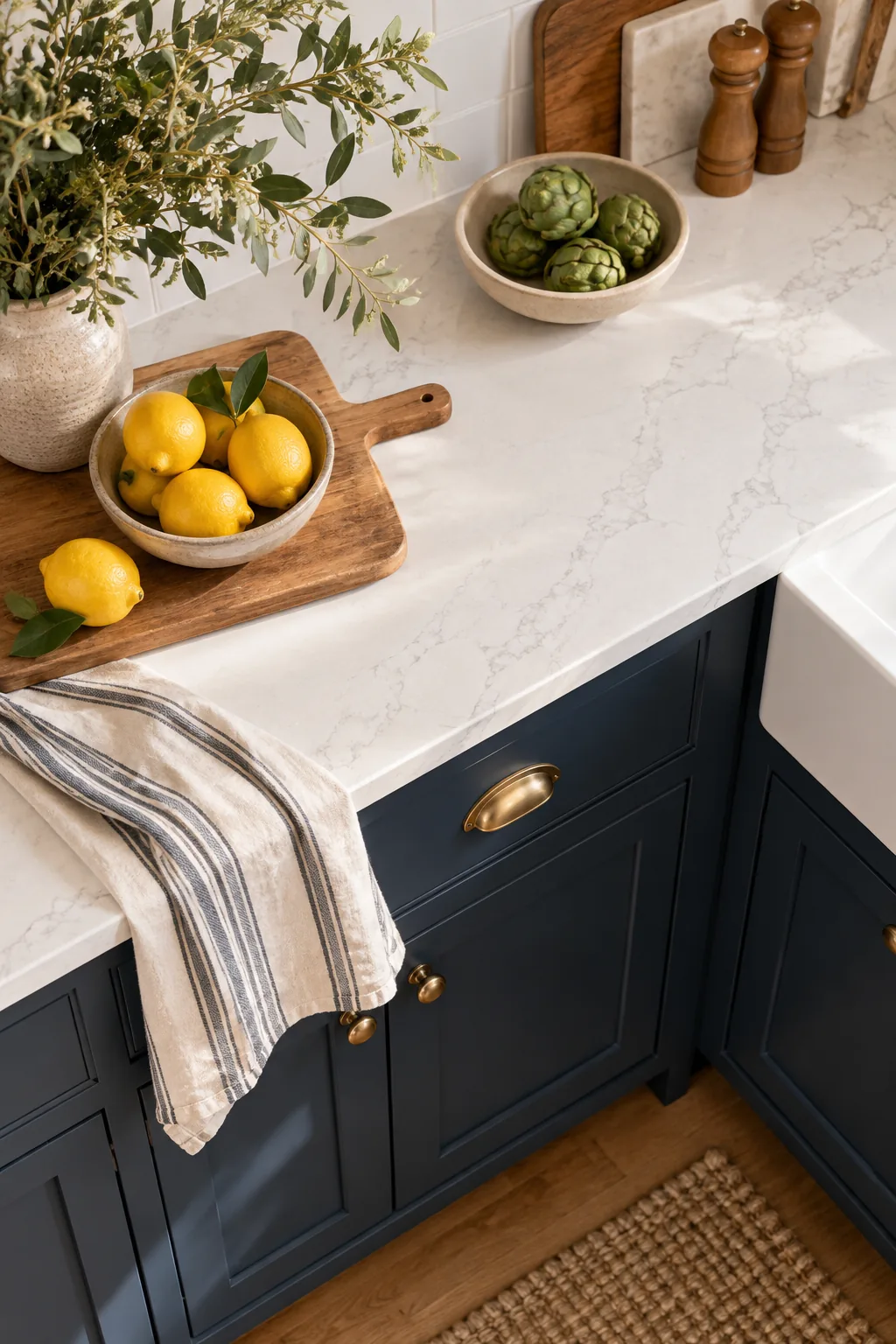
Specifying a substantial 1.5-inch edge thickness for your stone counters provides a modern, grounded visual weight that perfectly anchors the primary workspace against the dramatically darker cabinetry installed directly below.
Choosing the Right Edge Profile
Selecting a simple eased square edge rather than an ornate, traditional bullnose profile keeps the countertop silhouette clean and highly contemporary, allowing the rich cabinet color to remain the undisputed primary focal point of the room.
Maintaining Quartz Surfaces
Preserving the pristine warmth of your engineered countertops requires a surprisingly gentle touch; always wipe up acidic spills immediately and stick strictly to mild, non-abrasive dish soap to protect the factory resin seal from dulling.
Softening the Room with Wood
Introducing white oak accents through open shelving brings essential organic texture to the cool palette, provided you intentionally space them 18-20 inches above the counter to easily clear your tallest countertop espresso machines and blenders.
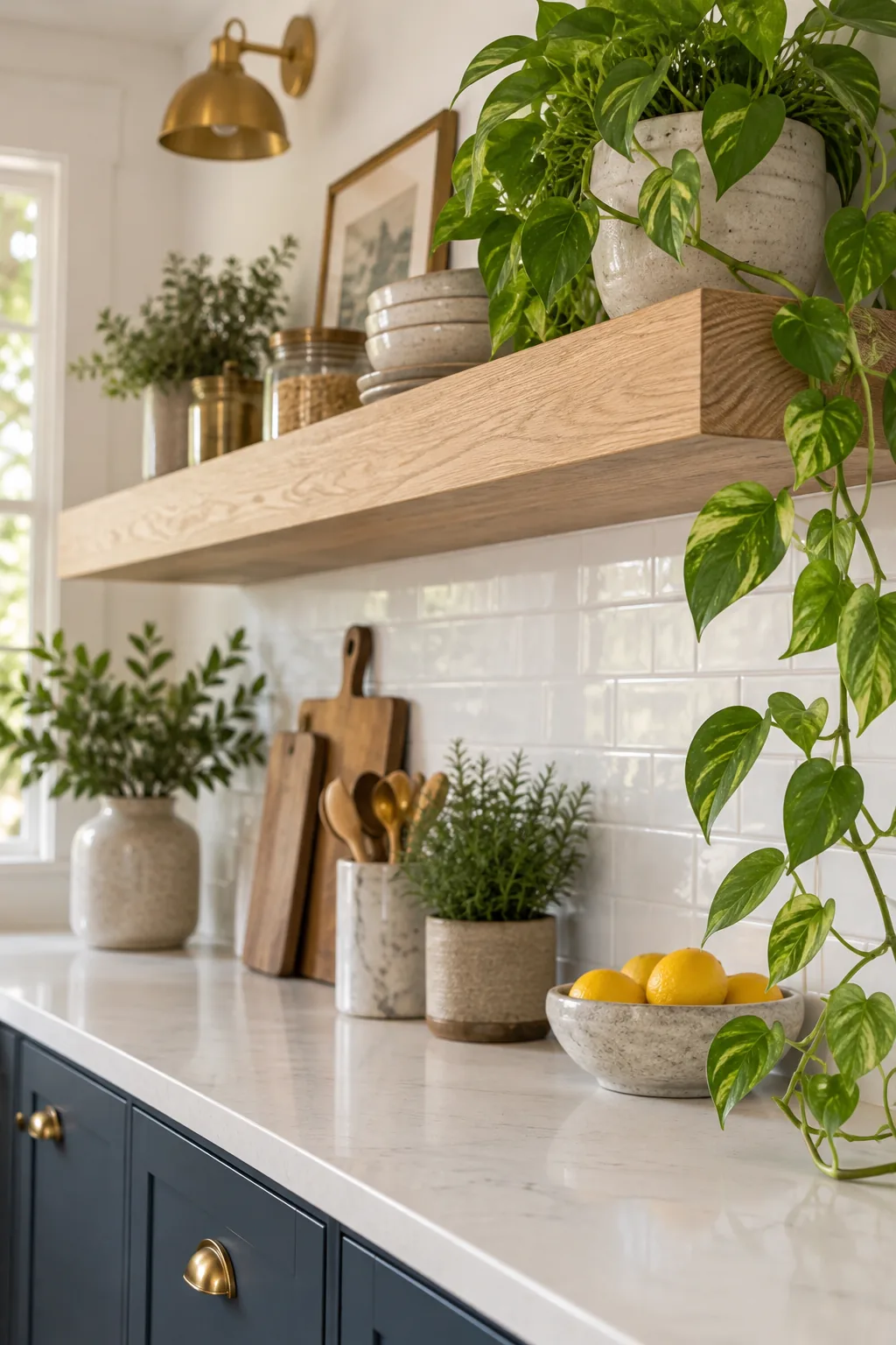
To keep your wood accents looking raw, natural, and freshly milled, choosing the right protective clear coat makes all the difference in preventing unwanted amber discoloration over the coming years.
Securing Floating Shelves Properly
Supporting heavy stacks of ceramic dishware requires heavy-duty concealed steel bracket rods drilled directly into the wall studs, ensuring your beautiful wood accents remain perfectly level, structurally sound, and safe for daily loading.
Transitioning to the Backsplash
Running a continuous slab of matching warm white quartz vertically up the wall behind the range creates a seamless, easily wipeable transition that visually expands the perceived height of your primary working zone.
Managing Kitchen Lighting
Because dark lower cabinets naturally absorb significant ambient light, strategic layered illumination using 3000K LED bulbs is absolutely necessary to keep the blue tones true and vibrant without turning them overly yellow or depressingly gray.
Layering Ambient and Task Lights
Combining overhead recessed ceiling cans with highly focused under-cabinet light strips ensures your stone countertops receive bright, shadow-free illumination exactly where you handle delicate daily knife work and intricate recipe preparation.
Styling for Everyday Use
Arranging functional, daily items like olive oil cruets, fresh potted herbs, and stacked ceramic bowls directly on the counter adds necessary life and organic texture without creating overwhelming, stressful visual clutter across your work surfaces.
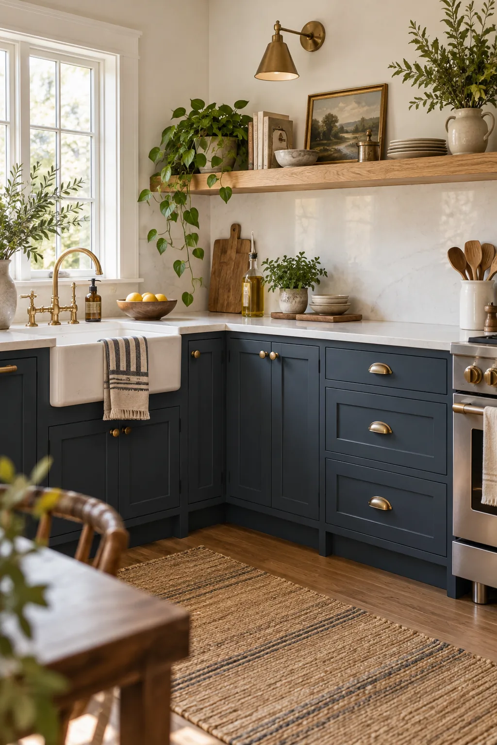
Establishing a purposeful, contained arrangement for these cooking essentials keeps your workspace highly efficient while simultaneously acting as natural, highly personal decor that beautifully softens the hard architectural lines of the cabinetry.
Balancing Color and Texture
Drawing deeply on Eastern principles of elemental balance, combining the watery, recessive depth of navy cabinets with the earthy, grounding energy of raw oak and solid brass creates a deeply harmonious, restorative environment for cooking.
Grounding the Space with Flooring
Selecting a medium-tone hardwood floor with subtle gray undertones bridges the gap between the dark navy lowers and the bright white uppers, providing a continuous visual flow that makes the entire kitchen layout feel significantly larger.
Selecting the Right Sink Material
Installing a classic fireclay farmhouse sink reinforces the traditional warmth of the brass hardware, while its non-porous white surface perfectly echoes the bright quartz countertops for a cohesive, thoughtfully integrated material palette.
Integrating Panel-Ready Appliances
Concealing your dishwasher behind a custom navy cabinet panel eliminates visual interruptions along the lower run, ensuring the rich, dramatic paint color and beautiful brass hardware remain the uninterrupted stars of the kitchen.
More Ways to Style Dark Cabinets
Explore these distinct variations to find the perfect mood and material pairing for your own space.
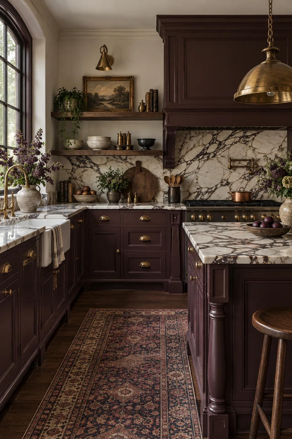
Moody Victorian Plum: Swap the navy for a rich plum and pair it with heavily veined marble for a dramatic, historic feel.
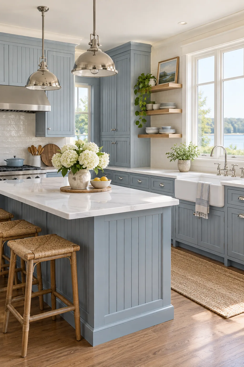
Coastal Transitional Slate: Lighten the palette with a soft slate blue and polished nickel hardware for an airy, beach-inspired aesthetic.
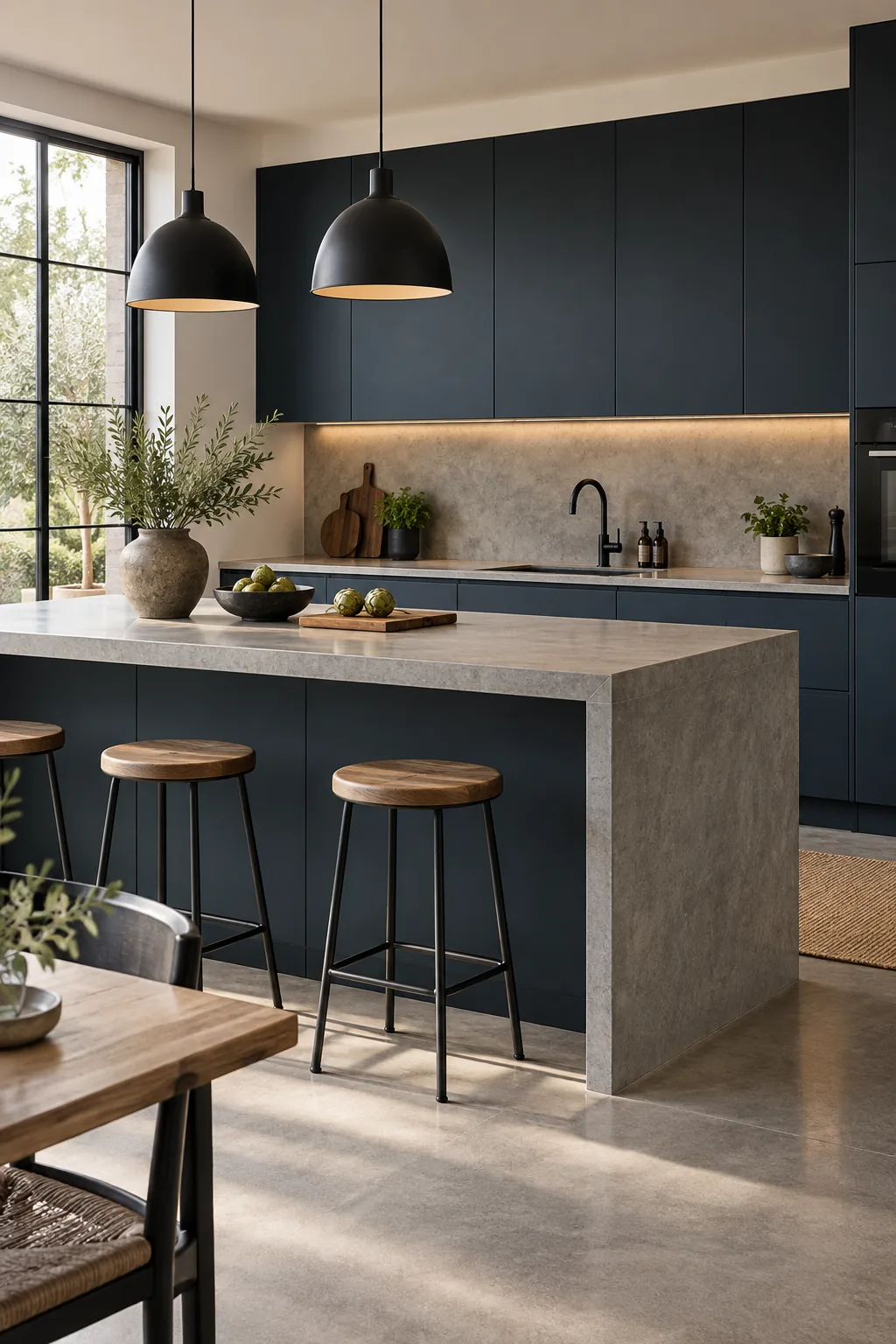
Modern Minimalist Midnight: Remove the hardware entirely and pair flat-panel midnight blue doors with raw concrete for an ultra-sleek, modern edge.
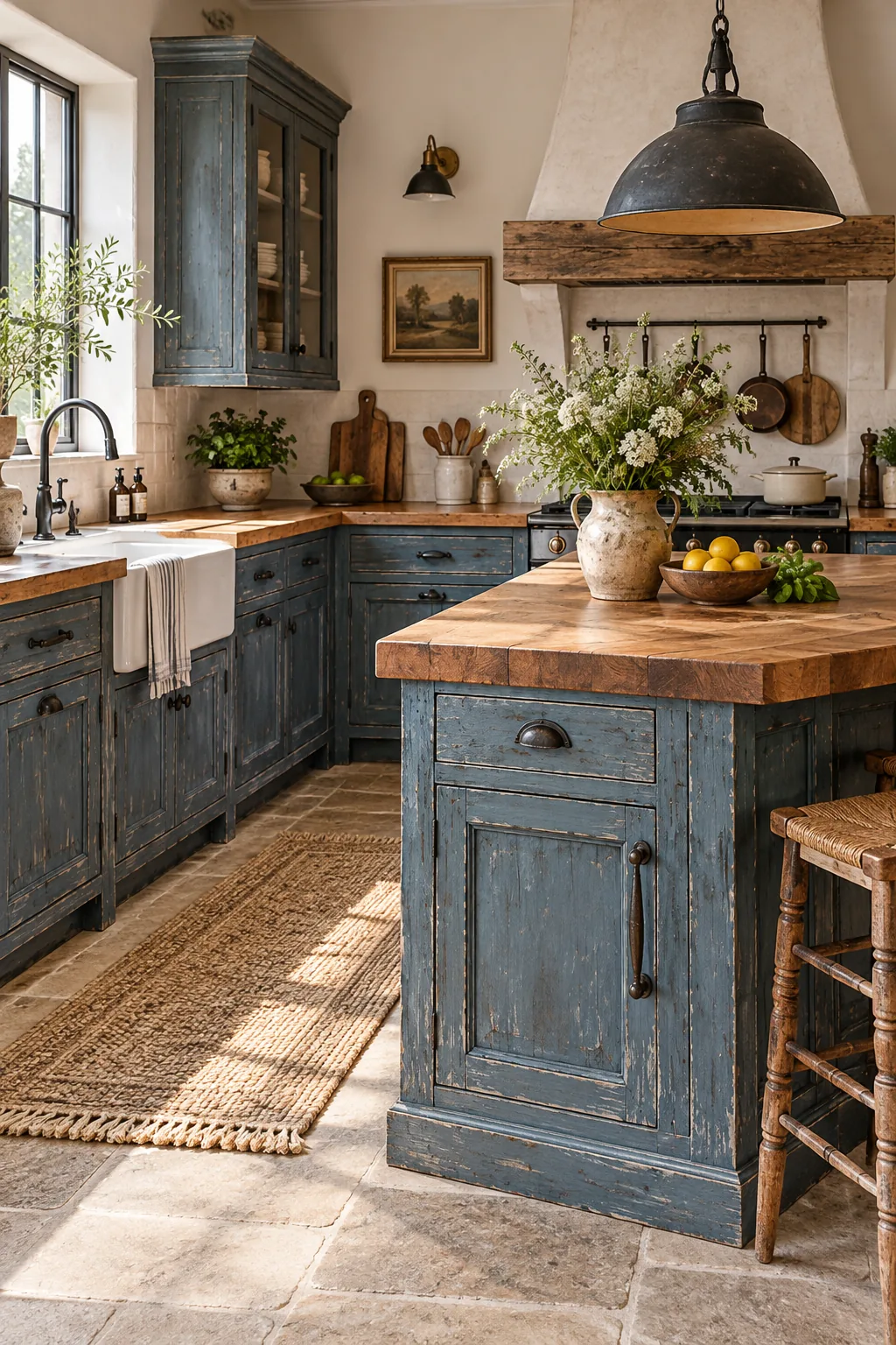
Rustic Farmhouse Denim: Embrace a lived-in look with distressed denim blue paint, warm butcher block counters, and heavy iron hardware.
Your Blue Kitchen Materials Cheat Sheet
Having the complete breakdown of the exact paint metrics, hardware finishes, and stone selections takes the stressful guesswork out of your upcoming design consultations, contractor meetings, and final showroom visits.
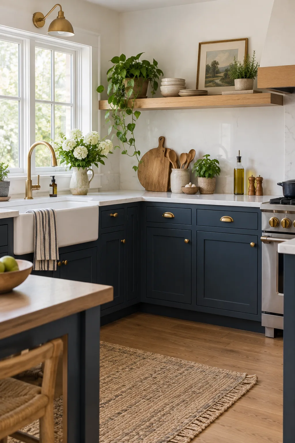
Whenever I finalize a major renovation project for my Denver clients, I rely on this exact sequence of materials to ensure a flawless, timeless dusty navy result every single time.
- Paint specification: Choose a dusty navy with gray undertones and a strict LRV of 10-15 in a matte or satin finish.
- Hardware selection: Install raw, unlacquered brass cup pulls and knobs to ensure a living patina develops.
- Countertop pairing: Specify warm white quartz with subtle veining and a modern 1.5-inch eased edge.
- Wood accents: Incorporate rift-sawn white oak floating shelves sealed with a clear water-based matte polyurethane.