
13+ Stunning Photo Wall Ideas for Your Home
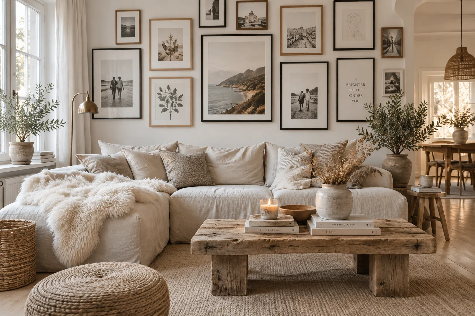
A well-planned photo wall turns an awkward, empty stretch of drywall into the focal point of your room. I am sharing my favorite layouts and framing tricks to help you get that custom, designer look without the guesswork.
1. The Floor-to-Ceiling Grid
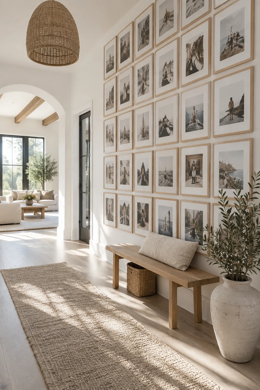
Most people stop hanging frames at eye level, leaving a ton of wasted vertical space. Taking a grid photo wall all the way from the baseboards to the ceiling draws the eye up and makes standard ceilings feel massive. You just need identical frames and exact spacing to keep the massive scale looking neat.
A two-inch gap between frames is usually the sweet spot.
2. The Corner Wrap
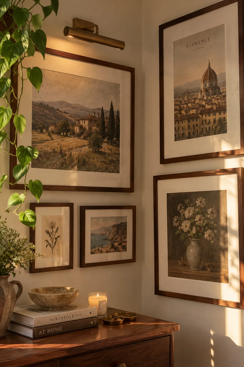
Wrapping a gallery wall around an inner corner works because it breaks up the rigid, flat plane of a standard room. You just carry the same frame style across the ninety-degree turn to pull the two walls together seamlessly.
3. The Three-Piece Statement
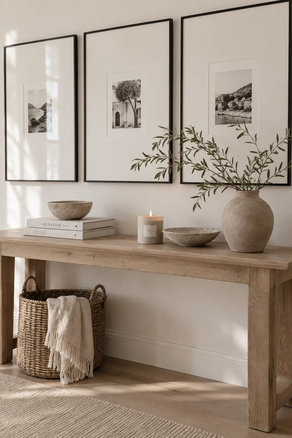
Three oversized frames fill a wall much faster than twenty small ones. This minimalist photo wall approach gives your space a high-end art gallery feel. I like to use huge white mats with small black-and-white photos in the center. It keeps the room feeling airy while still making a massive impact.
4. The Picture Ledge Layering
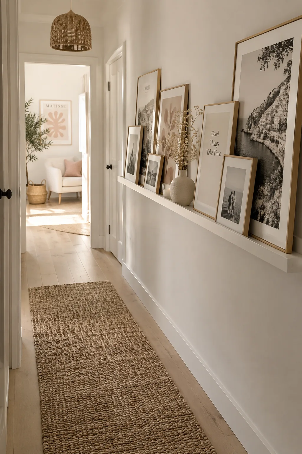
I always use this trick in narrow hallways where traditional framing feels too flat. Layering different sizes of art on a slim picture ledge lets you swap out photos whenever you want without putting new holes in the drywall.
5. The Staircase Step-Down
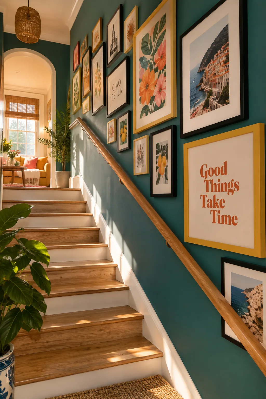
A standard staircase rises at about a forty-degree angle.
Matching your photo wall layout to this exact angle keeps the arrangement balanced. You just follow the diagonal line of the handrail as your center axis.
Build the rest of your frames outward from that middle line. It guarantees your art will never look lopsided.
6. The Eclectic Mix
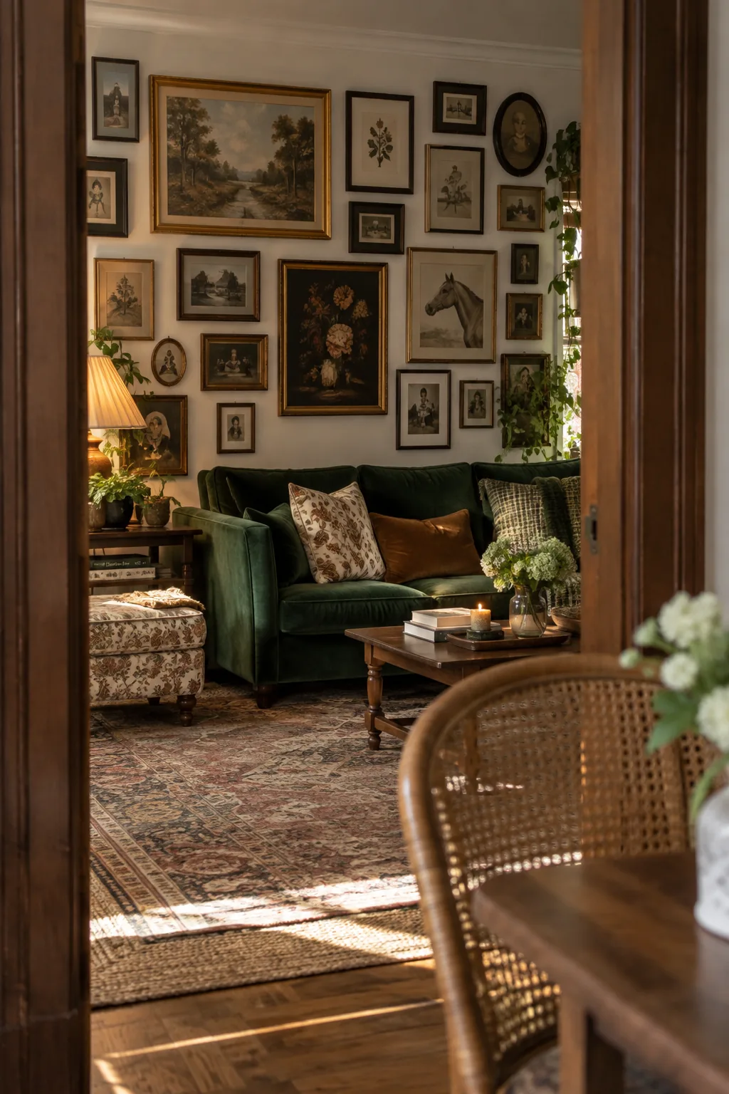
This layout creates a relaxed, collected-over-time vibe that feels incredibly inviting. You achieve this by mixing vintage gold frames with sleek modern wood and standard black borders. The secret to an eclectic photo wall is keeping the spacing tight so it reads as one large unit. I usually aim for a one-inch gap between every piece, regardless of its shape. This prevents the arrangement from looking like a messy thrift store pile.
7. The Monochromatic Matte
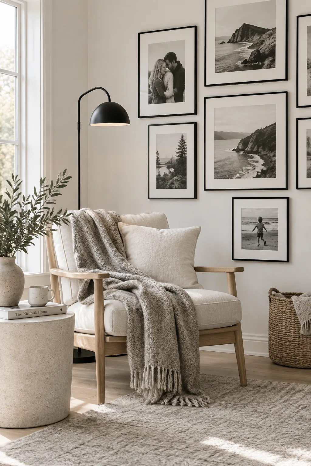
Sticking strictly to black and white photography works because it unifies completely unrelated subjects.
You can mix a landscape shot with a candid family portrait on the same monochromatic gallery wall. The lack of color removes all the visual clutter.
I recommend using identical thin black frames to enhance this sleek aesthetic. It pushes all the focus onto the images themselves.
8. The Symmetrical Triptych
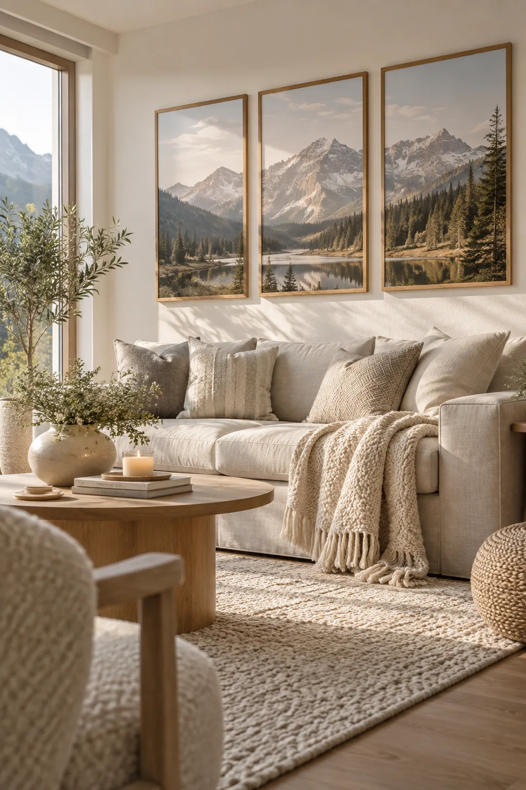
I recently installed this layout above my own living room sofa, and it completely anchored the space. Hanging a symmetrical photo wall with three identical vertical frames is the easiest way to fill a wide gap. You just split one panoramic image across the three frames to create an instant conversation piece.
Make sure the frames are perfectly level, or the whole illusion falls apart.
Why it works: The strict symmetry brings order to rooms with a lot of heavy, mismatched furniture.
9. The Mixed Media Display
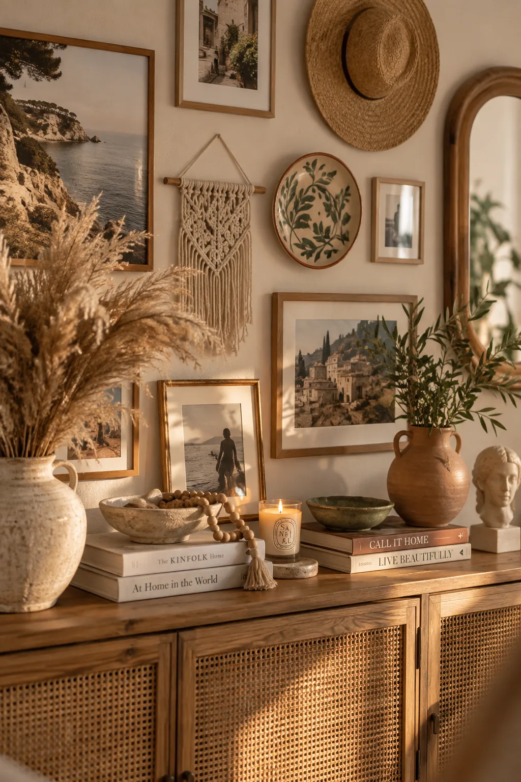
This arrangement creates a deeply personal, textured look that goes beyond standard photography. You simply weave a few dimensional objects into your mixed media photo wall to break up the flat glass.
- Small mirrors
- Woven wall hangings
- Wooden typography
10. The Asymmetrical Organic Shape
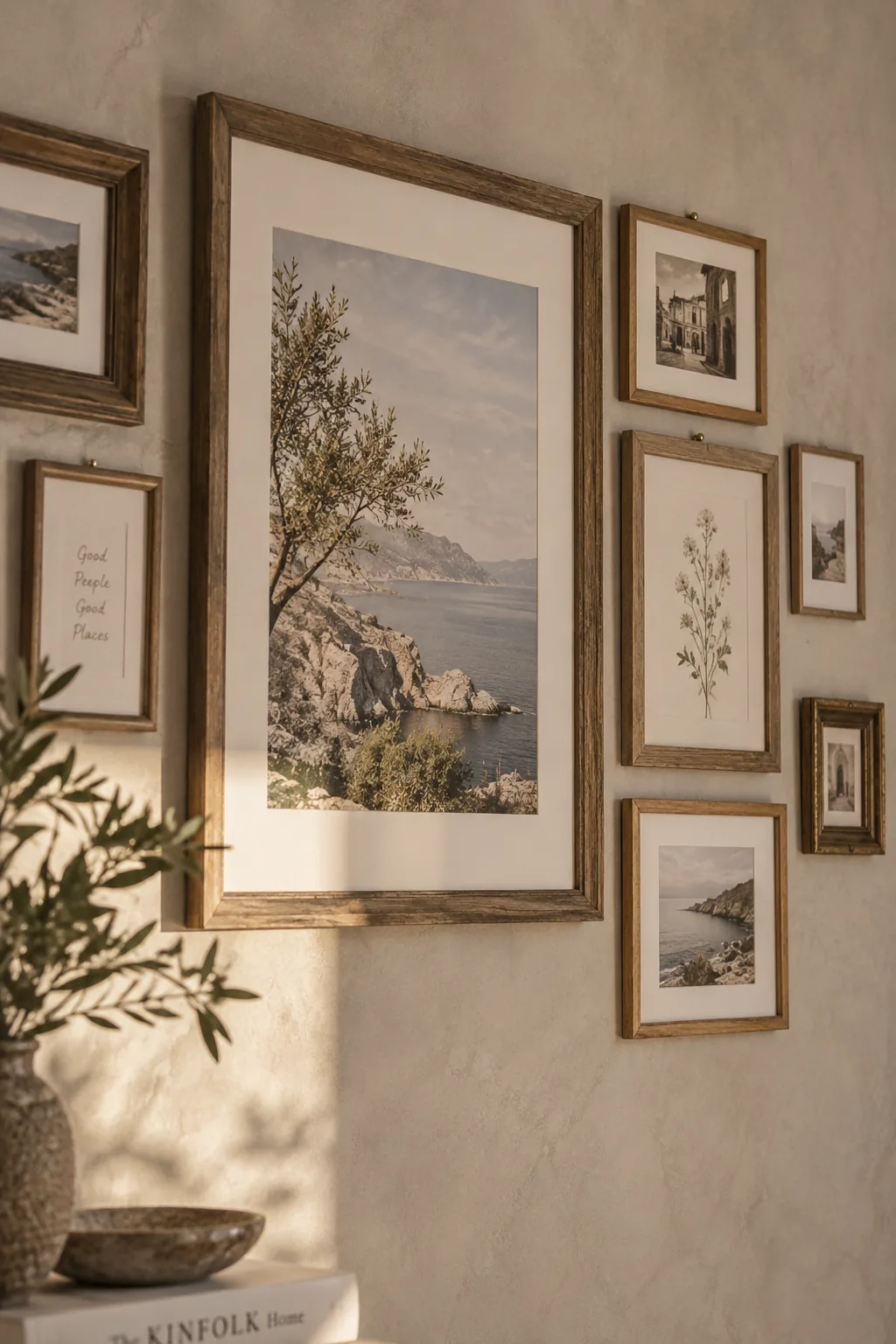
Most organic gallery layouts start with the largest piece off-center.
Placing your visual anchor to the left or right forces the eye to travel across the entire asymmetrical photo wall. You then build outward with smaller frames, letting the outer edges fade naturally into the blank wall. It feels much lighter than a rigid box layout.
Why it works: Off-center weight mimics natural landscapes, making the room feel more relaxed and less formal.
11. The Oversized Matting
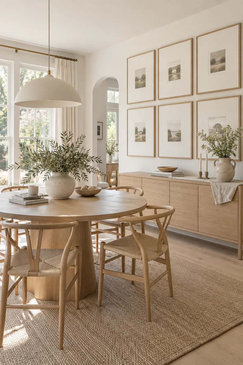
A standard mat board is usually two inches wide, but upgrading to a five-inch mat completely changes the aesthetic. This trick makes a budget-friendly matted photo wall look like custom framing from a high-end gallery.
12. The Floating Acrylic Frames
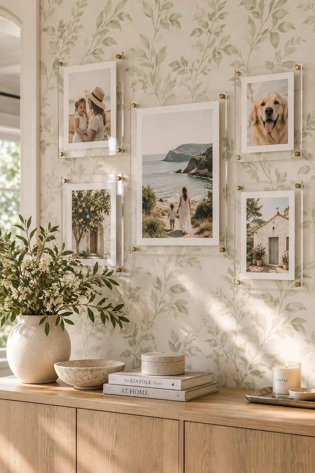
Using clear acrylic works beautifully because it lets your wall color show through the gaps.
This makes a floating photo wall feel incredibly light and modern. The hardware stands off the wall, casting subtle shadows that add depth to the room.
It is the absolute best choice for heavily patterned wallpaper. You get to display your art without covering up the expensive paper behind it.
13. The Leaning Floor Gallery
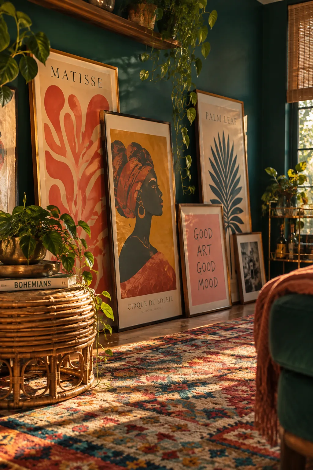
Frames taller than forty inches often look better resting directly on the floor. Layering a leaning photo wall against the baseboards creates a moody, bohemian studio vibe without a single hammer swing.
- One oversized anchor frame
- Two medium overlapping frames
- A small textured accent piece
14. The TV Frame Integration
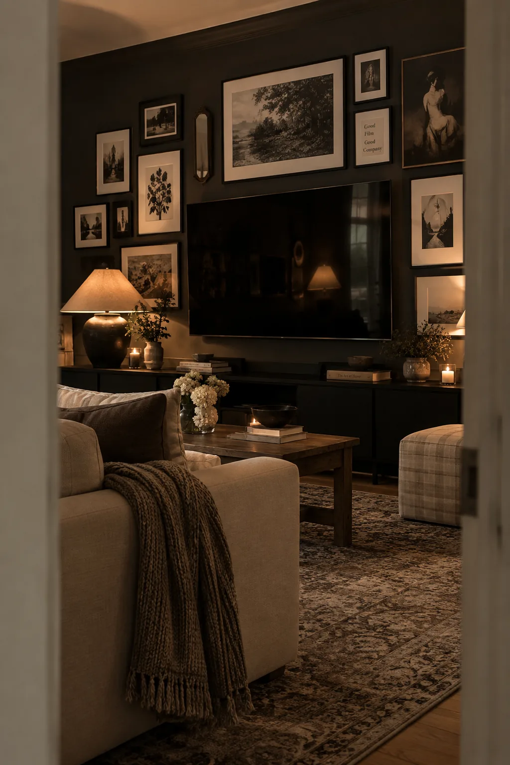
Blending your television into the layout works because it camouflages the giant black box in your living room. You surround a smart TV with a dark gallery wall using black frames and moody art to make the screen disappear. I like to keep the spacing tight and the frame finishes matte to reduce glare. It completely transforms the wall from a tech zone into a curated art display.