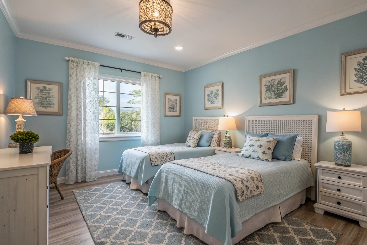
Walking into a room washed in serene blues instantly calms the mind, while stepping into a space adorned with vibrant yellows energizes the spirit. In the world of interior design, color transcends mere decoration—it’s a powerful tool that shapes our emotions and profoundly influences our daily experiences within spaces.
The Psychology of Color: How Our Spaces Speak to Us
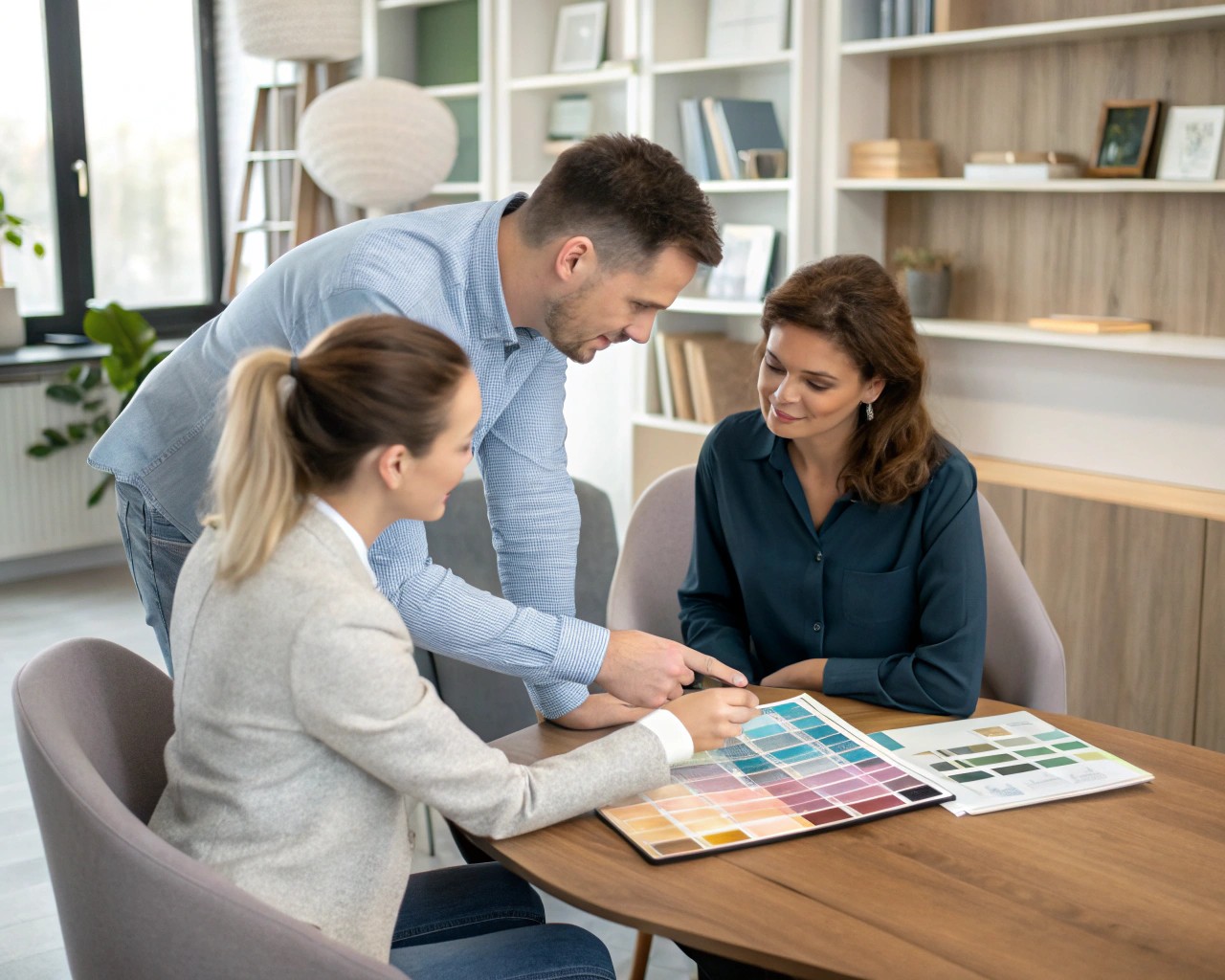
Color psychology in interior design is about understanding how different hues affect our emotional responses and behavior. Every color has its unique impact on our psyche, influencing everything from our energy levels to our productivity and mood.
“Color psychology is a cornerstone element of interior design, not just for aesthetic purposes, but to fully optimize each space based on the feelings and emotions each color invokes,” according to research in the field. As a designer with over a decade of experience transforming spaces, I’ve witnessed firsthand how strategic color choices can dramatically alter a room’s ambiance and the wellbeing of those who inhabit it.
Understanding the Color Wheel Basics
Before diving into specific colors, let’s establish some foundational terms that will help you communicate with designers and paint professionals:
- Primary Colors: Red, blue, and yellow—these cannot be created by mixing other colors
- Secondary Colors: Green, orange, and purple—created by mixing primary colors
- Tertiary Colors: Six shades created by mixing primary and secondary colors
- Tone: Refers to the brightness or deepness of a color, altered by adding gray
- Tint: A lighter shade created by adding white to a color
- Shade: The darkness level of a color, created by adding black
Warm Colors: Energizing Your Space
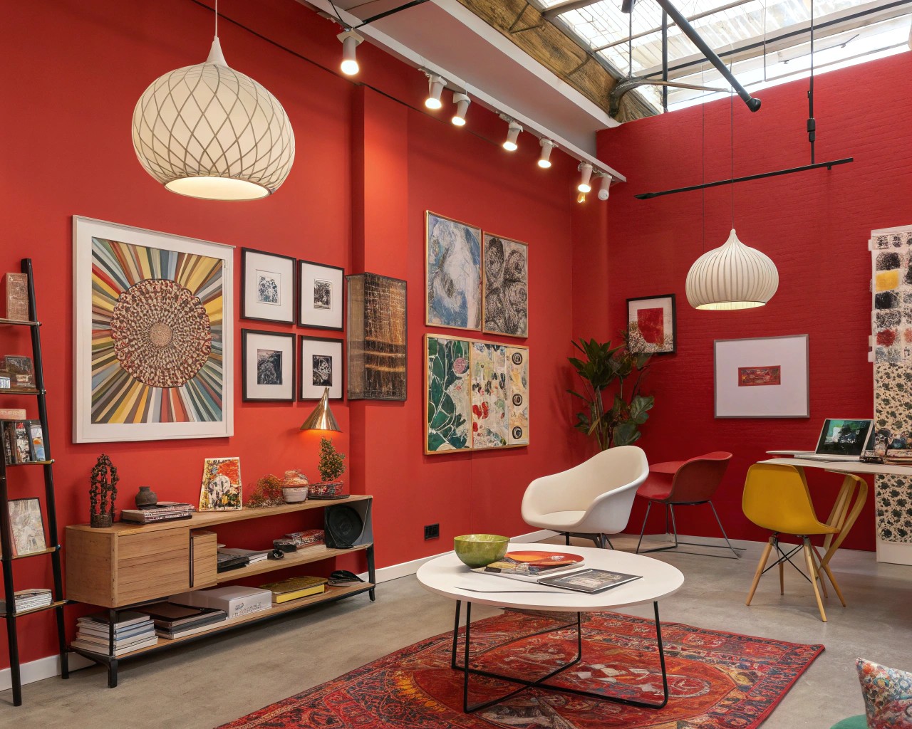
Warm colors—reds, oranges, and yellows—form the vibrant end of the spectrum, bringing energy and warmth to any space. These colors stimulate conversation and creativity, making them ideal for social areas in your home.
Red: The Power Player
Red entices a wide range of emotions including passion, excitement, and ambition. Its ability to trigger energy makes it an excellent choice for creative spaces like home offices and studios. When working with clients who want to make a bold statement, I often suggest red as an accent rather than the dominant color.
“Red is a primary color situated at the warm end of the spectrum, characterized by its long wavelength and high energy,” notes color research. This powerful hue commands attention and infuses spaces with vibrancy.
Best Uses for Red:
- Dining rooms (red has been shown to increase appetite)
- Creative spaces and home offices
- Accent walls in living areas
- Kitchen details
Case Study: For a family in Berkeley Hills, we incorporated a persimmon-colored starburst-patterned wallpaper on the dining room ceiling, creating a dramatic focal point that energized family gatherings while maintaining warmth.
Orange: The Social Enthusiast
Orange invokes fun, energetic enthusiasm and studies show it can stimulate physical effects such as “increased socialization, increased oxygen supply to the brain, and elevated feelings of joy”. When a client was renovating her home gym, we chose a soft terracotta orange that provided the energy boost she needed without overwhelming the space.
Best Uses for Orange:
- Exercise rooms
- Social gathering spaces
- Creative studios
- Playrooms
Yellow: The Mood Lifter
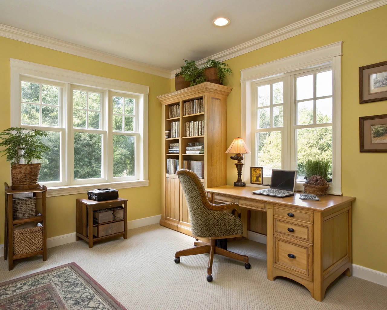
Yellow is often associated with optimism and joy, making it an excellent choice for spaces where you want to foster positivity. “Soft, pale yellows are easier to live with in the long run; the ambience they give will still provide guests with that cheerful energy, while reducing the chances of being overwhelming”.
Client Story: One of my clients, a writer who struggled with seasonal depression, transformed her office with a buttery yellow that she claims has significantly improved her winter productivity. We were careful to select a muted shade that wouldn’t cause fatigue with prolonged exposure.
Cool Colors: Creating Calm and Focus
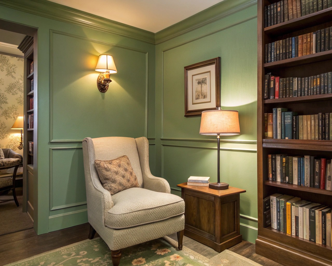
Cool colors—blues, greens, and purples—serve as sanctuaries of peace within a home, ideal for spaces dedicated to relaxation or focused work.
Blue: The Tranquility Creator
Blue is most frequently chosen for rooms intended to promote relaxation, which explains its popularity in bedrooms and bathrooms. “Dark colors such as blue can have a calming effect and help to reduce stress,” making them “ideal for bedrooms or rooms in which you want to relax”.
Best Uses for Blue:
- Bedrooms
- Bathrooms
- Reading nooks
- Home offices requiring concentration
Research from a university residence hall study found that “blue as interior color was considered to facilitate studying activity,” with students demonstrating a strong preference for blue interiors.
Green: The Natural Harmonizer
Green is often associated with nature and can have a calming effect. It stands for freshness, growth, and harmony. When I’m designing spaces for clients seeking a connection to the natural world, green is my go-to recommendation.
Designer Insight: In my own home, I’ve painted my meditation space a soft sage green. The color helps me transition from busy workdays to mindful evenings, creating a perceptible shift in my breathing pattern the moment I enter the room.
Purple: The Creative Mystic
Purple is often associated with creativity and spirituality, creating a mysterious and sophisticated atmosphere. For spaces where you want to inspire artistic expression or meditation, purple tones can stimulate imagination while maintaining a sense of calm.
Neutrals: The Sophisticated Foundation
Neutral colors provide the perfect backdrop for both bold accents and subtle elegance. Far from boring, today’s neutrals offer depth and sophistication when chosen thoughtfully.
Table: Color Effects by Room Type
| Room | Recommended Colors | Psychological Effect | Notes |
|---|---|---|---|
| Living Room | Greens, Blues, Neutrals with warm accents | Balance of energy and relaxation | The social heart of the home benefits from versatile colors |
| Bedroom | Blues, Lavenders, Soft Greens | Relaxation, calm, restfulness | Avoid bright reds and oranges which can disrupt sleep |
| Kitchen | Yellows, Whites, Reds as accents | Energy, appetite stimulation, warmth | Yellow kitchens foster happy gatherings |
| Home Office | Blues, Greens, Neutrals with focused accents | Concentration, productivity, creativity | Blue facilitates studying and focus |
| Bathroom | Blues, Greens, Whites | Cleanliness, relaxation, refreshment | Spa-like colors create a sanctuary feel |
| Dining Room | Reds, Oranges, Rich neutrals | Stimulates appetite, encourages conversation | Warm colors enhance dining experiences |
Color Combinations That Surprise and Delight
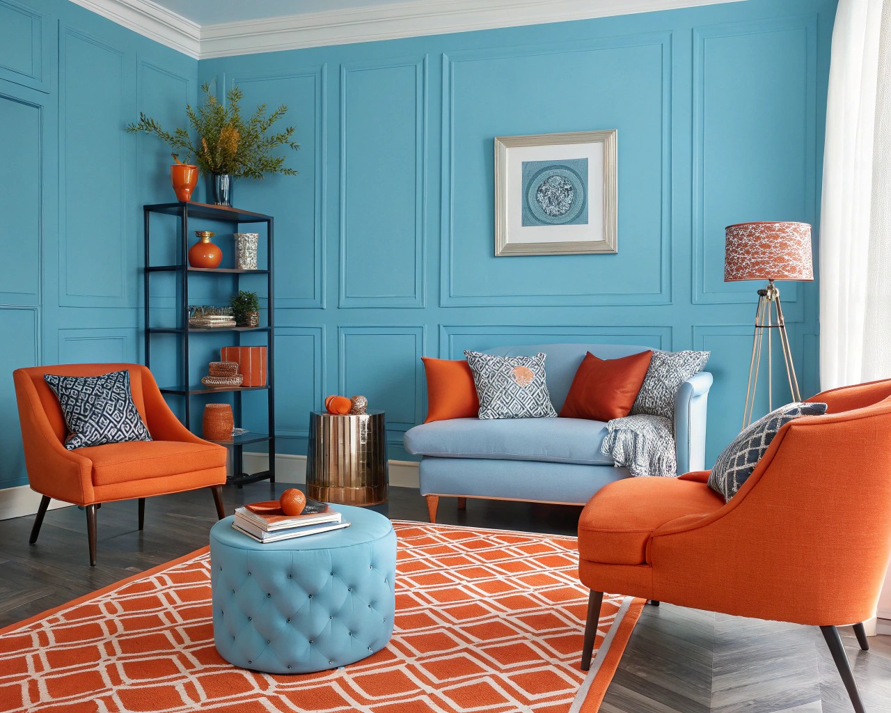
While traditional color combinations have their place, unexpected pairings can transform a space from ordinary to extraordinary.
Unexpected But Effective Color Pairings:
-
Green and Pink: Particularly sage green and dusty pink create a refreshing yet sophisticated palette, offering “nature’s tranquility and the softness of pastels”
-
Blue and Orange: This striking contrast pairs cool and warm tones, creating visual tension that captures attention. “Deep navy blue walls with a vibrant orange velvet chair is exciting to the eye”
-
Green and Blue: Earthy green tones paired with navy blue create a versatile and harmonious palette that feels both natural and sophisticated
Case Study: The Fearless Approach to Bold Color
Interior designer Kristy Kropat demonstrates how to use vivid hues cohesively without overwhelming spaces. For her San Diego home, she wanted colors “true to the ’60s architecture” so she created a mostly gray exterior with a striking green feature wall. This approach demonstrates how architectural elements can guide color decisions for cohesive design.
Saturation and Brightness: The Other Dimensions of Color
Beyond hue, the saturation and brightness levels significantly impact how a color affects mood. “Bright colors can make rooms appear larger and airier, while dark colors can make the room look smaller and more comfortable”.
In a university study examining monochromatic office interiors, researchers found that “higher saturated color offices resulted in higher vigor scores for mood,” while lightness and coolness or warmth did not significantly influence mood.
Designer Tip: Creating Color Stories
One approach I find incredibly effective with clients is developing color stories—palettes that create a narrative throughout the home. “Color stories are interactions of color that tell the client’s story. It is about how colors play off each other to evoke a feeling, thus the client’s story they want to tell with the interior of their home through color”.
When guiding clients through color selection, we often create a broad palette of certain colors that flow throughout the home, with splashes of additional colors in different spaces for added interest and layers.
Practical Tips for Implementing Color Psychology
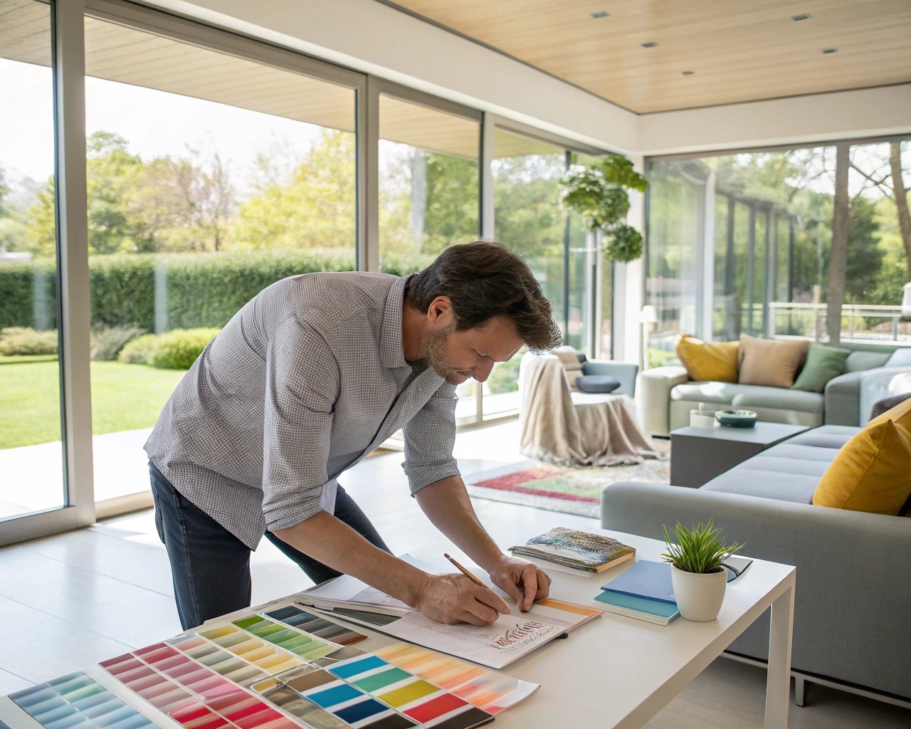
How to Choose Colors That Reflect Your Personality:
-
Identify your desired emotional response: Do you need a calm space or an energetic one? Are you entertaining or seeking intimacy?
-
Bring inspiration images: During the discovery process, gather photos of spaces that resonate with you emotionally
-
Consider room function: Match color psychology to the room’s purpose (relaxation, socialization, creativity, focus)
-
Test before committing: Paint large sample patches on different walls to observe how the color changes with lighting throughout the day
-
Build a whole-home palette: Create a cohesive color story that flows from room to room while serving each space’s unique purpose
Avoiding Common Color Mistakes:
- Choosing colors that feel trendy but don’t align with your emotional needs
- Selecting colors without considering natural and artificial lighting
- Using overwhelming saturation levels (especially with bright colors)
- Ignoring the psychological impact in favor of purely aesthetic considerations
- Failing to test colors in the actual space before full application
The Luxury of Thoughtful Color Selection
Certain colors consistently make spaces look more expensive and sophisticated. According to designers, shades like navy blue, olive green, and oxblood red create an immediate sense of luxury.
When designer Holly Kopman selects rich-looking hues, she looks for “colors that feel like suede when you look at them”—colors with depth and subtle complexity that change beautifully as light shifts throughout the day.

