
17+ Beautiful Living Room Color Ideas for Your Home
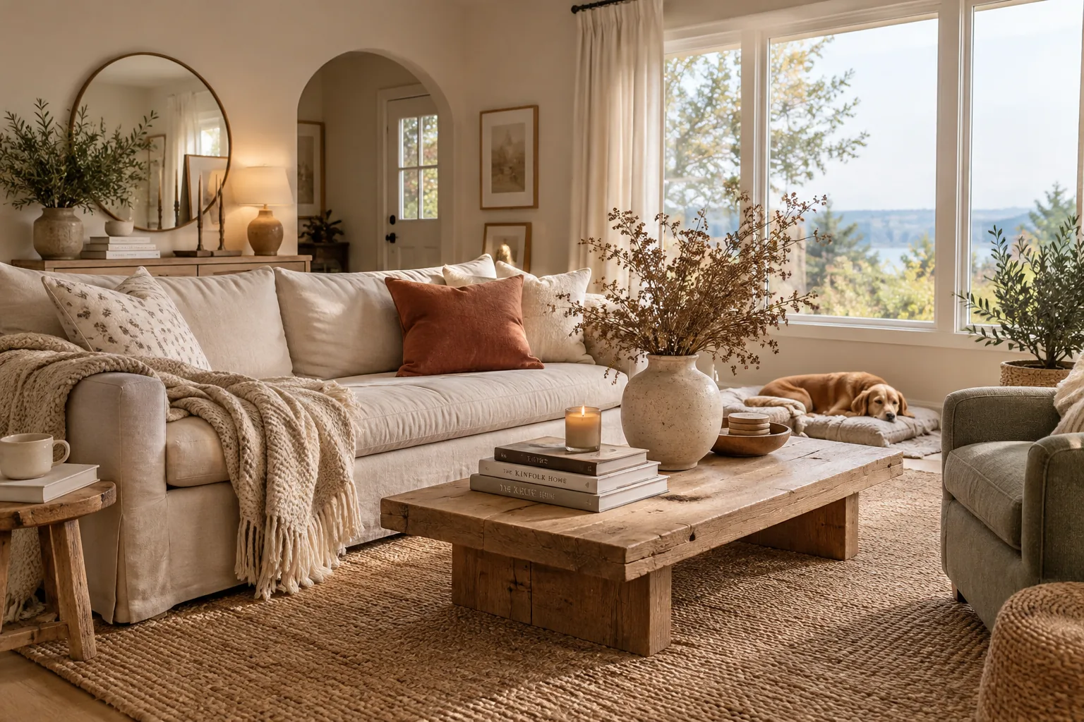
Choosing a new palette for your space is the fastest way to completely change its mood. I put together these practical color combinations so you can skip the guesswork and get straight to decorating.
1. Earthy Olive Green
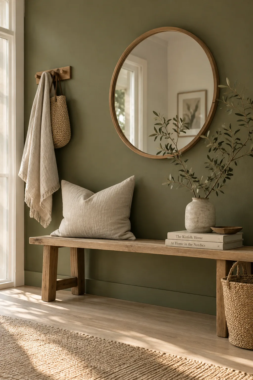
I always start with earthy olive green when a client wants color but fears anything too bright. It acts just like a neutral while bringing a rich, grounded warmth to your main seating area.
2. Warm Terracotta and White
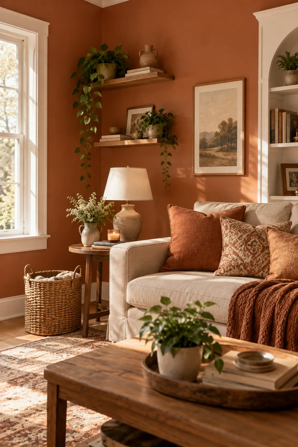
Layering warm terracotta over crisp white trim creates an instant sense of cozy architecture. It draws the eye upward and highlights your room's natural bones.
You just need a few matching accent pillows to tie the whole look together.
Keep your larger furniture pieces in soft beige tones to let the walls shine.
Why it works: The high contrast between the rusty orange and pure white keeps the room feeling fresh rather than heavy.
3. Monochromatic Charcoal Gray
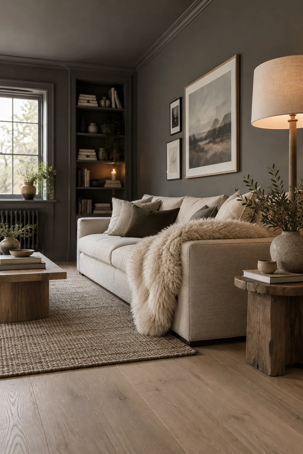
My favorite trick for small spaces is painting the walls, trim, and ceiling in the same soft charcoal gray. This continuous sweep of dark color blurs the edges of the room and makes it feel incredibly expansive.
4. Navy Blue and Mustard
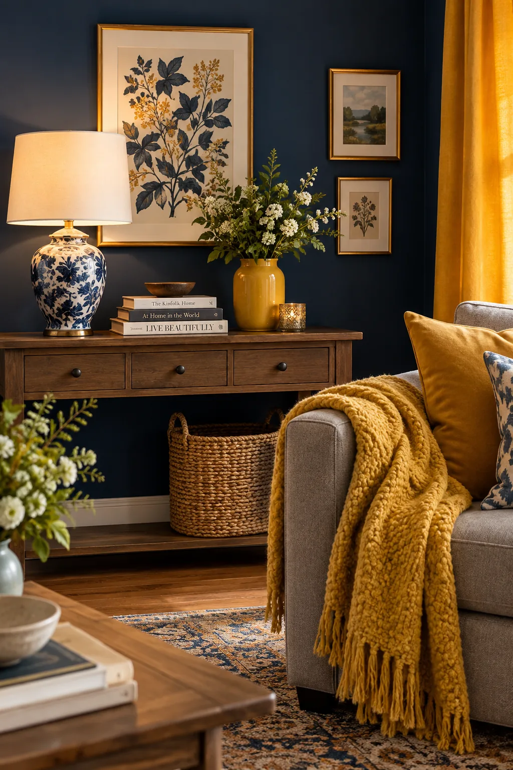
A 60-30-10 ratio is the golden rule for balancing navy blue and mustard.
Use the dark blue for your walls as the main 60 percent. Let a neutral gray sofa cover the 30 percent, and pop in that vibrant mustard on your curtains and throw blankets for the final ten.
5. Deep Emerald Green
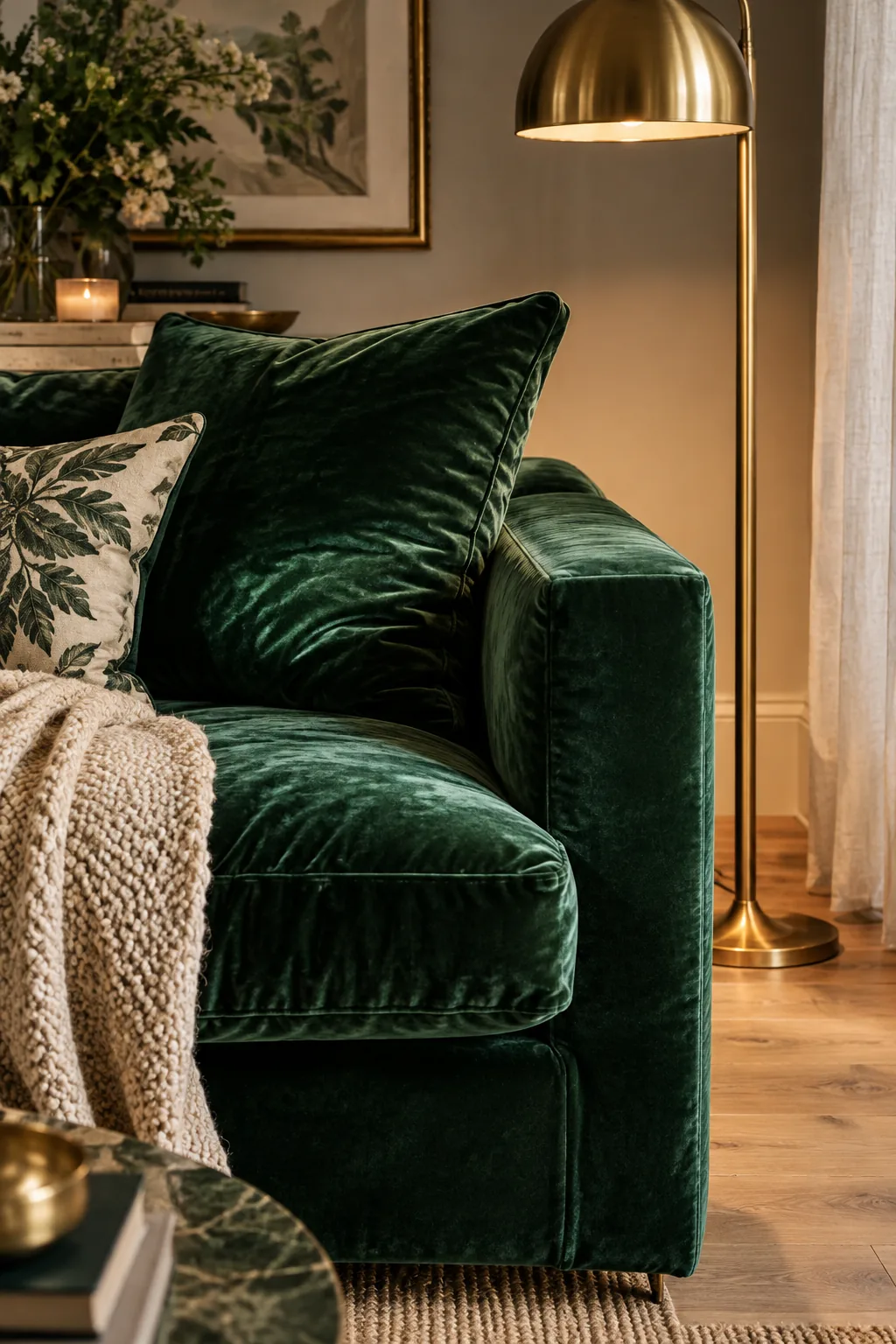
Anchoring a room with a deep emerald velvet sofa sets a luxurious foundation for the rest of your colors. You can easily build around it with brass light fixtures and light oak floors. The metallic hits bounce light around the dark upholstery.
Just avoid matching your curtains to the couch so the space does not feel like a cave.
6. Dusty Light Blue
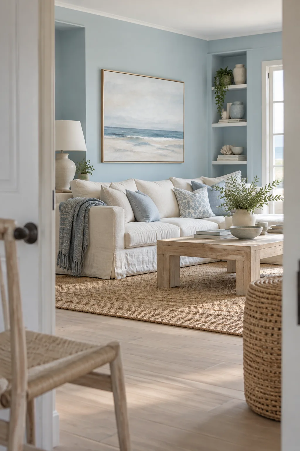
A serene, coastal vibe comes together effortlessly when you mix dusty light blue with warm sandy textures. Paint your walls in a matte finish to absorb the natural light and keep the color soft. Bring in a chunky jute rug to ground the airy tones above. Add a few pieces of bleached wood furniture to carry that beachy feeling throughout the space. The result is a calm retreat that never feels overly themed.
7. Tonal Blush Pink
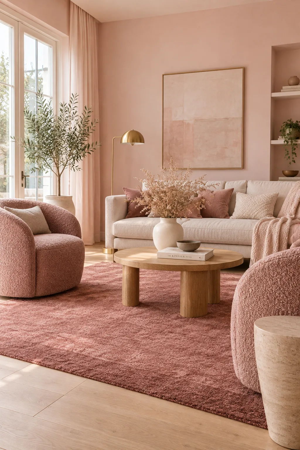
Three distinct shades of blush pink will keep a monochromatic room from falling flat.
Paint the walls the lightest tint, choose a mid-tone for your accent chairs, and use a deep rose for your area rug. This subtle stepping of colors creates depth without needing to introduce a completely new hue.
8. Matte Black Accents
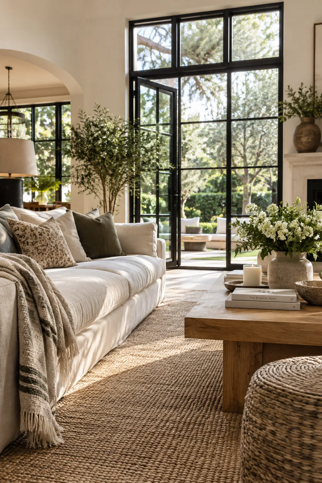
Grounding an airy room with matte black window frames pulls your eye straight to the view outside. The dark contrast acts like a picture frame for your yard while giving the interior a modern, tailored edge.
9. Warm Mushroom Greige
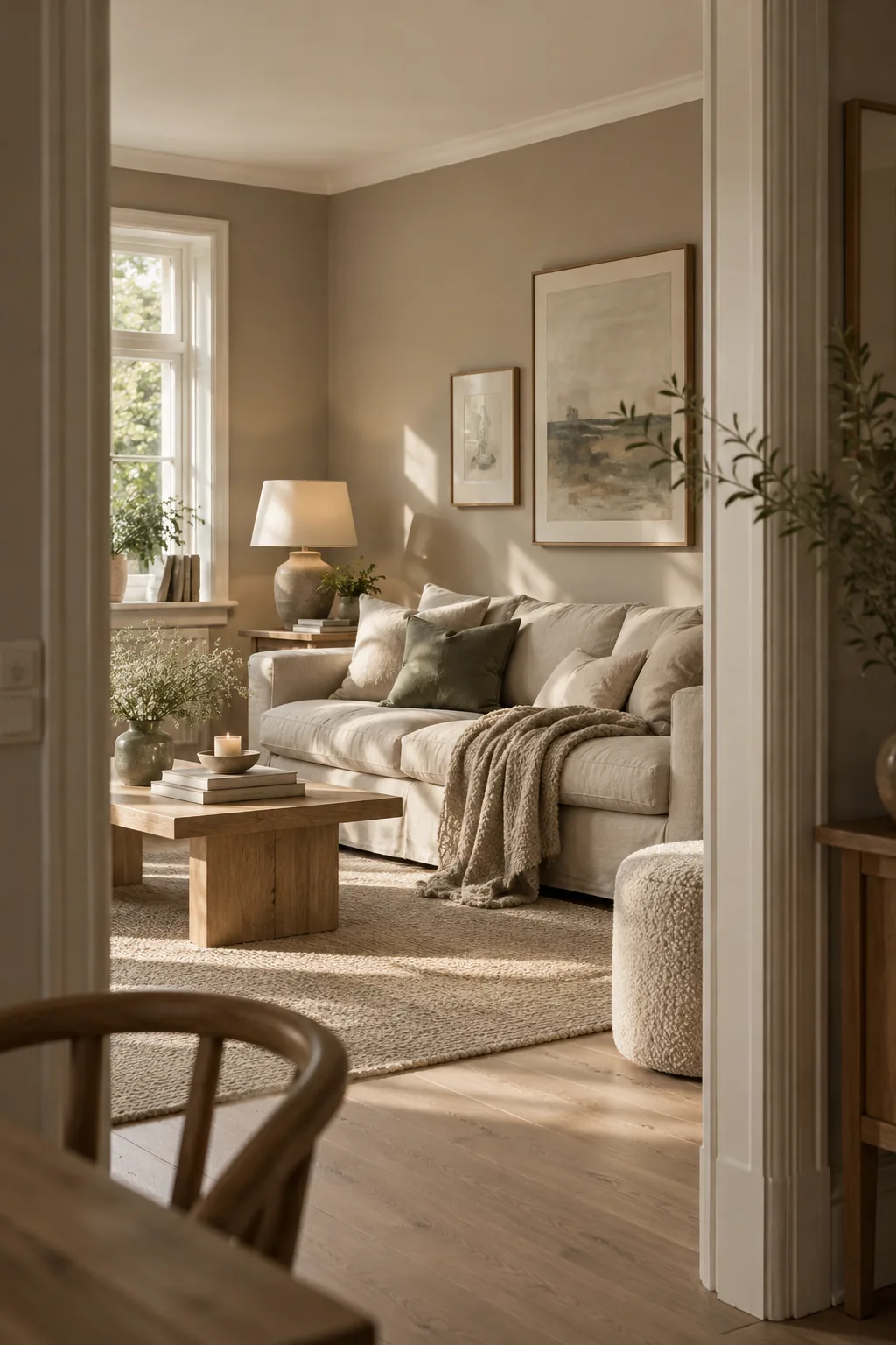
I recently updated my own living room using a base of warm mushroom greige.
It completely changed the way the afternoon light filters through the space. The walls shift from a cool stone in the morning to a cozy taupe by evening.
Pair it with crisp white ceiling paint to keep things looking intentional.
10. Glossy Chocolate Brown
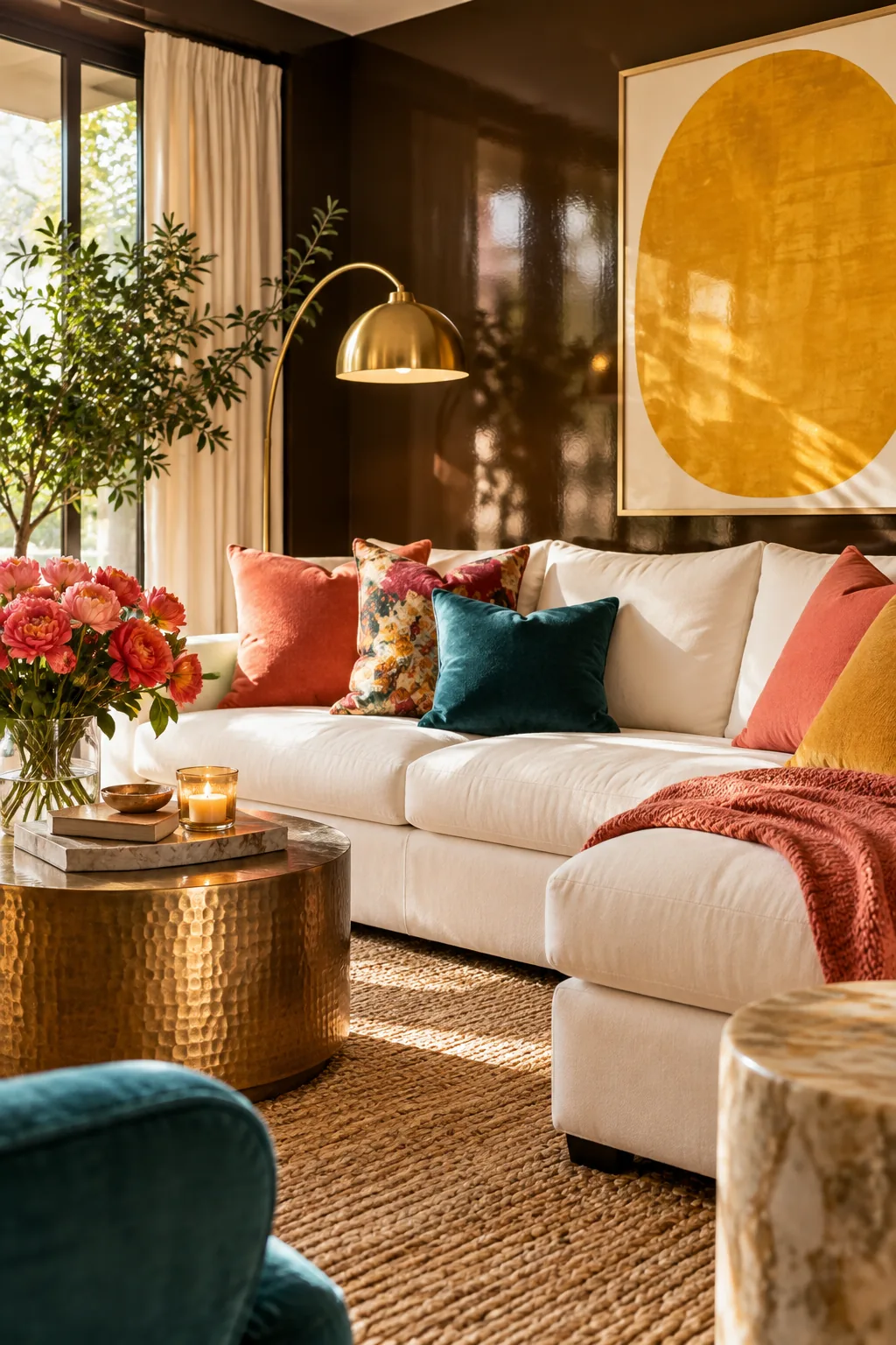
Two coats of glossy chocolate brown paint can turn a boring focal wall into a massive statement piece. To pull this off without making the room too dark, you need to balance the heavy walls with a few specific bright elements.
- Crisp white ceiling paint
- Light oak flooring
- Polished brass light fixtures
11. Burgundy Wainscoting
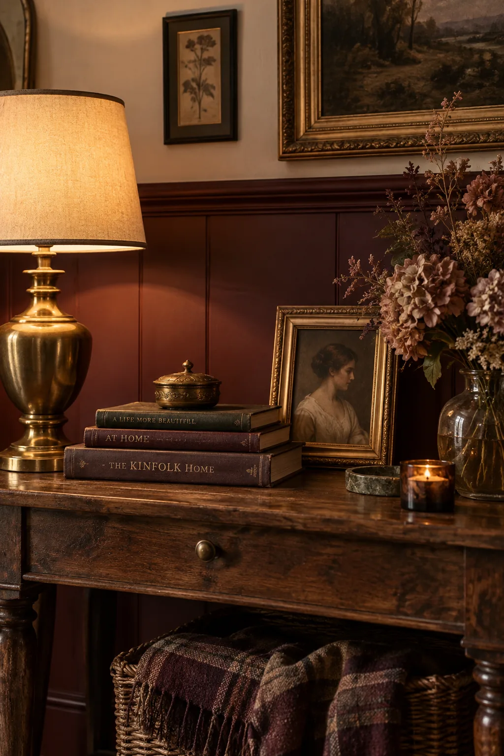
A moody, historic aesthetic is incredibly easy to achieve with burgundy wainscoting.
Run the dark red paneling up to the chair rail and top it with a creamy off-white wallpaper. This traditional split keeps the heavy color grounded at furniture level while the upper half breathes.
12. Bright Jewel Tones
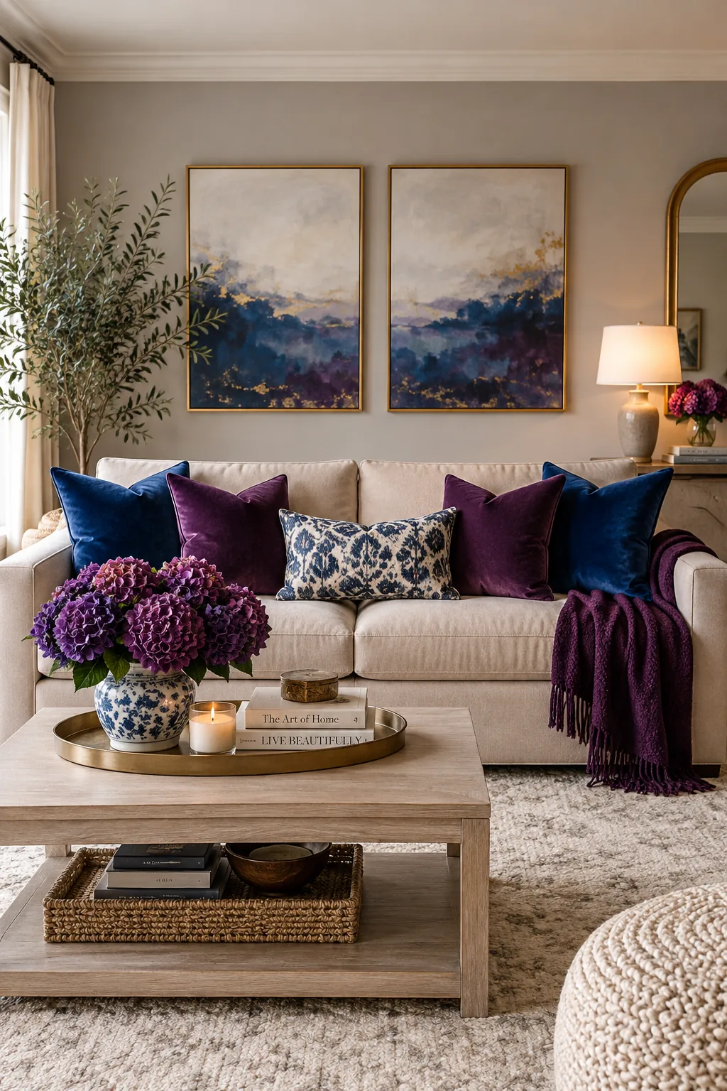
Exactly 50 percent of your room should be neutral if you want to use bright jewel tones.
This prevents the bold colors from fighting each other for attention. You can safely mix sapphire and amethyst as long as your background is quiet.
Bring in these vibrant shades through easily swappable textiles.
- Velvet throw pillows
- A patterned vintage rug
- Thick cotton curtains
13. Seamless Sage Green
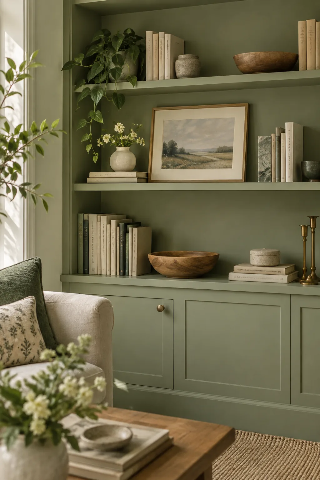
Painting your built-in bookcases the exact same soft sage green as the walls makes the room feel custom and expensive. The seamless color hides clutter beautifully and lets your books and art become the true focal points.
14. Strong Slate Blue
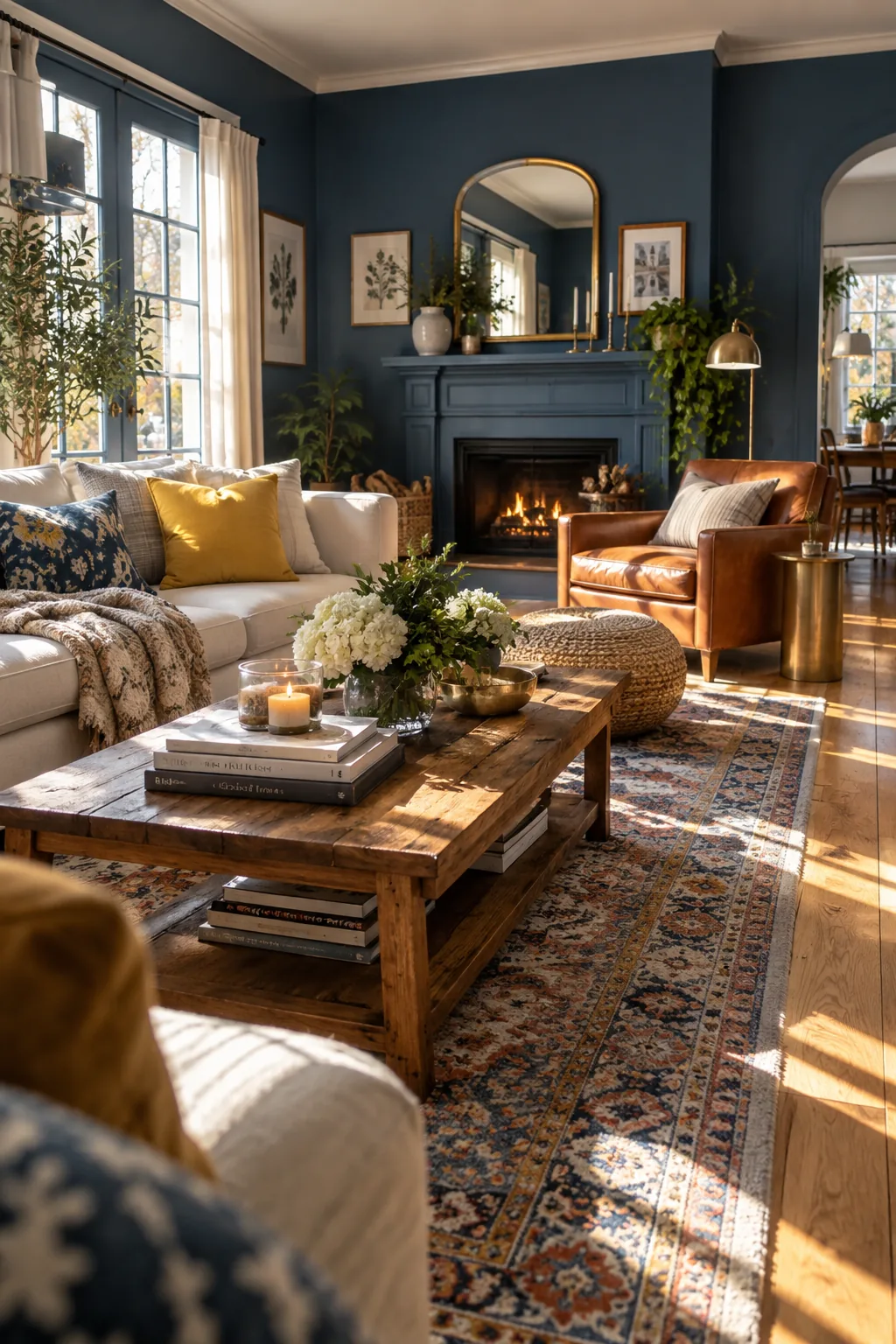
South-facing rooms wash out delicate colors with intense afternoon sunlight.
You need a strong slate blue to stand up to that harsh natural lighting. It holds its depth all day long.
Warm up the cool tones with a rich leather armchair.
Why it works: The blue absorbs the intense yellow light from the sun, creating a perfectly balanced, neutral-feeling space.
15. Art-Inspired Palette
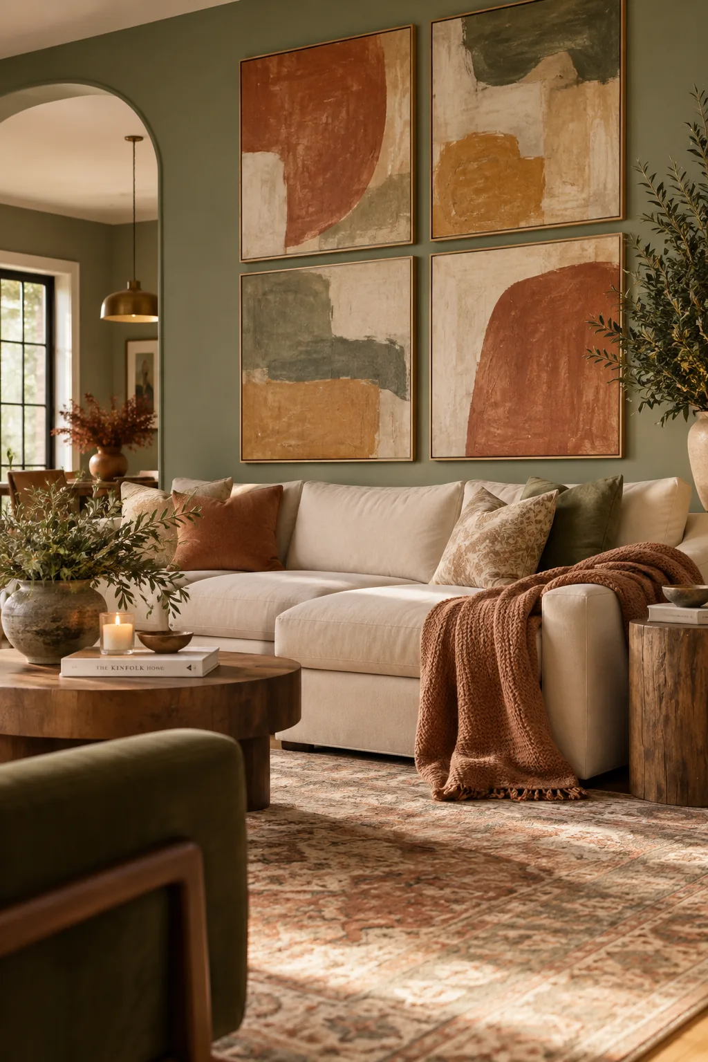
Four large-scale art pieces are enough to dictate your entire living room color palette.
Pull the least dominant color from the canvas and use it for your wall paint. This subtle matching trick makes the artwork pop while making the whole room feel professionally curated.
16. Warm Plaster Limewash
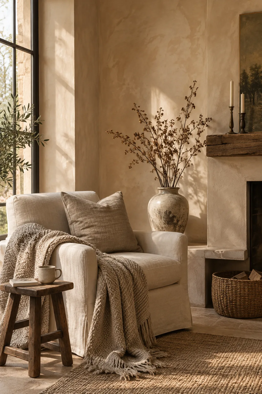
Limewashing your walls in a warm plaster tone adds instant texture that flat paint just cannot replicate. The mottled finish catches the light differently on every wall, creating shadows that act as their own accent colors.
It takes a bit of elbow grease, but the old-world charm is totally worth it.
17. Creamy Linen White
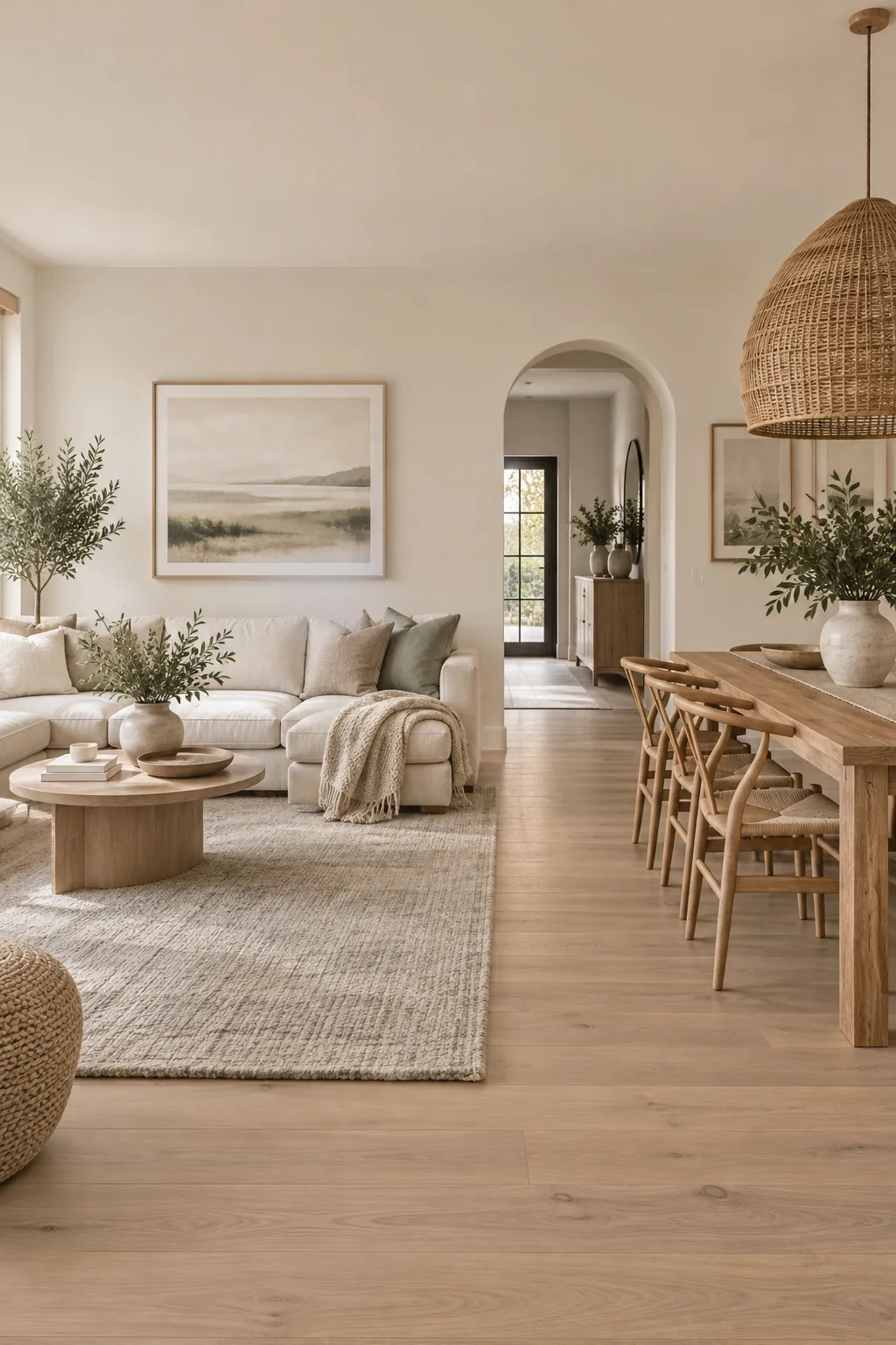
Open concept homes struggle with color transitions between the living and dining areas.
Using a consistent creamy linen white on all the walls provides a seamless flow. You can then define the separate zones using different colored area rugs and oversized light fixtures.
Why it works: The continuous wall color prevents the space from feeling chopped up, while the rugs act as visual boundaries on the floor.
18. Tinted Ceiling Paint
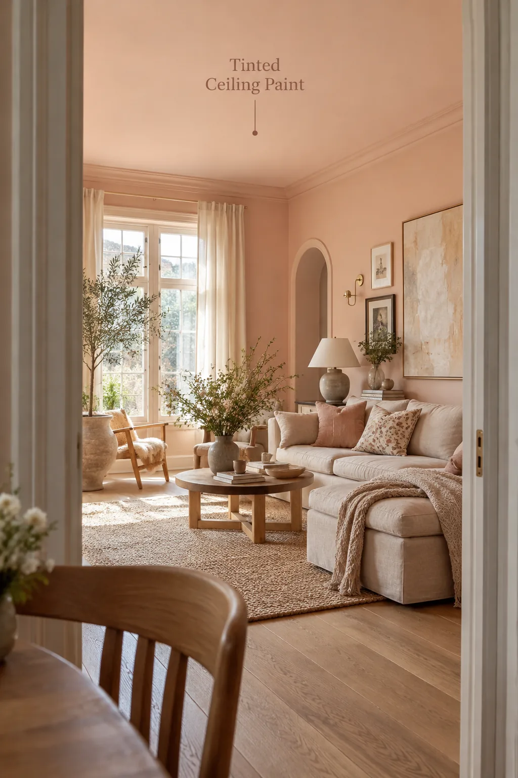
Paint your ceiling a shade lighter than your walls to make it look taller.
If you are using a soft peach on the drywall, ask the paint store to mix a version at 25 percent strength for the ceiling.
This subtle tint draws the eye up without creating a harsh line at the crown molding.