
17+ Clever Back to School Bulletin Board Ideas
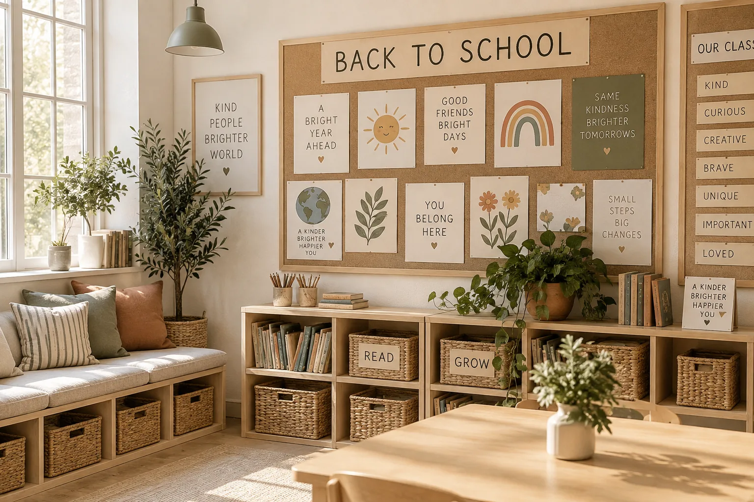
August always sneaks up on us, bringing that familiar itch to refresh our spaces for the new school year. Here are my favorite ways to style a bulletin board that looks amazing without taking up your entire weekend.
1. Hang a pennant banner
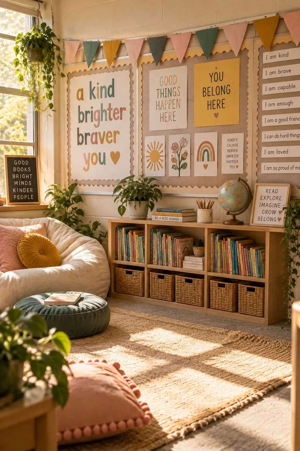
Paper pennants instantly fill dead space.
You just string some colorful triangles across the top edge of your board. It draws the eye up and hides any uneven stapling along the border. I usually stick to three alternating colors to keep it from looking chaotic.
Why it works: It works because the repeating geometric shapes create an anchor for whatever you pin underneath.
2. Layer your borders
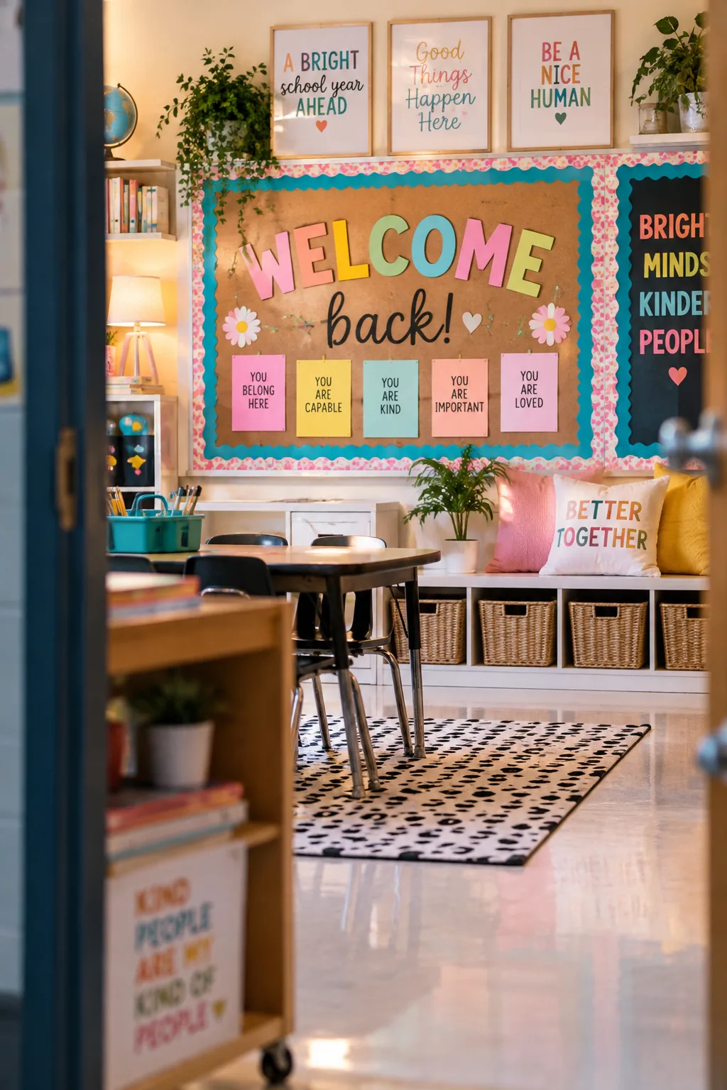
A standard cork board needs at least two layers of border to look finished. I like to start with a thick, solid-colored scalloped trim and layer a thinner patterned border right on top. This adds instant depth without requiring any fancy background paper. You can secure both layers at once using standard staples every six inches.
3. Use fabric instead of paper
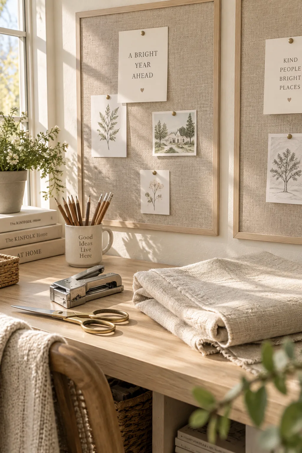
My absolute favorite trick for a quick refresh is using fabric backgrounds instead of paper. It never tears when you pull out old staples, and the texture makes the whole display feel warmer. You just need a few basic supplies to pull this off.
- Two yards of cheap cotton fabric
- A heavy-duty stapler
- Iron-on hem tape for clean edges
4. Go dark with the background
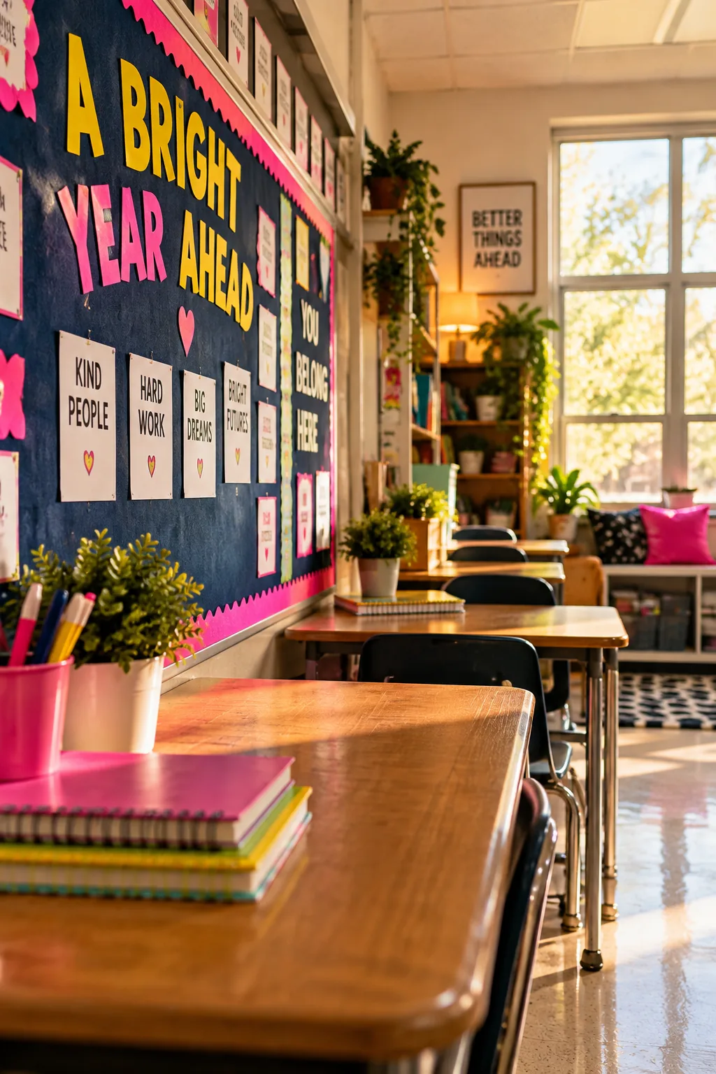
Darker backgrounds make brightly colored student work pop right off the wall. Most people default to pastel or white paper, but a navy blue backdrop completely changes the vibe of the room. It hides staple holes brilliantly and won't show fading from the sun halfway through October. I pair it with bright yellow or neon pink lettering to create a sharp, high-contrast look. Even simple white flashcards look totally custom against that deep blue.
5. Glue clothespins to tacks
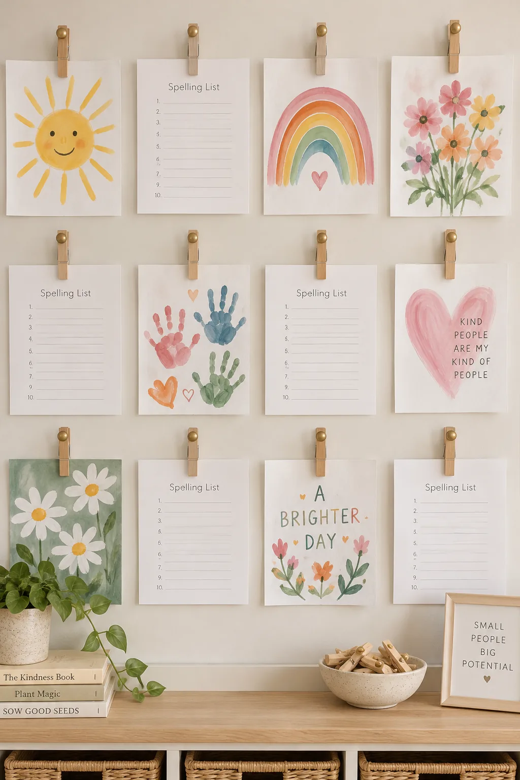
I always keep a stash of clothespins glued to thumbtacks for my displays. It lets you swap out weekly spelling lists or art projects in exactly five seconds without ripping the paper.
Why it works: It works because the pinch mechanism takes the wear and tear instead of your display materials.
6. Make giant 3D flowers
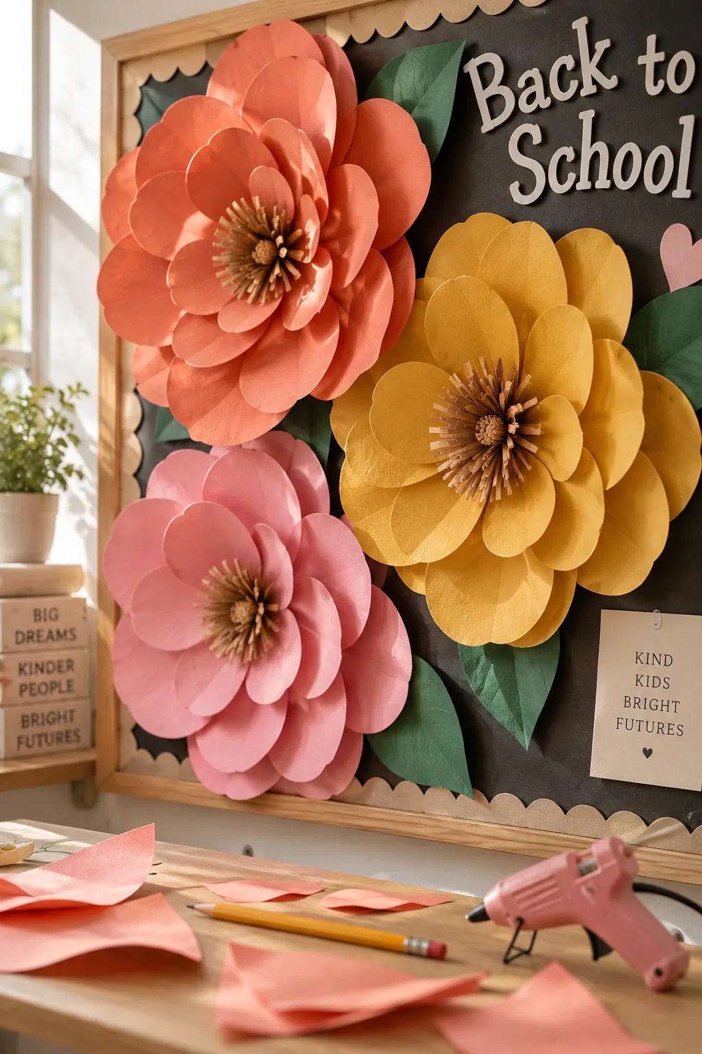
Oversized paper flowers take up massive amounts of visual real estate.
You can cover half a board with just three giant blooms. I curl the petal edges around a pencil to give them a lifelike 3D effect.
They look incredibly intricate but only require standard cardstock and a hot glue gun.
7. Color-code the information
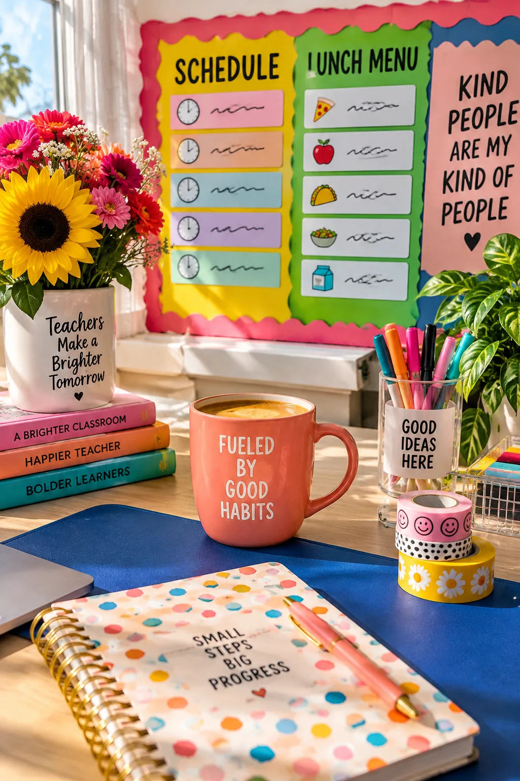
Group your information clusters by color to help kids navigate the board. Put all the daily schedule cards on yellow backing, and keep the lunch menus on green. This visual sorting stops the board from looking like a giant messy collage. It trains their eyes to jump straight to the information they actually need.
8. Add 3D shelves
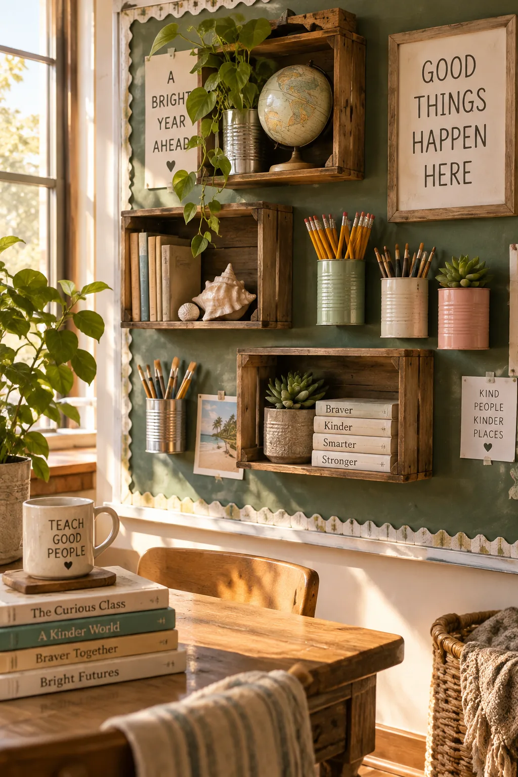
Three-dimensional elements hold a reader's attention roughly twice as long as flat paper. Stapling up empty paint cans or lightweight wooden crates creates actual shelves right on your bulletin board for displaying real objects.
9. Create a photo border
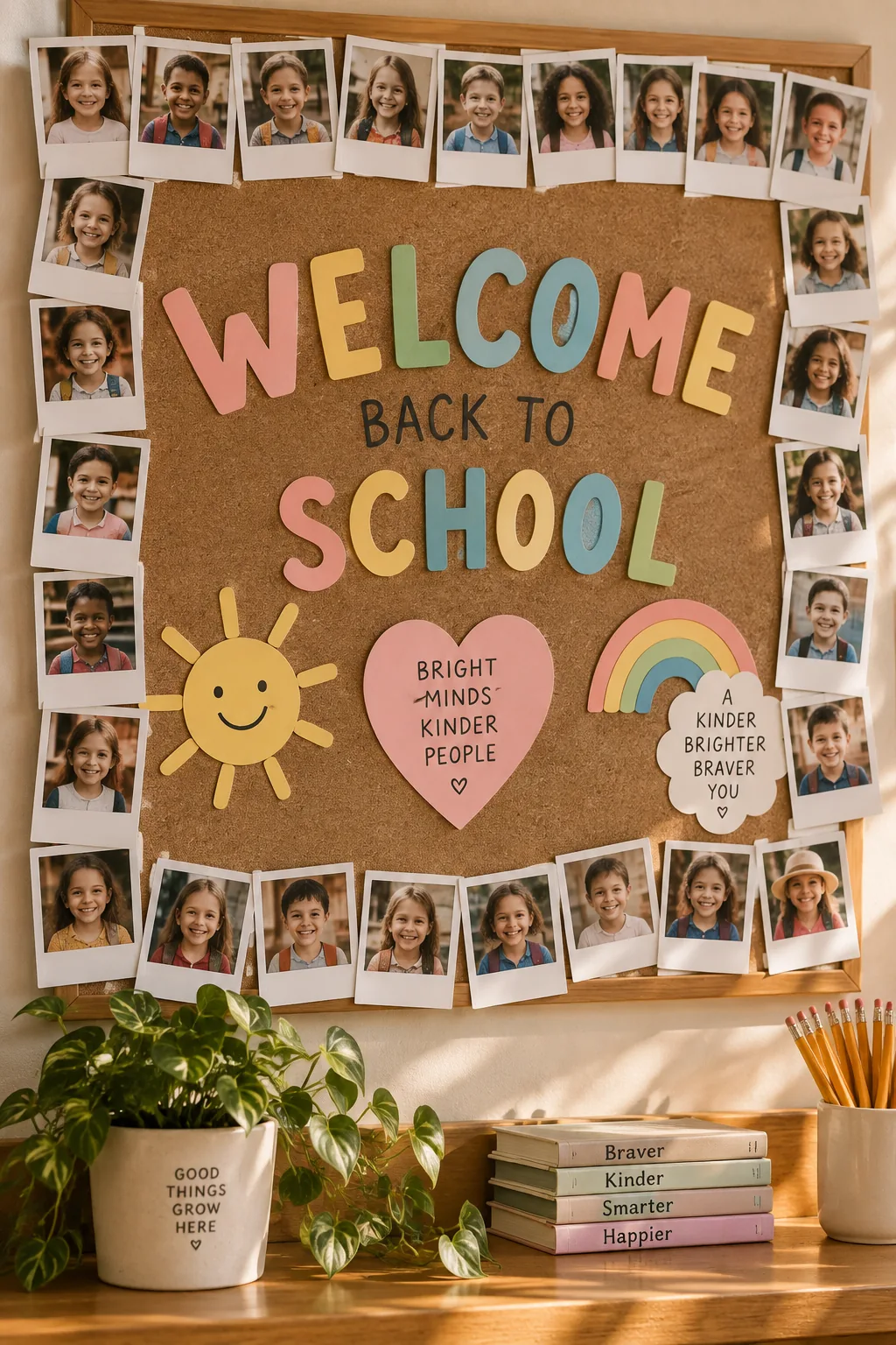
Instant-style photos give a room an immediate community feel.
Taking a quick snapshot of each child on the first day creates the perfect personalized border. I leave a thick white margin at the bottom of each print for them to write their own names.
You only need a few things to set this up.
- A basic photo printer
- Square photo paper
- Black permanent markers
10. Stick to one color family
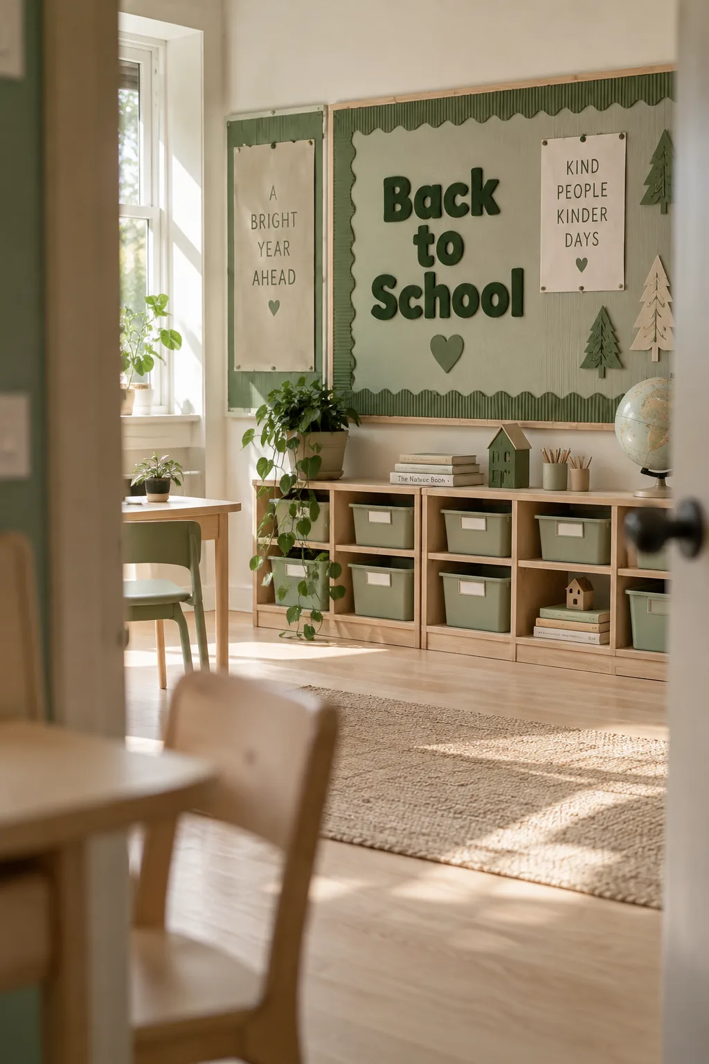
A clean, minimalist aesthetic comes easily when you stick to a monochromatic color scheme. Using varying shades of green for the background, border, and lettering feels incredibly soothing in a busy space. You can introduce texture through corrugated cardboard or felt letters to keep it from falling flat. This approach looks highly intentional and cuts your decision fatigue in half.
11. Hang paper pockets
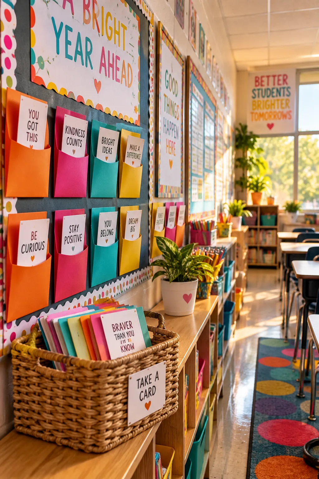
Interactive elements turn a static display into a daily destination. I love hanging small paper pockets filled with daily brain teasers or positive affirmations. The kids actually stop to engage with the board instead of just walking past it. Keep a few items nearby to make it functional.
- A small cup of pencils
- Blank sticky notes
- A drop box for answers
12. Cut letters from felt
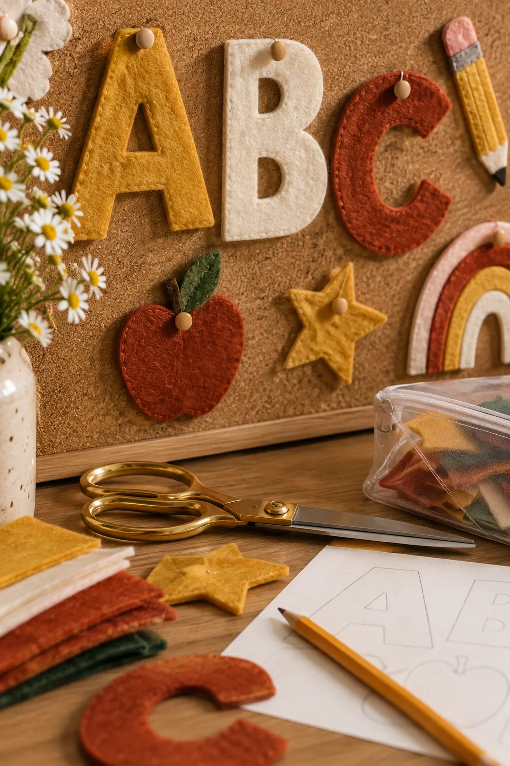
Standard bulletin board letters fade noticeably after just three months under fluorescent lights. I trace my letters onto heavy-duty felt and cut them out instead. They look warmer, cast a nice little shadow, and last for years without losing their color.
Plus, you can just toss them in a plastic storage bag when the year is over.
13. Braid a yarn border
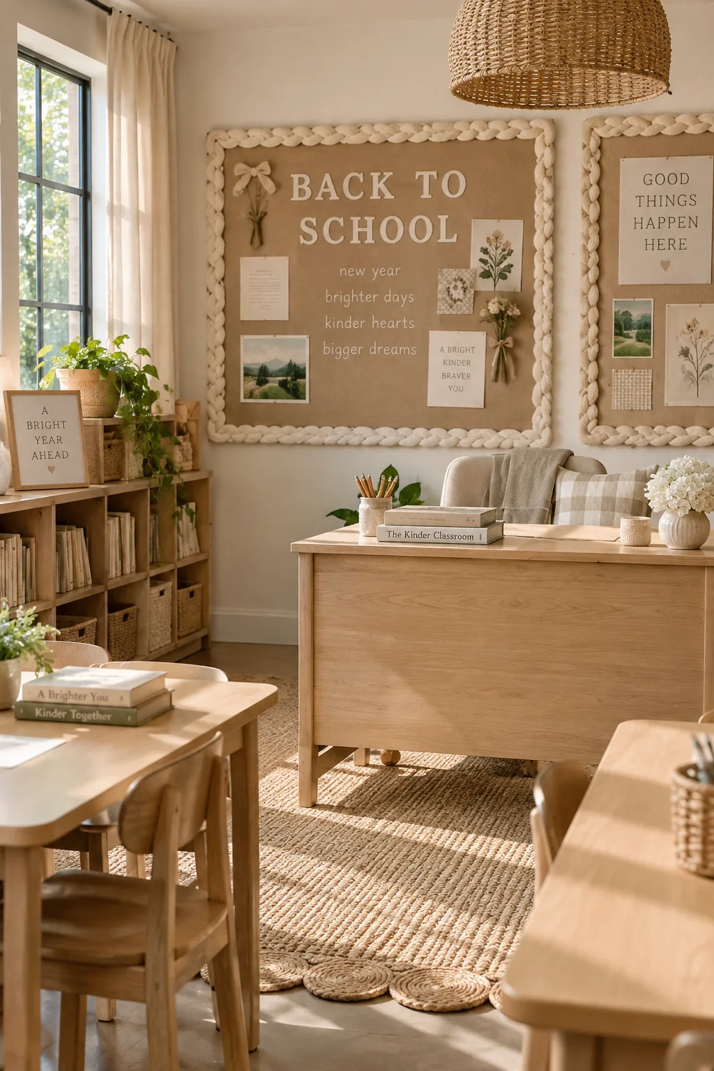
Chunky yarn makes an incredible, unexpected border material.
You can braid three thick strands together and staple it right over the edges. It softens the hard corners of the frame beautifully.
The texture brings a cozy, living-room vibe to an otherwise institutional space.
14. Map out a neat grid
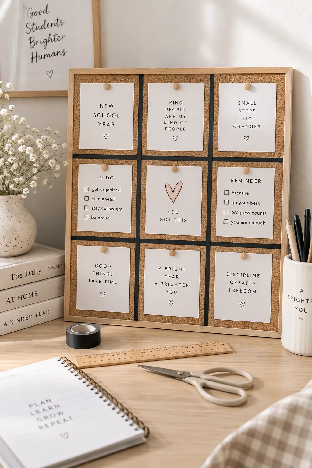
The sheer simplicity of a grid layout is what keeps a board looking professional.
Using thin black tape to divide your board into equal squares gives every piece of paper a designated home. It totally eliminates that chaotic, overlapping look.
Grab these supplies to map out your grid.
- Thin black masking tape
- A long level
- A measuring tape
15. Frame it with lights
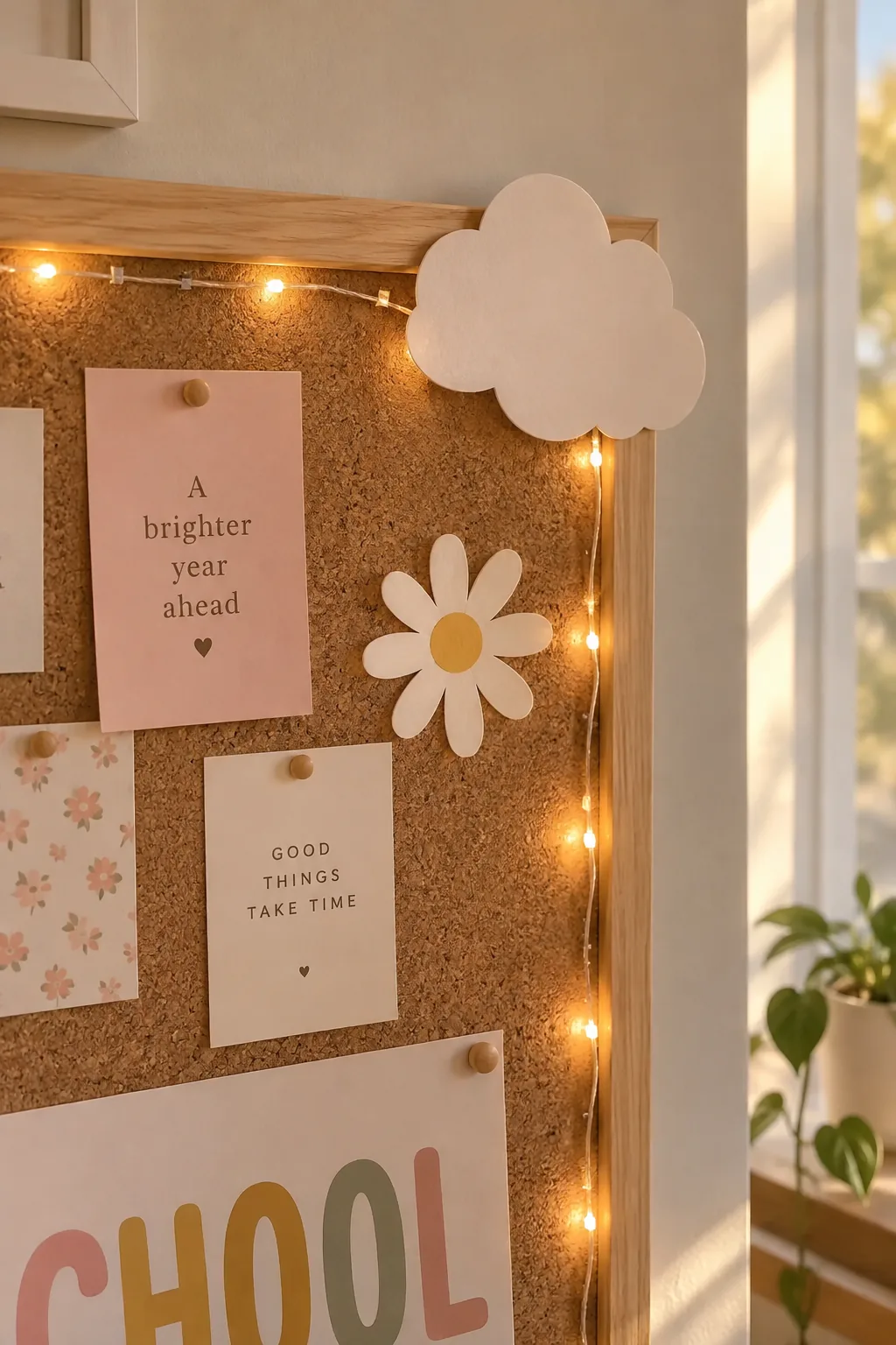
Hang a string of fairy lights to frame your focal point.
Battery-operated lights weigh almost nothing and staple easily to the cork. They cast a warm glow that makes early dark mornings feel a lot more welcoming.
I tuck the battery pack behind a large paper cutout so it stays completely hidden.
16. Layer old book pages
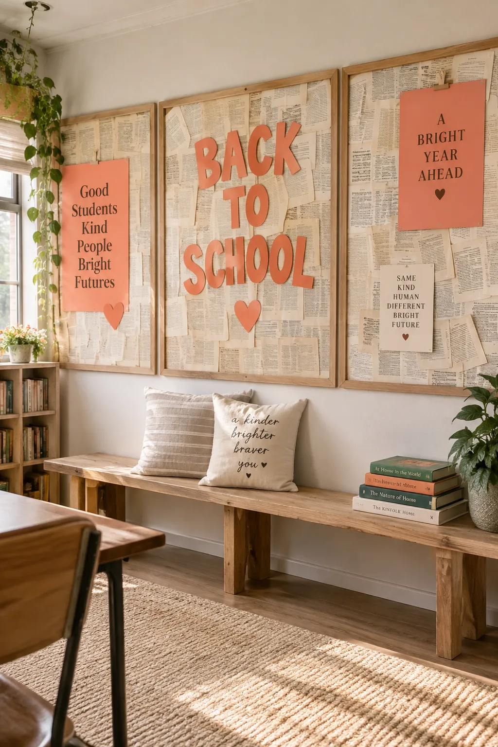
I am slightly obsessed with using repurposed book pages as a background layer. You can pick up damaged dictionaries at thrift stores for pennies and staple the pages up in a staggered, overlapping pattern. It creates this beautiful, subtle texture that feels incredibly appropriate for a learning space. Just make sure to use solid, bright letters on top so your title stands out against the text.
17. Mount wooden clipboards
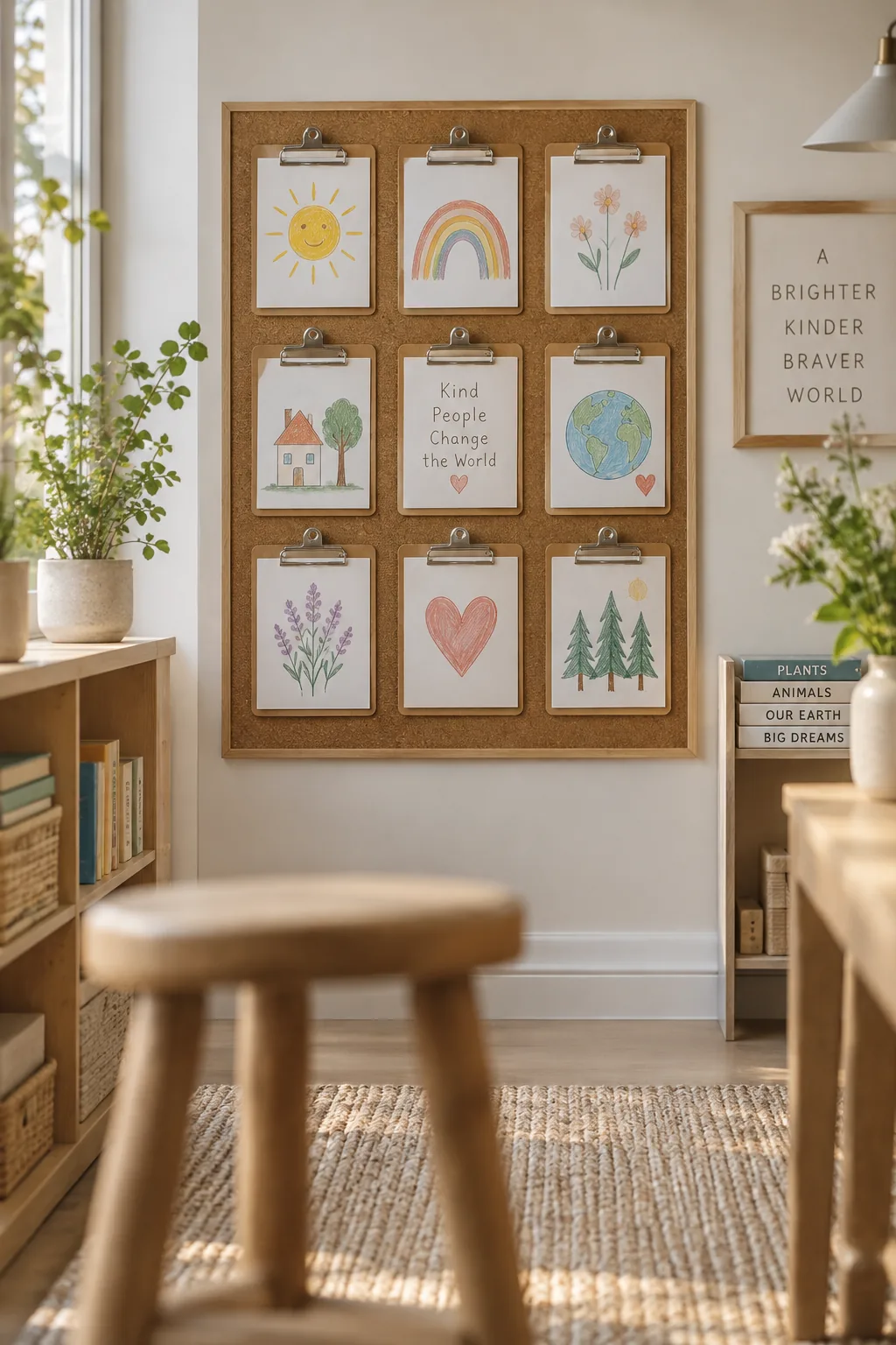
Hanging clipboards instantly upgrade the look of student work.
You just mount nine wooden clipboards in a perfect square directly onto the cork. It gives the board a clean, gallery-wall feel and makes switching out assignments effortless. The wood tones also add a nice natural element to the room.
18. Start with black and white
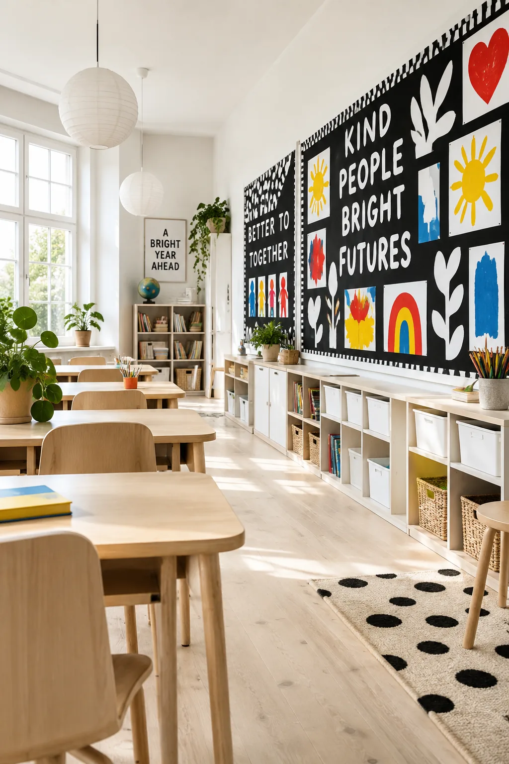
The high contrast of a black and white theme is what makes it so striking.
You use a black background with bold white typography, then let the kids' artwork provide all the color. This setup prevents the board from clashing with the seasonal projects that go up throughout the year. It acts like a blank canvas that always looks highly intentional.