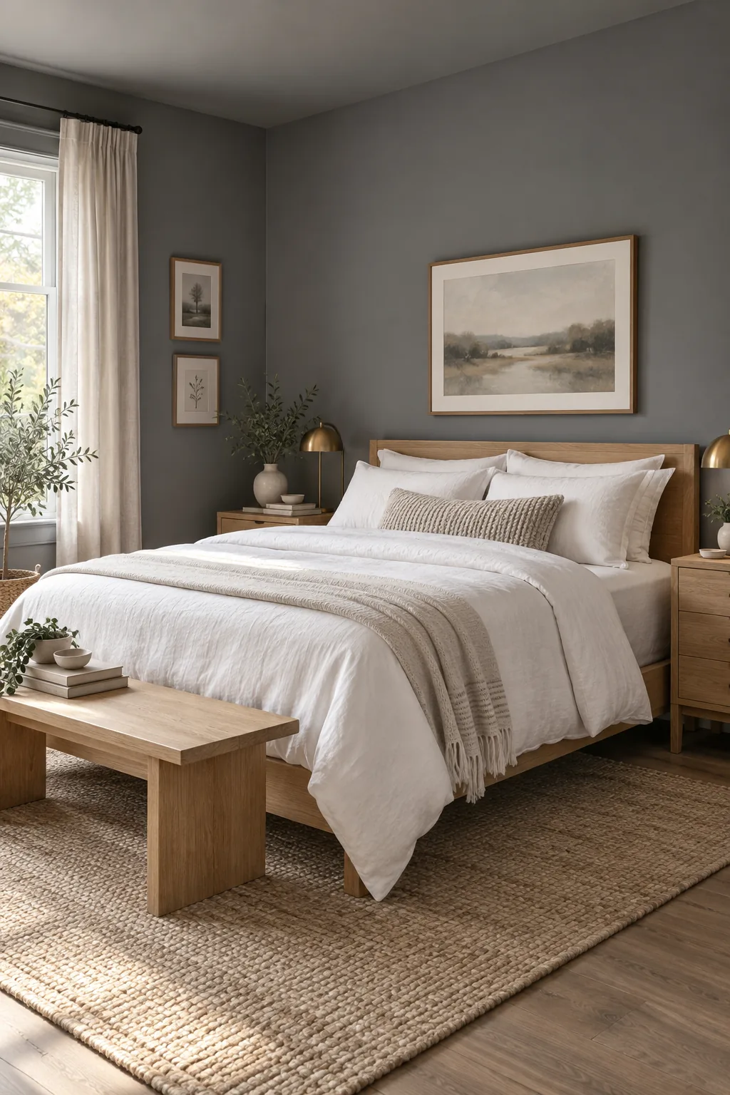
Bedroom Colors for a Restful Retreat: LRV & Finish Chart
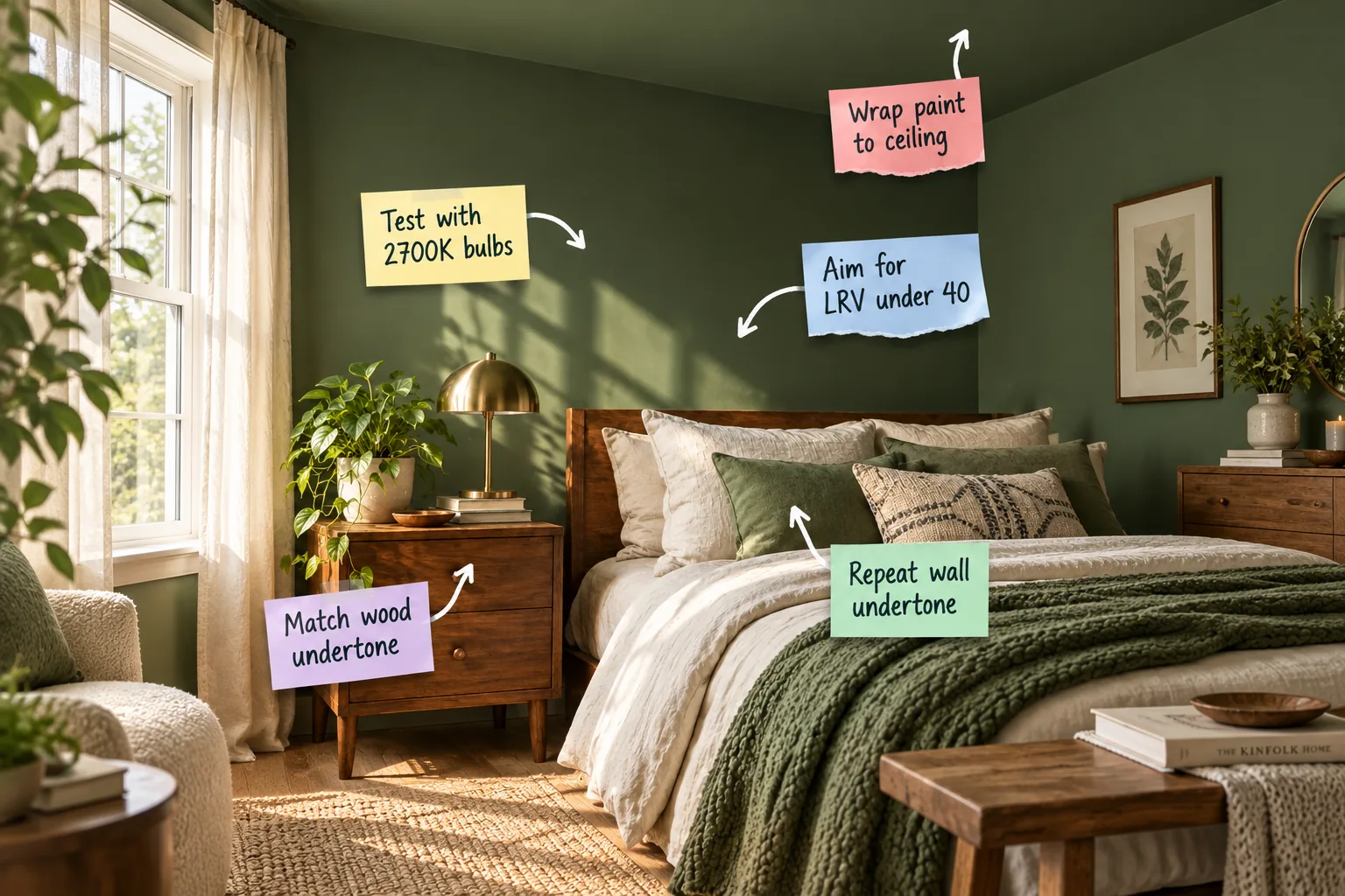
To create a deeply soothing retreat with the right lighting and coordinated bedding, you need our bedroom paint LRV and finish chart to find your perfect moody shade. I use this exact system to balance dark wall colors with warm woods so the room feels intentional and restful.
Selecting Restful Bedroom Colors with an LRV Under 40
Light Reflectance Value measures how much light a color bounces back into your space, and I always aim for an LRV under 40 to create a visually quiet atmosphere. Colors reflecting less than 40 percent of light actively absorb excess daylight, signaling to your brain that it is time to rest.
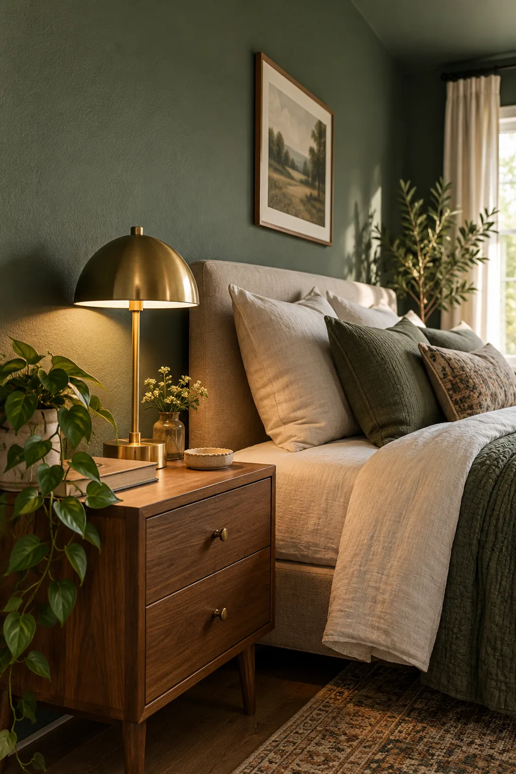
By intentionally selecting a color that absorbs light, you prevent sharp morning glare and create a den-like environment that promotes deeper, uninterrupted sleep cycles.
Balancing Natural Light in a Moody Space
Before committing to a dark color, evaluate how the sun moves through your bedroom windows during the day. Rooms with southern exposure can handle an LRV as low as 10, while northern-facing rooms need a slightly higher LRV around 35 to prevent the space from feeling like a cave.
- Southern exposure: Intense, warm daylight washes out dark colors, allowing you to use deep charcoals or forest greens with an LRV between 10 and 15.
- Northern exposure: Cool, indirect light emphasizes blue tones, so choose warm-based dark paints with an LRV between 30 and 39 to maintain coziness.
- Eastern exposure: Bright morning light fades quickly, meaning your dark walls will look vibrant early on and deeply muted by the afternoon.
Understanding these directional light patterns ensures your chosen paint color remains rich and inviting rather than flat or dreary. You can adjust your target LRV up or down a few points based on exactly when you spend the most waking hours in the room.
Your Bedroom Paint LRV and Finish Chart
To help you match your desired mood with the right sheen, use this chart to pair specific low-LRV ranges with the ideal wall and trim finishes.
| LRV Range | Vibe & Mood | Recommended Wall Finish | Recommended Trim Finish |
|---|---|---|---|
| 10–15 | Dramatic and deeply enveloping | Flat or Matte | Satin |
| 16–20 | Rich and traditionally moody | Matte | Satin or Semi-gloss |
| 21–29 | Balanced earthy retreat | Matte or Eggshell | Satin |
| 30–39 | Softly shaded and cozy | Eggshell | Semi-gloss |
In my own Denver home, choosing a flat finish for my dark walls completely eliminated the harsh glare from my bedside lamps, which is crucial when evaluating artificial light.
Before you head to the hardware store to gather swatches, it helps to know exactly where to look for this crucial measurement.
Testing Your Paint Choice with 2700K Bulbs
You must test with 2700K bulbs because this warm light drastically shifts how undertones appear, especially when you are creating a seamless spatial illusion by painting the ceiling to match the walls.
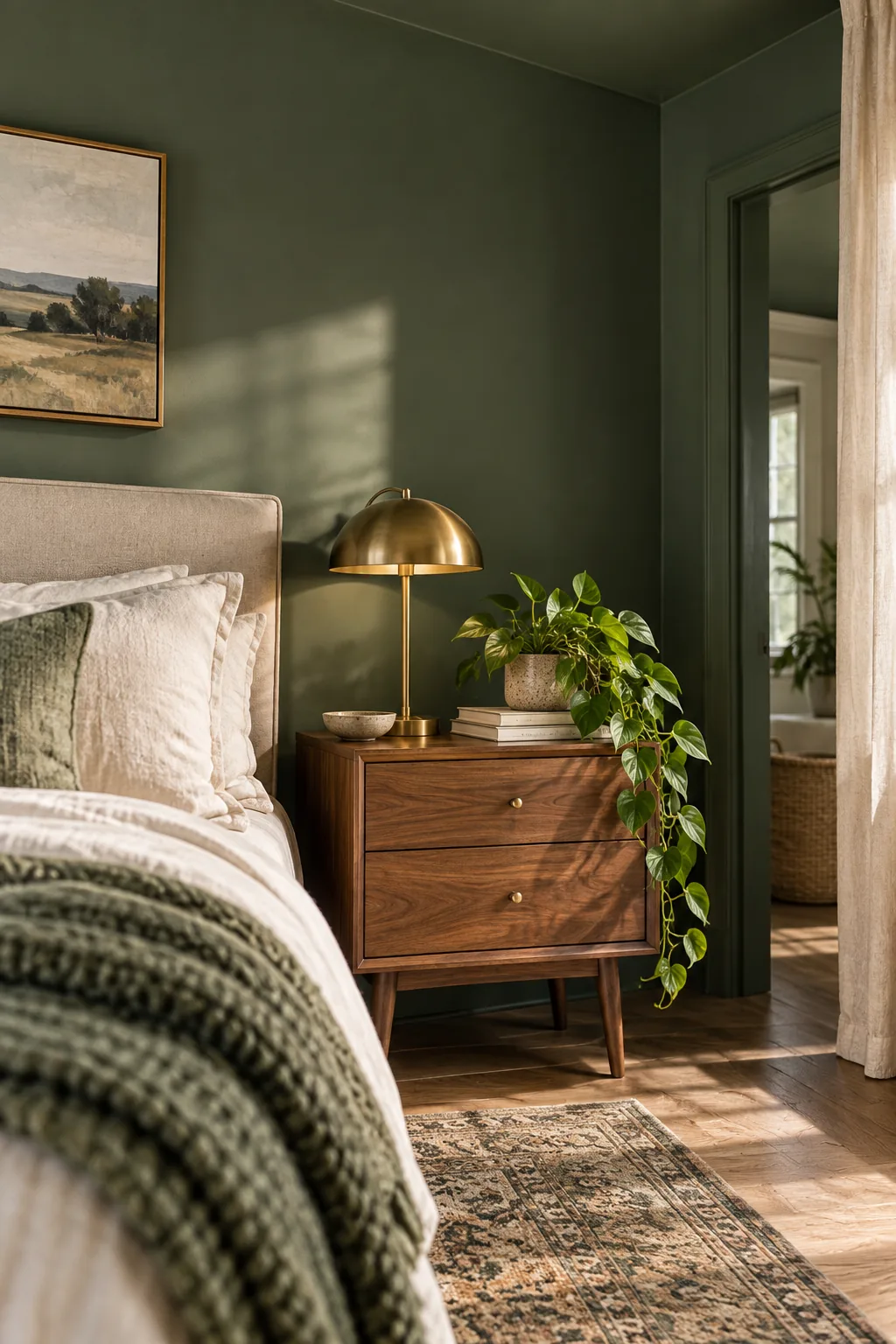
I once skipped this step in a color-drenched client project, and a beautiful sage green looked muddy gray until we swapped the cool bulbs and followed this exact testing sequence.
- Paint a large swatch on a movable piece of foam board rather than directly on your existing wall color.
- Turn off all overhead daylight bulbs and rely entirely on your bedside lamps.
- Install a 2700K bulb in your lamp and place the painted board directly in its warm glow.
- Observe the swatch at night to confirm the undertones remain rich and soothing.
Wrapping Wall Paint Onto the Bedroom Ceiling
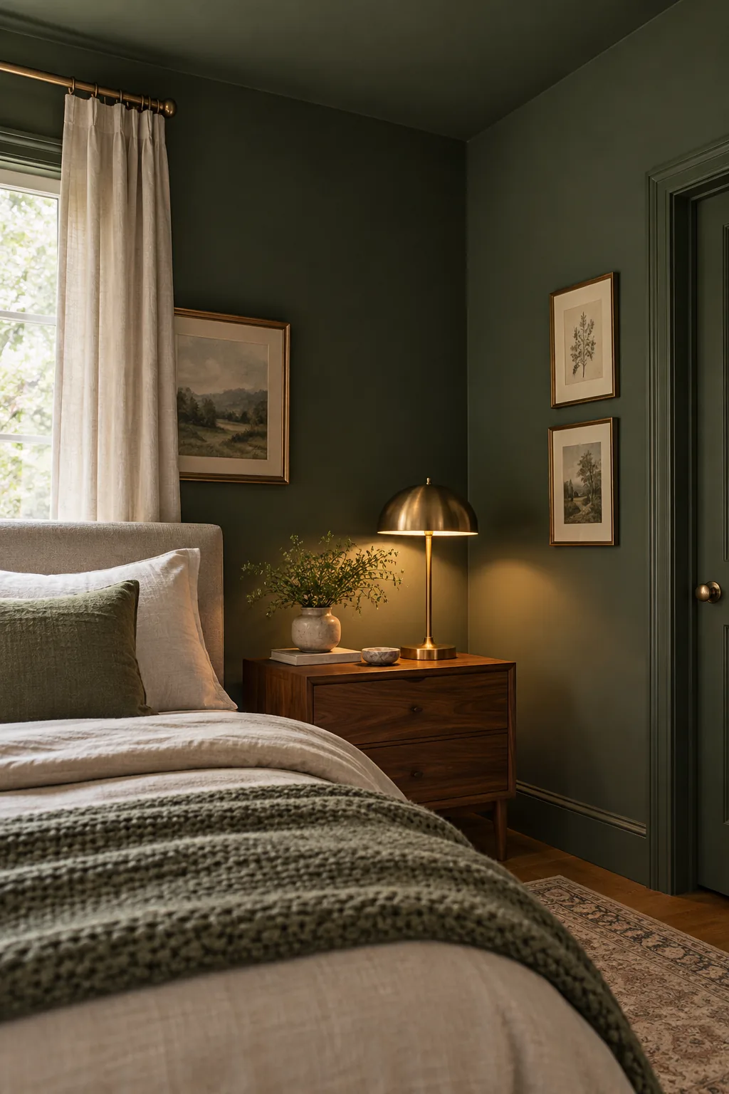
The color-drenching technique of wrapping paint to the ceiling erases the high-contrast white boundary line that visually chops a room in half. By continuing your dark wall paint overhead, you make the bedroom feel taller and significantly more enveloping.
Choosing the Right Accent Colors for Depth
A fully color-drenched room needs carefully chosen accent tones, like muted terracotta against sage green or mustard yellow against dark charcoal, to prevent the space from feeling visually heavy. These subtle shifts break up the visual expanse of low-LRV paint, ensuring your eyes have comfortable places to rest.
Matching Nightstand Wood Undertones to the Walls
To ground your moody walls, match the wood undertone of your furniture to the paint’s temperature to create harmony rather than clashing contrast. Warm walnut or oak nightstands naturally complement earthy green or brown paints by echoing their organic warmth.
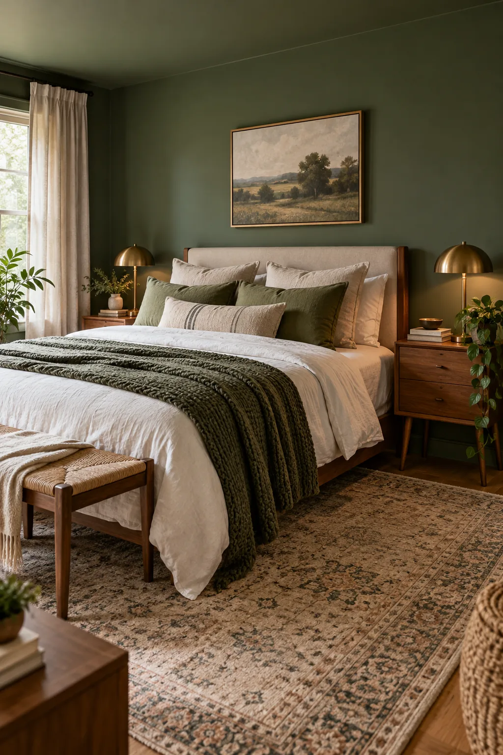
When your furniture shares the same underlying color temperature as your walls, the entire bedroom feels cohesive, grounded, and professionally designed.
Repeating the Wall Undertone in Your Bedding
You can pull the entire room together when you repeat the wall undertone in your layered pillows and duvet. Using a desaturated, lighter version of the wall color in your textured soft goods echoes the primary palette while softening the visual weight of dark painted walls.
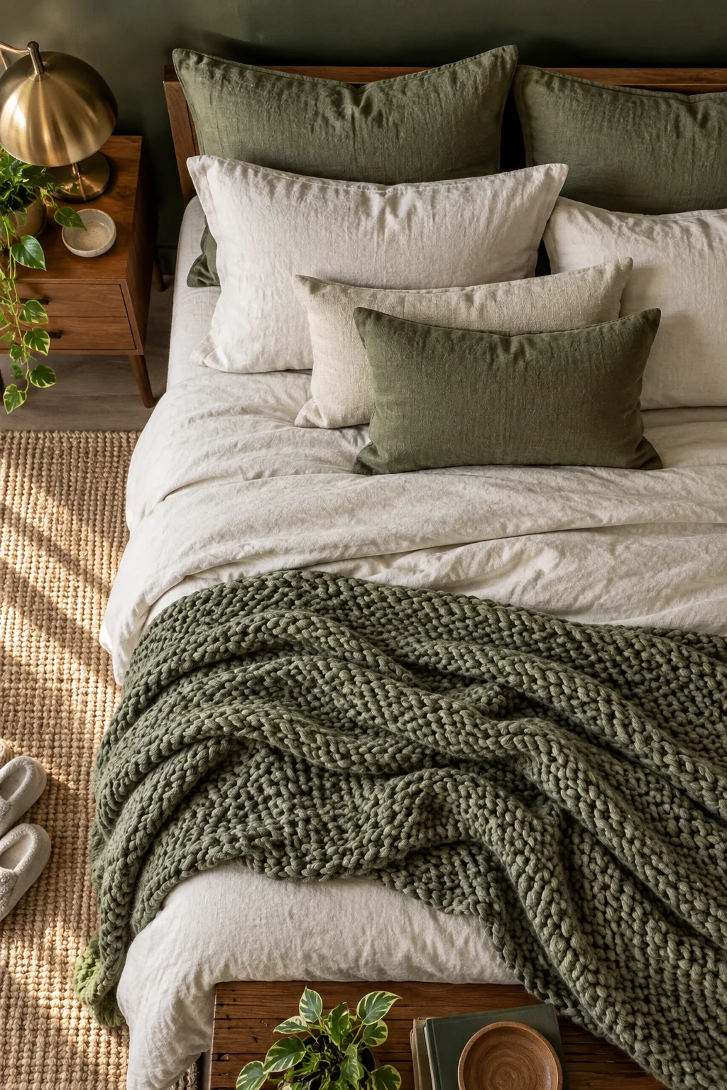
Once your core colors are established, use this quick review to ensure your bedding layers look intentional and inviting.
5 Restful Bedroom Color Palettes to Try
Explore these distinct low-LRV bedroom looks to find the perfect atmosphere for your own restful retreat.
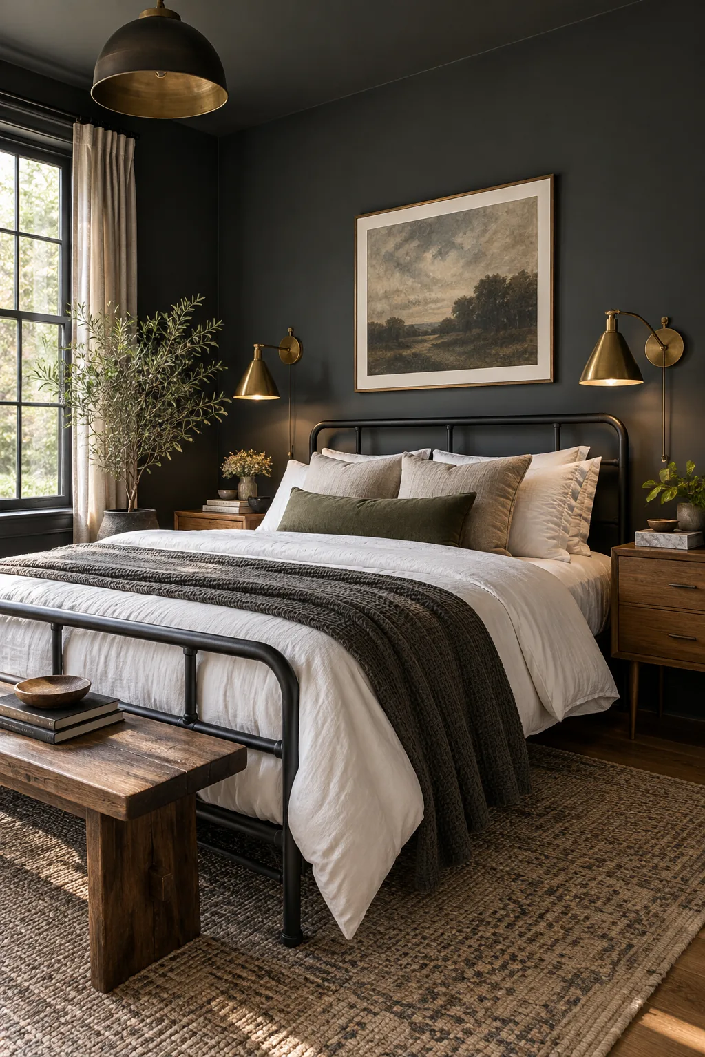
Moody Charcoal and Brass: Deep charcoal walls create a striking contrast against warm brass fixtures, perfect for a modern industrial retreat.
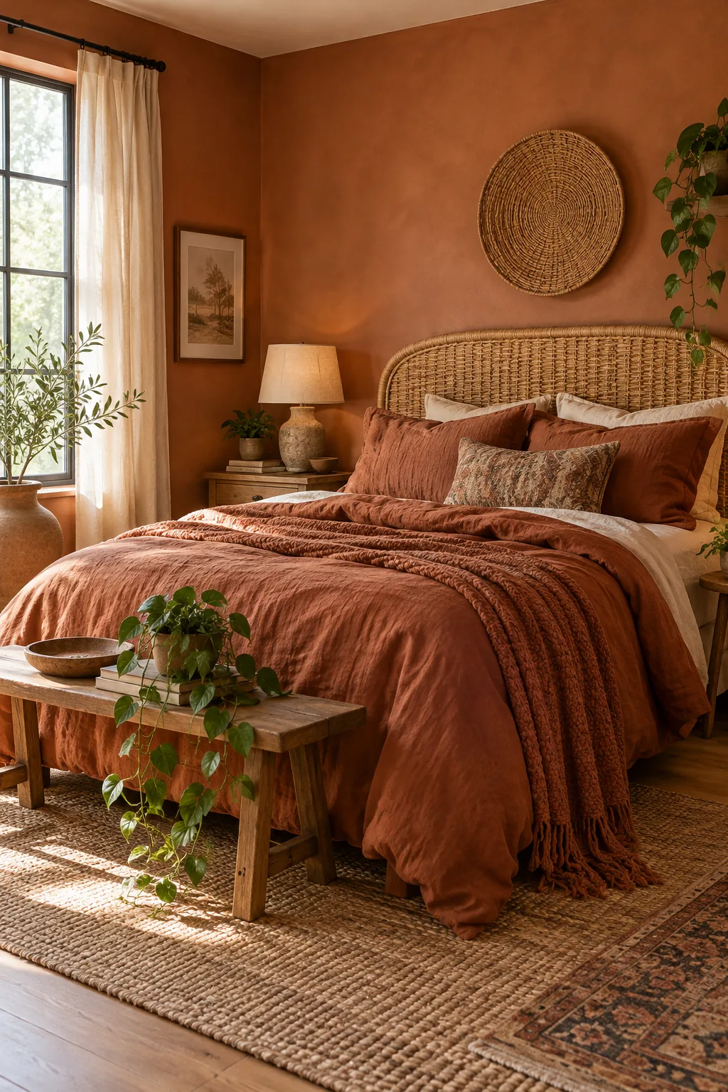
Warm Terracotta and Rattan: Earthy clay tones paired with natural rattan bring a grounding, sun-baked warmth to this relaxed bohemian space.
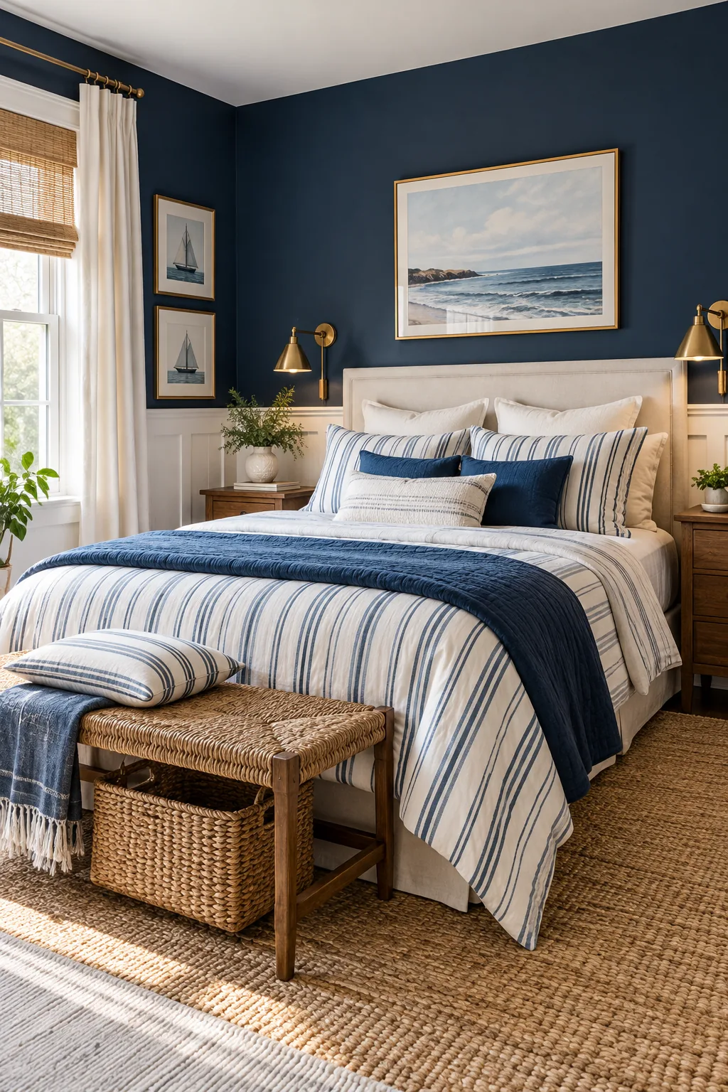
Deep Navy and Crisp White: Rich navy blue walls anchored by bright white trim offer a timeless, tailored take on coastal bedroom styling.
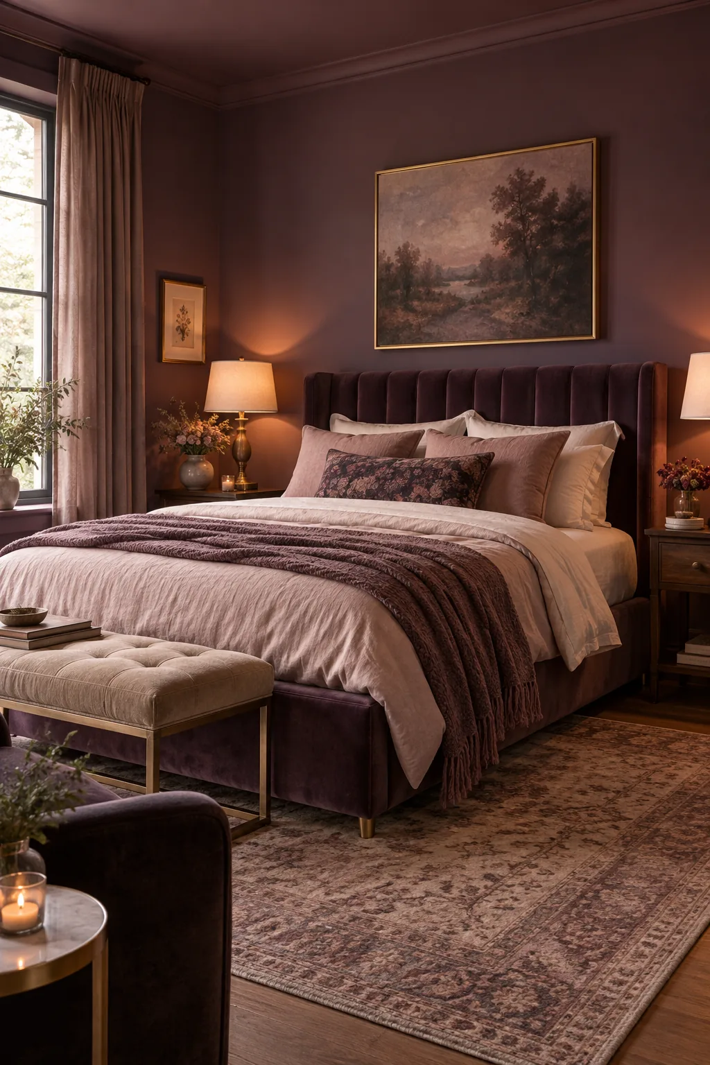
Soft Plum and Velvet: Muted plum paint combined with plush velvet upholstery creates an undeniably romantic and luxurious sanctuary.
Slate Gray and Light Oak: Cool slate walls let pale blonde oak furniture shine, delivering a serene and uncluttered Scandinavian aesthetic.